[PROCESS] KORPO SKULPTI and ALTA STATION
Mike del Mundo and Mike Huddleston close out their behind-the-scenes look at the Year 2 Deluxe Print Set.
The Deluxe Print Set from Mike del Mundo & Mike Huddleston was announced during [REWARDS] DAYS when we showed off the first two prints, followed by THE GREAT BIBLIOTEKA and THE BANK.
With the final prints – KORPO SKULPTI and ALTA STATION – now revealed, we welcome back our own Mike del Mundo and Mike Huddleston to walk you through what went into designing these locations and creating these prints.
If you haven’t checked out the previous [PROCESS] posts, do yourself a favor and give those a read for insight and amazing visuals from two of the best in the game.
A reminder that 3 Worlds / 3 Moons is a reader-supported initiative. If you like what we’re doing and want to get access to great comics, events, exclusive merch and discounts from EMPORIA, and want more from us, please:
To get even more, you can also:
Before we get to the meat of the post itself, the below is image-heavy, so we strongly advise using the Substack app to read it, as email providers sometimes limit images. You can also click through and read via the web.
Let’s begin with Mike del Mundo, who took the words “body sculpting” to their literal and visually stunning limits…
Mike del Mundo: Here’s the description I got when tackling this design:
Inside the Academy ruins, the Korpo Skulpti is the body sculpting studio – the place great mages would go to have their forms determined. Basically, you walk in as a human, walk out as a magic being. It’s a dark, creepy, terrifying place that hasn’t been used in ages and is in severe disrepair, but we can still see the horrors that happened here, with deformed animal bones and remains seared into the room itself from times when the magic stopped working. Decrepit sculptures of transformations gone wrong.
The room should have eyes – two huge, grotesque, bulging bloodshot eyes in the wall – no eyelids. Back in the magic cycle, the room would gaze upon you and make its determination.
The floor (or it can be ceiling, or a floating orb – whatever you think) would be an ever shifting, goopy clay that would claim you and whatever form you chose/brought with. For example, if you wanted to be a deer man, you brought a deer, maybe sacrificed it, and let the clay subsume you both, hoping you came out the other end. (Note: it isn’t always an animal you get turned into, obviously, so we don’t want that to be the only iconography.)
After reading that info about Korpo Skulpti, the first thing that came to mind was that this is going to be fun. If you don’t know by now, I love drawing animals. The thought of trying different types of animals in the most grotesque way, described in animal body parts twisted in pretzel-like forms sounds kinda dark and gross, but funny enough I had a sense of ease in terms of knowing that I wouldn’t have to really think about anatomy or making things right. This was an exercise in just freestyling and having fun. If I’m gonna draw three eyes on a cow, then I draw three eyes on a cow. If I’m going to draw a flamingo with its neck intertwining to create the body that eventually looks like a brain, let’s do it. And so on and so on.
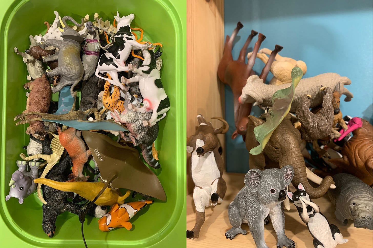
I just let the pen do its work this time to create shapes and attach them to whatever. Lots of fun. The one thing I did add was an element of beauty into this dark, grizzly picture. I felt that since we’re looking at a place that’s frozen in time, I wanted you to feel like you’re walking into a museum and seeing these elements of the story unfold but to show some beauty in the struggle. So to get this feel, I relied on the colors a lot. Colors are a great way to change the mood of the piece. You can have black and white art that can make these disfigured animals with their gruesome insides showing look unappetizing, but then adding a pastel palette of rainbow-like colors can make the them look like gummy bears. My goal was to have something in between that – a nice juxtaposition. Although I did do a lot of freestyling with how I drew these animals in disfigurement, I did have my trusty references of animal figures to add some recognizability to them. Thank God for my kids’ animal collection, ha.
The last thing I added to the piece was a space man – maybe it’s Tajo – I needed a focal point to help sell the story of this bygone era frozen in time like a disfigured fossil. So adding a human element as if he’s surveying the area helped to show that and give the reader a sense of what time or era we’re looking at.
All in all, I wanted to create a dark gruesome piece that can hopefully make it on your wall. Hope the touch of pretty helped.
’til next time!
Mike Huddleston is up next, discussing what it took to cook up his ALTA STATION print seen across two different generations.
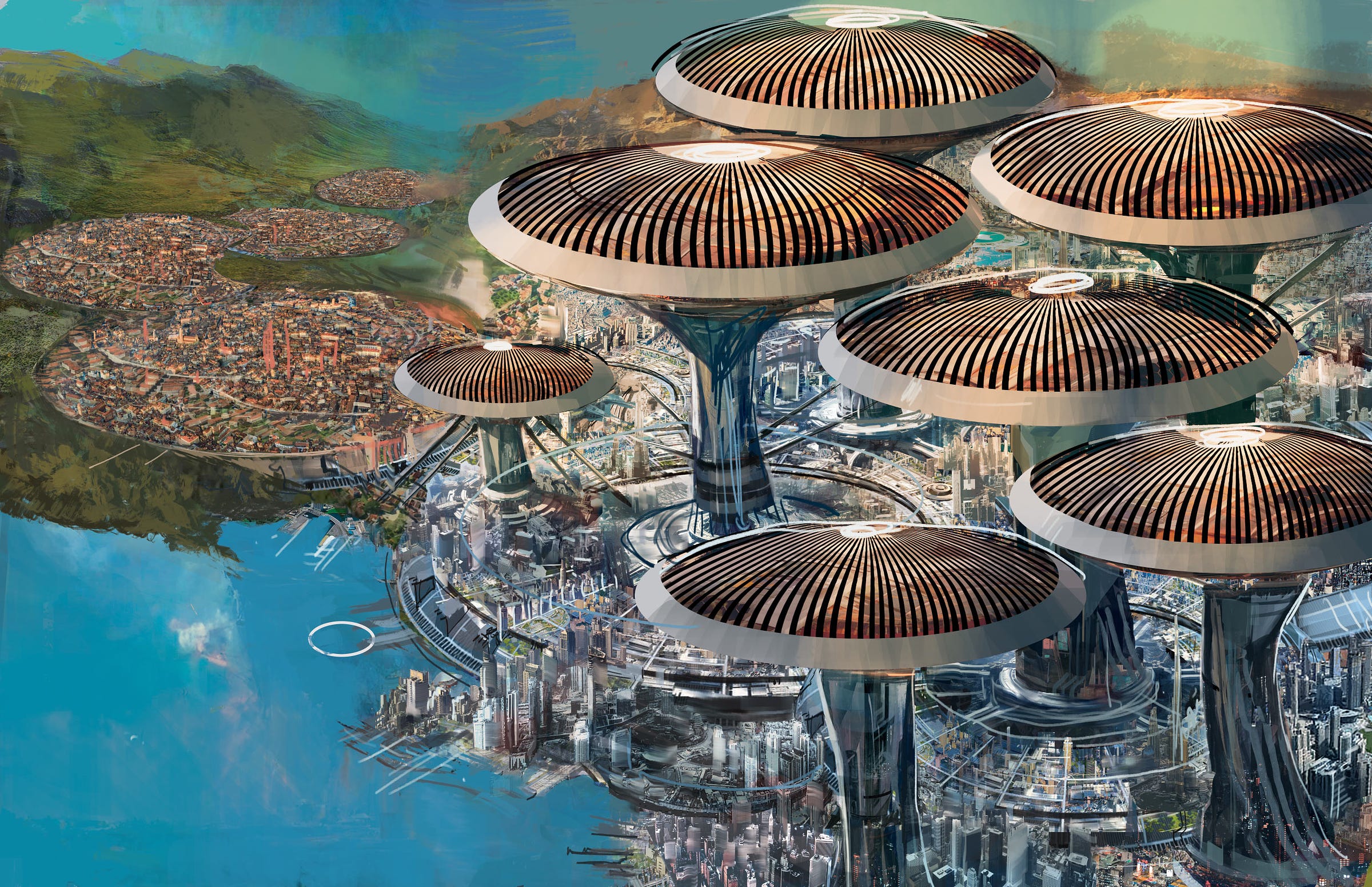
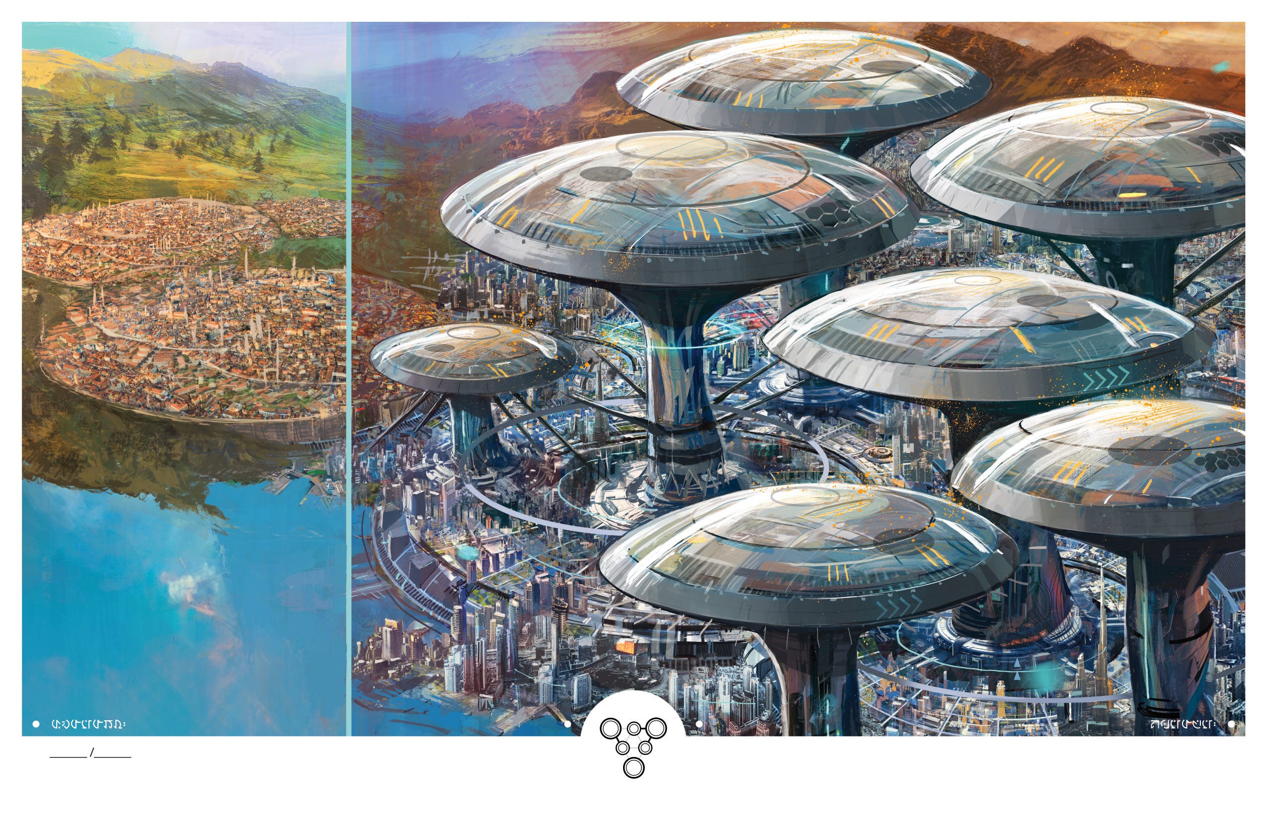
Mike Huddleston: Alta Station is the largest settlement we've visited so far in 3W/3M, and it was an interesting place to visualize because we see this metropolis both before and after it’s transformed by significant technological breakthroughs.
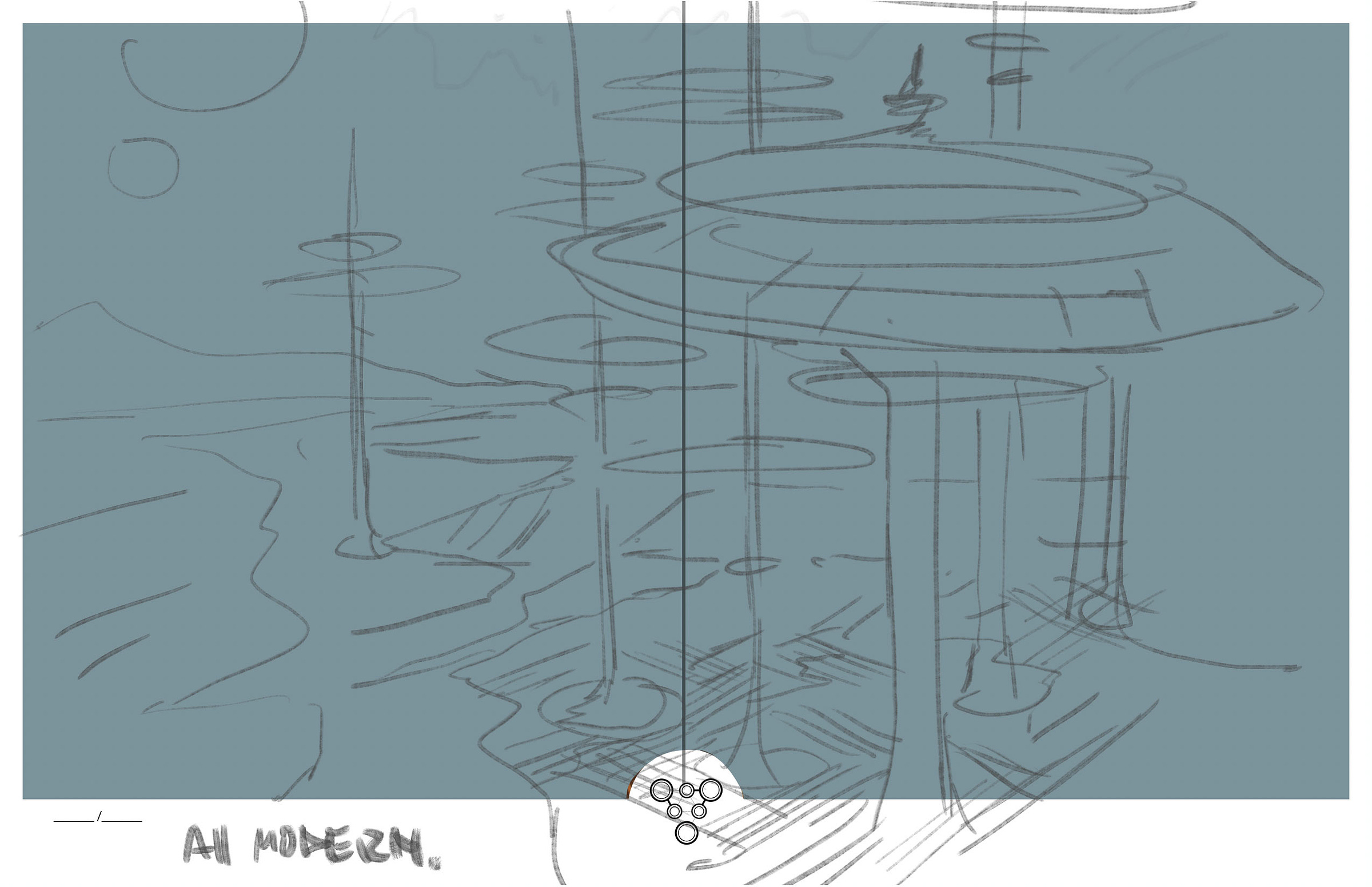
I don't want to spoil anything about the function of the towers, but there were a lot of different takes on how to present this tech: What scale should the towers be? How much would they transform the city? What effect would they have on the environment around them? How much does the city grow after the towers arrive?
Ultimately, we decided the towers should be a visual analogy to mushrooms, so I got to work depicting a sprawling sci-fi metropolis dominated by these enormous technological mushrooms.
The final concept for the city, old and new, hopefully sets an intriguing mood for both our artists and readers to explore. It's a large enough place that nearly any imaginable story could take place there and I'm excited to see it brought to life.
As always, a special thank you to Mike and Mike for sharing their insights with all of us, and the whole 3W/3M Team is excited to see these on your walls in the near future!


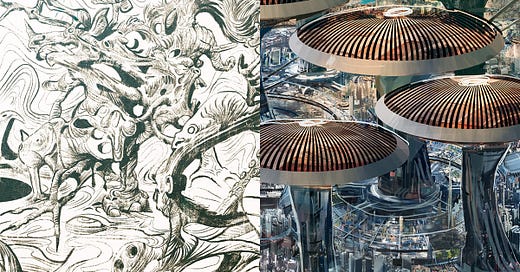


![[PROCESS] THE GREAT BIBLIOTEKA and THE BANK](https://substackcdn.com/image/fetch/w_280,h_280,c_fill,f_auto,q_auto:good,fl_progressive:steep,g_auto/https%3A%2F%2Fsubstack-post-media.s3.amazonaws.com%2Fpublic%2Fimages%2Fd72ed8a8-a3ce-4cc7-952d-1e77ff721147_1000x714.jpeg)




These process articles are brilliant!
I’d love hear about any plans to publish any content in non-traditional formats? The book arts are a good example. Having a unique way of experiencing a story in a physical format that isn’t just a comic book.