[PROCESS] THE GREAT BIBLIOTEKA and THE BANK
Mike del Mundo and Mike Huddleston deliver the behind-the-scenes info on their latest prints.
By now you’re all familiar with the Deluxe Print Set from Mike del Mundo & Mike Huddleston that we announced as part of the Year 2 subscriber rewards. Now that we’ve unveiled the third and fourth images, Mike and Mike are back to take you into their minds and show how they brought these brand new locations to life.
If you haven’t checked out the previous prints or the accompanying [PROCESS] post, please know you’re missing out on some absolutely gorgeous work and killer craft insight.
A reminder that 3 Worlds / 3 Moons is a reader-supported initiative. If you like what we’re doing and want to get access to great comics, events, exclusive merch and discounts from EMPORIA, and want more from us, please:
To get even more, you can also:
Before we get to the content itself, the below post is image-heavy, so we strongly advise using the Substack app to read it, as email providers sometimes limit images. You can also click through and read via the web.
With that, let’s kick things off with Mike del Mundo, who shares how a number of swerves at the end really brought his piece together…
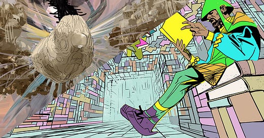
Mike del Mundo: The description for The Great Biblioteka called for a city of books. Big skyscraper towers of them, with connecting bridges and ladders.
I didn’t stray away too much from that description, just added to it a bit.
My goal for the Biblioteka was to have it as immersive as possible that you can almost get that old book smell and feeling. So everything from the autumn colors to the gritty textures were used to achieve that. I also wanted to show how high these buildings were but at the same time get as close as possible so you can see the books and not mistake them as bricks in the distance.
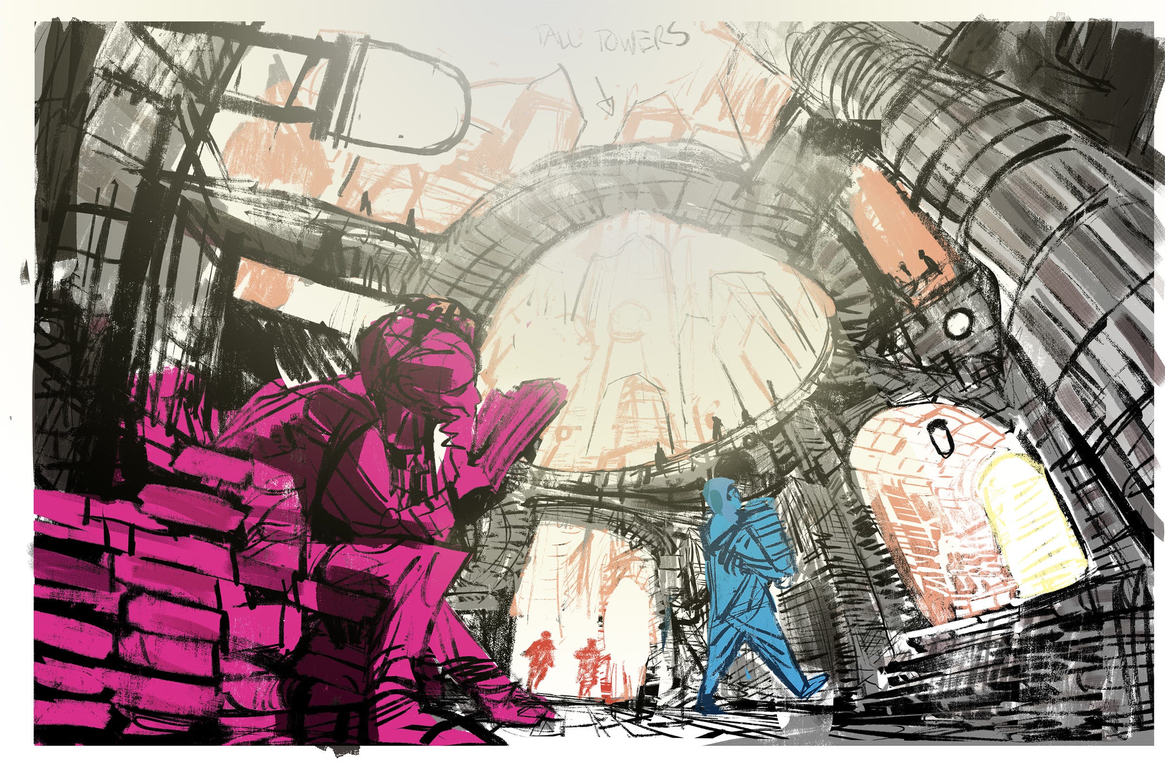
So I went for an open air type area, a small court in the foreground and also give the magnificence of the skyscrapers in the background. Adding in a worm’s eye view type of perspective help to fit all these elements in.
The cool thing about this illustration is that some of my favorite elements in it were sparks of ideas that came last-minute just as I was close to the finish line.
As I was finishing, I had a feeling like it was undone, like it was missing something. Sometimes it’s just that feeling that you have like it needs something else. It felt static, needed an extra piece of storytelling. I mean, I added in one or two Academics reading and looking through books, but it wasn’t enough – it needed that extra cool visual that would make it interesting. So I thought, hey, someone or something would need to maintain these books. This city would require a massive amount of maintenance and strict rules to make sure the city doesn’t topple over like Jenga blocks. I thought adding in robot janitors to maintain the books would be a cool touch and an interesting visual to include. Some robots would sweep and clean while others would replace books that have been taken out or missing. Then I added a robot in the top corner of the illustration.
The big spider-type bot with the legs made of books in the background was initially just part of the overall architecture, but I thought it would be a shame just to have it as this cool hanging ball of decor so I switched it up and added life to it with some spider legs that would find lost books or helping academics flip through pages. This massive walking ball of books would be the head librarian that would lead the rest of the bots to maintain the place. Adding the librarian bot gave movement to the image and it helped to give it a touch of storytelling that gave the perfect finish.
Now we’ll turn things over to Mike Huddleston as he draws you into his artistic web and a vault you don’t want to mess with…
Mike Huddleston: “Concept art” can be a lot of things. Whenever I get something to concept for 3W/3M, my instinct is to flesh that design out as much as possible. If I had the time, I’d do animation-style turnarounds for everything, because I know we’re handing this design to an artist who is going to be asked to draw this thing 100 times, from every angle, doing god knows what. Drawing comics is hard enough, I don’t want to hand an artist a big mess of a design that doesn’t work.
Sometimes, though, concept art has a different job. Sometimes it’s more of a mood piece that’s meant to inspire an artist to work out that character or location for themselves, and this image of “The Bank” is definitely more in that direction.
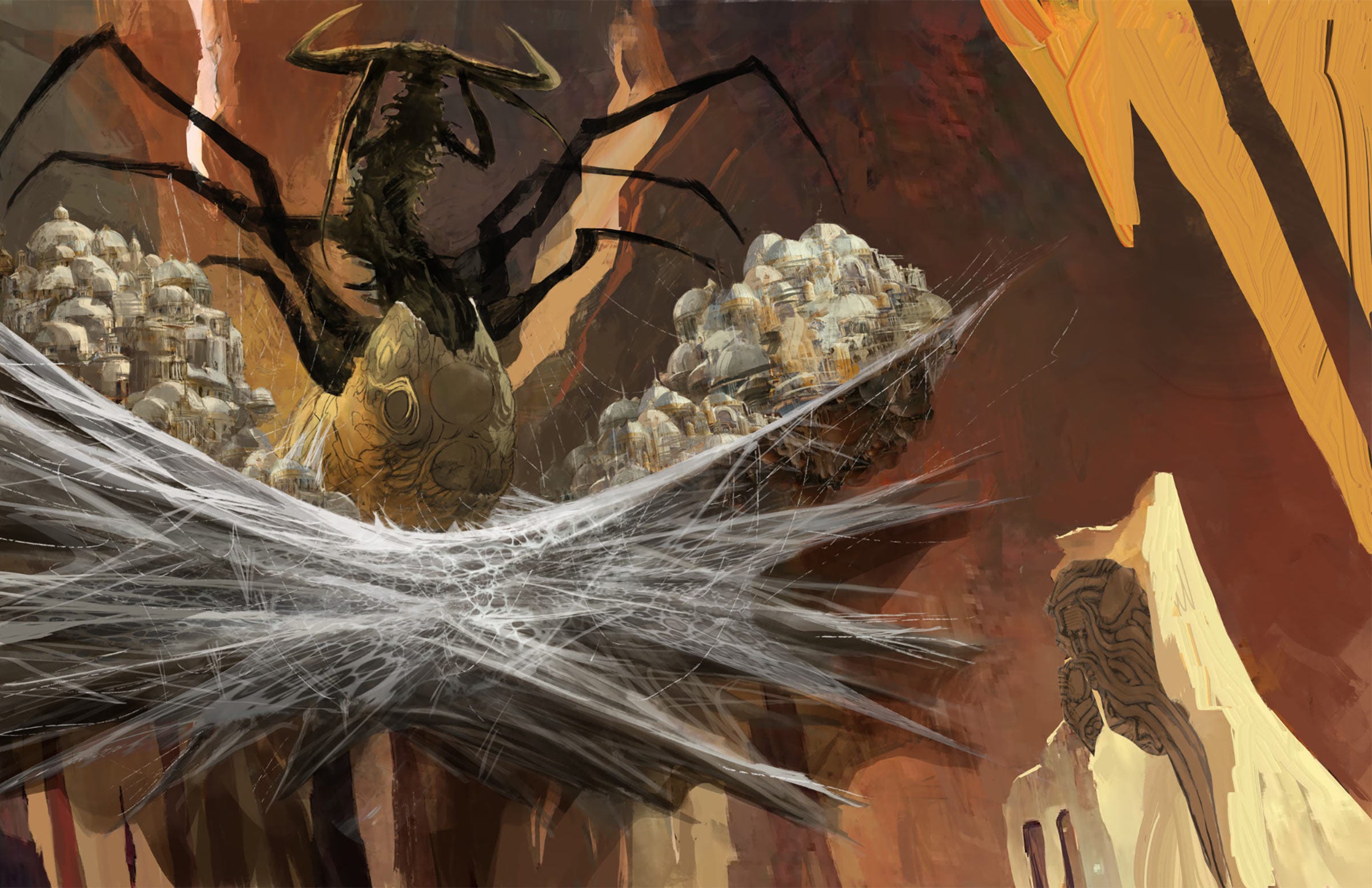
The Bank is described as “a small city unto itself, the Vatican of money… built heavily on the web of a giant, bedazzled praying mantis/spider-like creature that sits at its center, acting as a living vault for Fayrii’s greatest treasures…” “In front of the mantis (or somewhere) is a main structure where they offer up tithe/deposits to her to consume.” “One thought… is they store everything inside a big orb that the thing consumes.”
This is a pretty cool idea! The challenge was to try to capture it in a way that it felt dramatic, and the moment of tithing seemed to me to have the most oomph.
Camera placement was the first hurdle. Usually I try to include humans in any location I’m designing. It gives a design a sense of scale, plus I think audiences subconsciously start telling the story of a place if they see humans populating it. The difficulty here was the city is so large, how do I include humans in a way that you can even see them?
At this stage, I had settled on a horseshoe-shaped city, hanging inside the spider’s web, all within a desert ravine. Below the web, more parts of the city hung like Christmas tree ornaments. The giant spider / mantis didn’t change much from my very first sketch. I thought the centipede-style body was creepy, and an early attempt at open mandibles felt like horns, which I liked, so they stayed.
In the foreground, we see the structure offering up the tithe (including one tiny human figure). The hope here is that since the tithing orb and the hole in the spider’s body are the only circles in the piece, a viewer will intuit that there’s a connection.
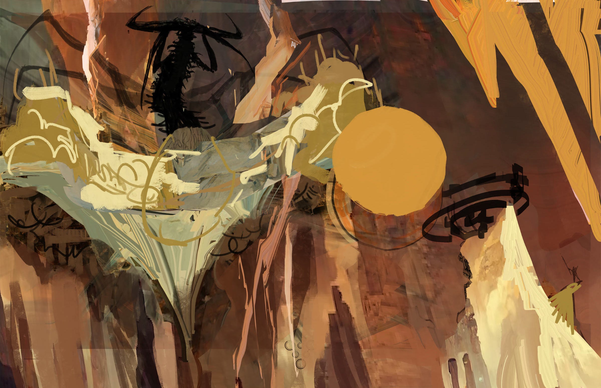
Now that I’ve got a basic concept and composition, it’s time to start thinking about color. The desert location allows for a really warm palette so I’m just experimenting to see what I can do. At this point it’s fun to just block out abstract shapes in color. A surprising amount of this stage remained untouched all the way to final.
At this point I’m trying to figure out how exactly you paint an ornamental city hanging inside a giant spider web, and the truth is, I have no idea. This is where my inexperience as a concept artist is starting to show and I’m getting a little anxious wondering if I can pull this off at all.
I’m starting to find some things that work. I think the suggestion of the spider’s web mostly works, and I really like the hoses and mechanical elements embedded in the foreground rock. The scale seems off though now to include the human in my earlier sketch. The city is too close for a human to be anything but ant sized in the picture.
The Final piece. In the end I was happy with where the piece landed.
I don’t think I was successful in communicating the horseshoe shape of the city. Just landing the city on the web was a victory. Trying to figure out how transparent the web was and how much city you’d see as it receded into thicker parts of the web was beyond me. Maybe next time.
I liked the orb filled with offerings, and I thought the shapes, along with the only use of pure white on both, did successfully connect the orb to the hole in the spider’s body.
I never really landed on a solution for the humans, but I did place a comically small platform near the tithing orb that I covered with what could be people.
The lightning on the orb was a last-minute idea that I think was crucial. It acted as a storytelling element showing the movement and direction of the orb, and it added life to the image.
In the end my hope is that there’s enough drama and suggested information to inspire the artist working on this script. If it can do that, the piece is a success.
Thanks to Mike and Mike for showing us how it’s done.
Rest assured, the remaining two prints will be revealed very soon!




![[PROCESS] del Mundo / Huddleston Prints](https://substackcdn.com/image/fetch/w_280,h_280,c_fill,f_auto,q_auto:good,fl_progressive:steep,g_auto/https%3A%2F%2Fsubstack-post-media.s3.amazonaws.com%2Fpublic%2Fimages%2Fd8930ba6-07b1-47b4-a1c9-a94894507c47_1200x857.jpeg)




In the Biblioteka, was much thought given to the function of the tools on each of the second robot's legs?
Great work and insights, Mikes.