Today we're back with designs for Arena drawn by the amazing Andy Kuhn. I've always admired Andy's storytelling and his ability to stage action, so when I read this script I knew he would crush it. The job for Mike del Mundo and I was really just to give Andy some cool looking action figures to bash together and get the heck out of his way.
Mike and I split the designs for this story, again to keep mixing our design approaches. A gladiator designed by me versus one designed by Mike felt like a perfect opportunity to make something interesting, and when I saw Mike's design for the King's champion I felt like it worked. Mike's fighter was an enormous character with a mask and impaled by swords- he was awesome! I wanted to accentuate the contrast as much as possible so I designed a comparatively normal person. This guy is an underdog and needs to read like one.
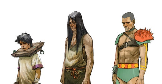
This story was unique in that we followed a character for what is basically his entire life. We needed designs all the way from infancy to adulthood. To be fair, I left it to Andy to design "infant gladiator", but for the rest I tried to show what a horrible situation our hero finds himself in. At his youngest age, he can be seen locked in a cangue (I had to google that), with large iron manacles around his wrists. I don't think this idea translated in the story itself, but I wanted our hero's situation to actually look better here than in the next older design. Here he's a kept prisoner. His clothes almost fit, he has shoes on... but a few years pass and in the next design he's in rags. Maybe no longer valuable as a child fighter, he's been thrown into the streets.
The final design is our hero ready to fight in front of royalty and the King himself. Who knows what series of circumstances brought him here, but he's been washed, shaved and fitted with brightly colored clothes and armor.
"PAGE TWO, PANEL 1 Big shot. Pulled back-- on one side is the banquet table, raised and majestic. On the other is the tunnel, with the fighter and his handlers emerging. In between is a giant, elaborate fighting ring. "
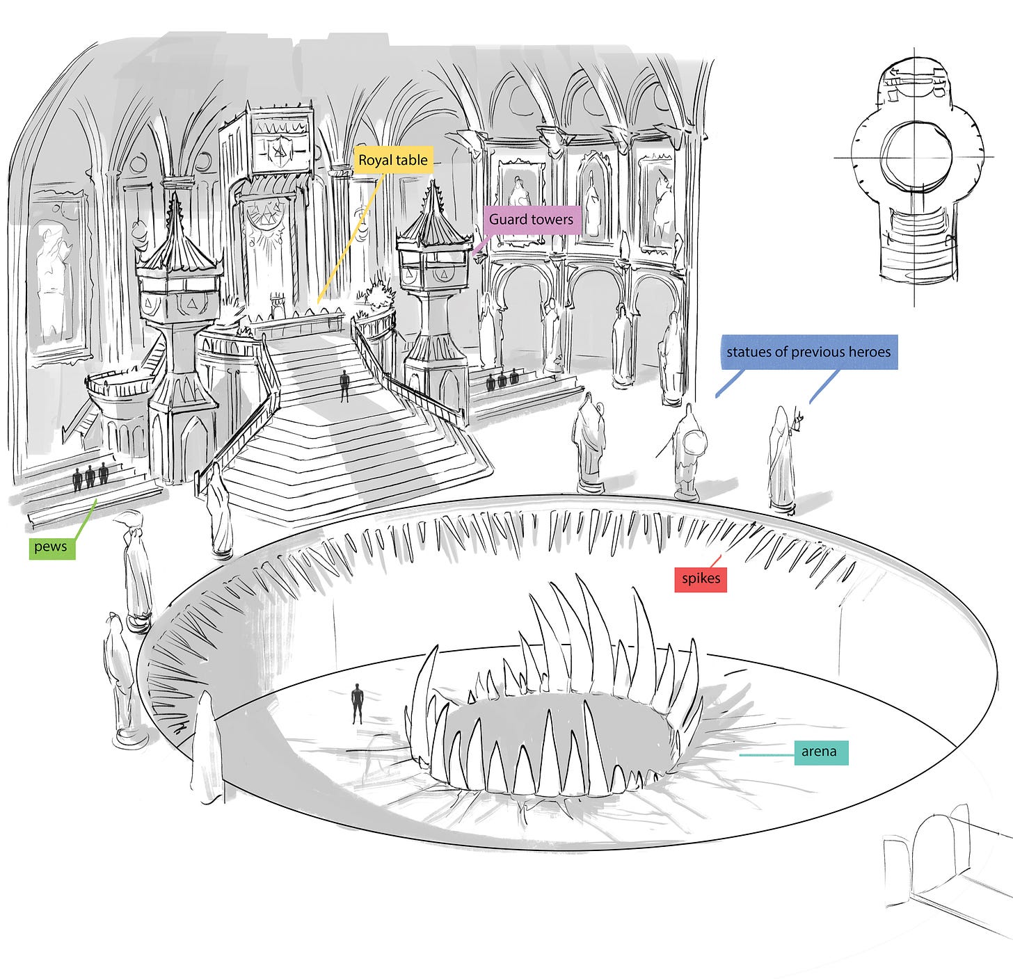
This is all the script has to say about the banquet hall- which leaves things pretty open. My first thought here was honestly being a little frustrated we didn't see the outside of the Kings castle. It's not at all necessary for this story, but it's a chance to communicate something about the people who live inside- does it look like a castle from a fairy tale? or a technological fortress? or some sort of nightmare?
We didn't have an exterior, so this one room had to do all the work. So I just went big and cathedral-like: arches, pews, huge staircases, and even guard towers. This place needed to feel alien, but recognizable enough to communicate age, some level of sophistication, and most importantly- power. Finish the room with an oversized banquet table that looks directly down into the gladiator pit, and hopefully we've given a sense of the decadence and cruelty of this King and assembled royals.
Somehow Mike and I ended up splitting the designs for the pit and the fighting ring inside the pit. I think originally I had taken on the banquet room and Mike del Mundo was going to design the fighting ring, but as we talked through the story with the team the ring changed and became a recessed pit. There are some big teeth in the center of that pit, but I'll let Mike explain those tomorrow when he shares his designs.
My final contribution to the story was to flesh out this group of royals who are dining with the King. We wouldn't get a chance to talk to these characters, or see them in various situations, so their look was the only tool we had to communicate something about them. I tried to make them extremely varied and outlandish: alien haute couture, odd utensils, robotic spider-like legs etc. I ended up really liking these characters and there's one in particular I'd love to craft a story around, but.... we'll see. Who knows what's in store for these people.
And that's it! My designs for Arena. If you guys have any questions or comments let me know below.


Hi Mike! Do you start designs for these with a full script in hand? Or is it a rough outline of the story or as little as a list of characters/concepts? Did you and Mike talk in advance about the designs or did you each do your own thing and then meld the two sets together towards the end of the design process? Or is Andy really doing the final blending of the concepts?
Man, this is very exciting as I love Kuhn's work and the behind the scenes summary above makes you want to read it. Plus, cangues!