[Art] of DUNE 01
It all starts with Schoenherr
Over the next week or so, we’re hosting a series of posts, events, and conversations celebrating all things DUNE, from the books to the art to the films. Join us in honoring one of the greatest worlds ever imagined.
And a reminder- this Tuesday, November 2 at 9pm Eastern, we’ll be watching Lynch’s DUNE (1984) as the next installment of our [Worlds Worth Watching] feature. Details here.
Any discussion of the Art of Dune has to start with John Schoenherr, “the only man to ever visit Dune,” according to Frank Herbert himself. Schoenherr’s work laid the visual foundation for every interpretation of the world that would follow.
So we thought today it would be fun for Jonathan and Mike H. to share their thoughts on a few choice Schoenherr pieces, and what makes them work so well.
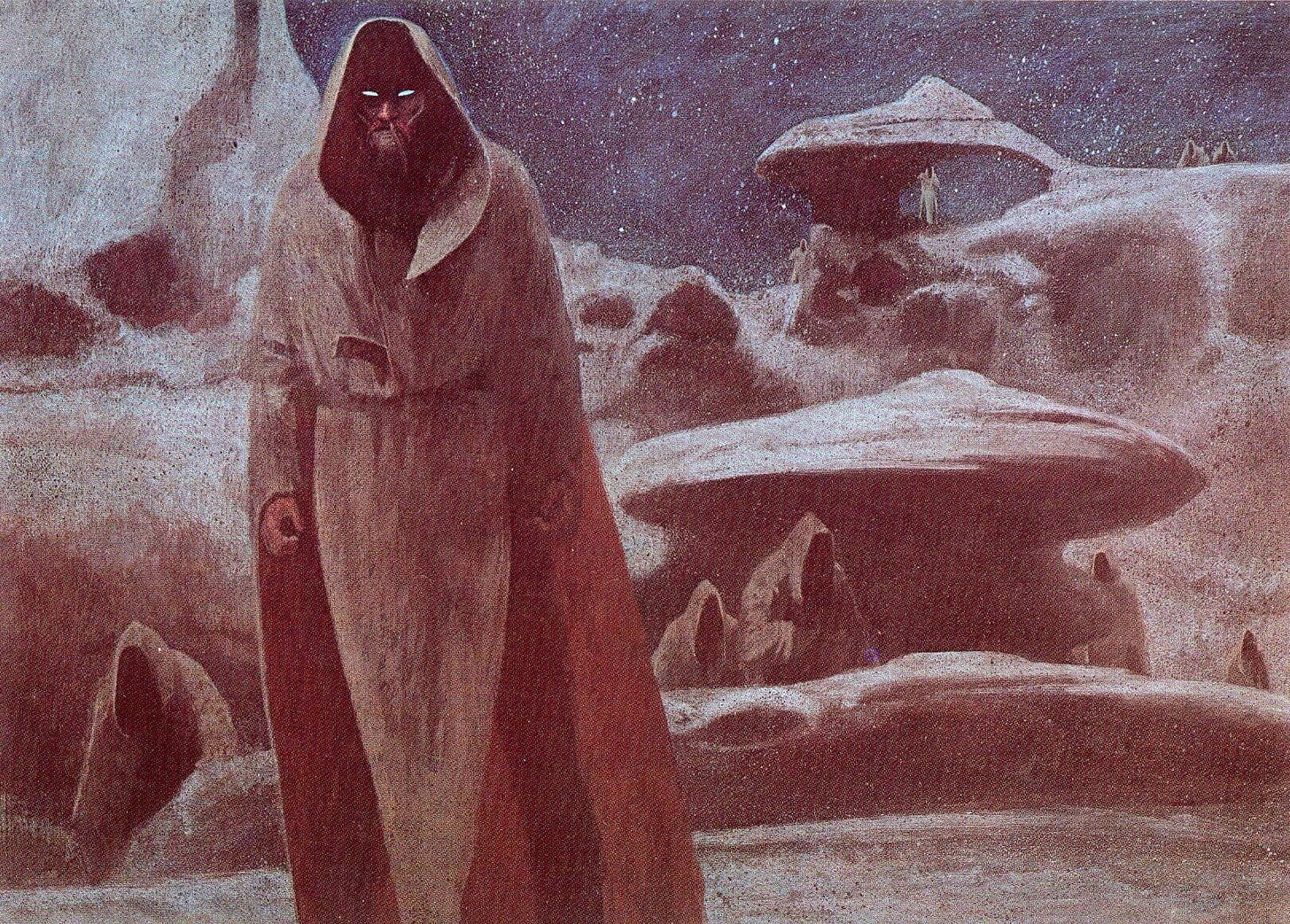
Mike Huddleston: I didn't realize that Schoenherr was illustrating Dune as it was being serialized, so he's as ground level as you can get for visualizing this material. His Fremen look noticeably less technological but he really captured a sense of menace and mystery with this one piece.
Jonathan Hickman: It’s kind of impossible for me to look at this and not see the visual origins of the Jawas in Star Wars. But when I looked to see when it was done it appears to be from a 1978 Dune calendar (which, if correct - and it might not be - then maybe it’s the other way around for this).
MH: Looking at these without context I'm guessing this is Lady Jessica on Caladan? Schoenherr's line work is pretty fascinating- not really formal but not completely random either. Does a great job of evoking alien flora and a lush environment probably as a contrast to the harsh environs of Dune.
JH: Agreed about the line work. You know, I love seeing old ink drawings that pre-date the proliferation of rapidographs in the 80s. I think I got my first set when I went to college in 1990, and they were pretty common by then. All of that stuff has been micron-ed now, but it was nib city for sketches when he was doing these. I love this piece.
MH: Okay, I'm really guessing here... this is like a Dune trivia game... is this Gurney packing his baliset for the crossing? The piece has a real mournful sense to it. A feeling of loss.
JH: Are those tears on his face? There’s no crying in worm ball.
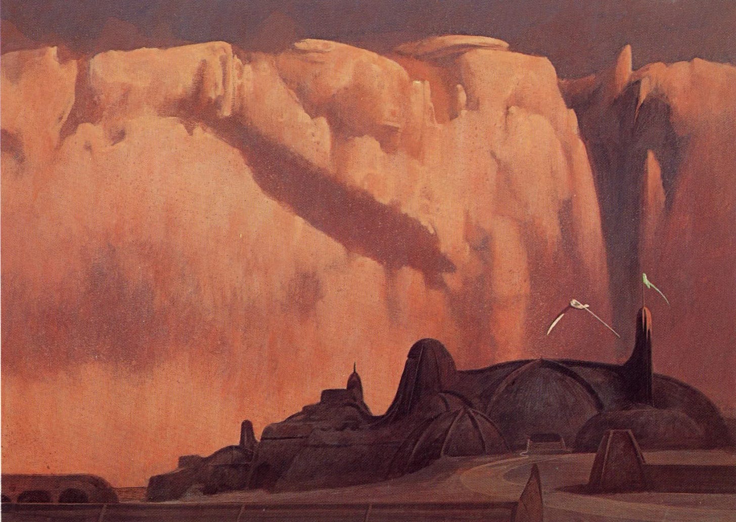
MH: This is a beautiful piece and so evocative! The dark, almost tarnished copper look to the city, framed by that bright shield wall- it makes the goings-on inside that place feel heavy and ominous. The only white being used to pop the (what I assume are) ornithopters is fantastic. Wow, well done.
JH: Yep. This is the shit.
3 Worlds 3 Moons is a reader-supported initiative. Your subscription directly enables us to make more comics, hire more creators, and tell bigger and better stories. We appreciate your patronage!
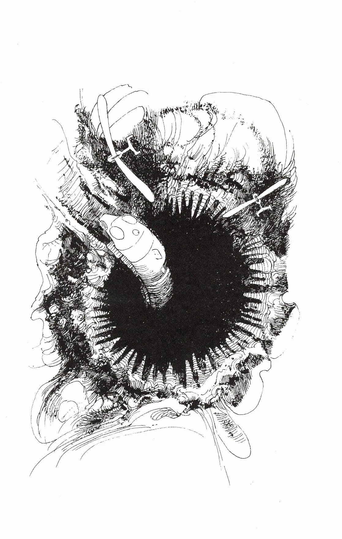
MH: It feels odd to look at what is probably the first published drawing of Shai Hulud. For some reason this piece reminds me of Bill Sienkiewicz's fantastic comic adaptation of David Lynch's Dune.
JH: Bill actually posted his version of this the other day on instagram. Here’s a link. And speaking of those Dune adaptations of Mr. Sienkiewicz, man those things were hard to get a hold of before eBay. It’s so brilliant. Get yours here.
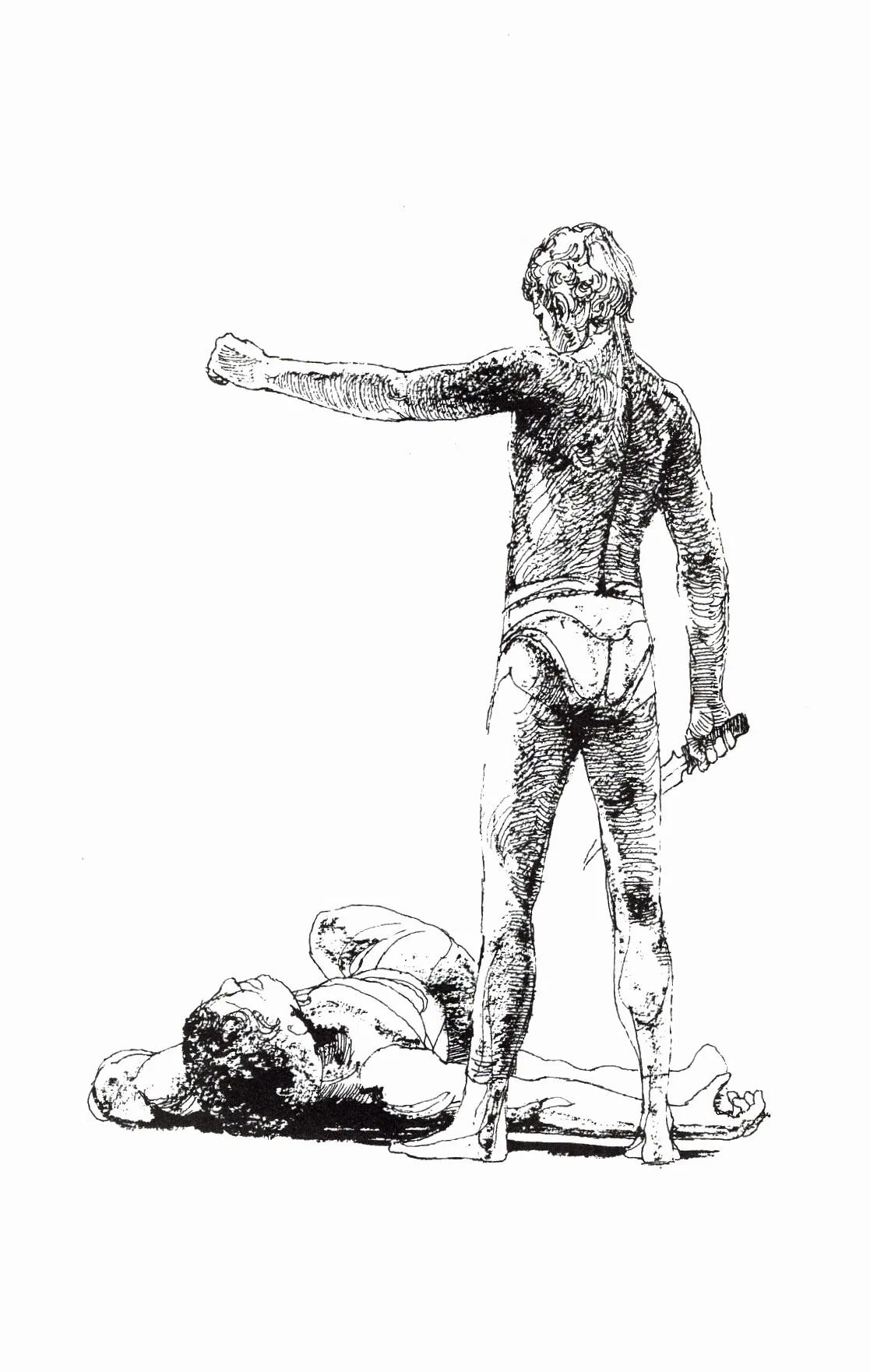
MH: I'm guessing this is after Paul kills Feyd (spoilers!) This drawing feels like it would be right at home with drawings depicting gladatorial Rome. Schoenherr's figure work here is great. Weighty and dimensional. The way he's using his ink lines to carve out the contours of the back and shoulder muscles is really nice and the fact that he leaves other areas totally spare makes this a beautiful drawing.
JH: It’s interesting that this crysknife design kinda lines up with what Lynch used in his Dune (I mean, the shape of a blade’s a blade, but the profile seems really close). I can’t imagine what kind of gig it must of been back in the day to build the visual language of that film from all the various disconnected takes by various artists. I suppose the thing most like that that we’ve seen in our life was Jackson’s first LotR trilogy where they had decades and decades of art translated from text without an overreaching, agreed-upon, ‘style guide.’
MH: The Baron. Now I know I've seen this one before. I think every filmed adaptation of Dune has been trying to recreate that face. This could be a depiction of Hades, plotting some scheme from his underworld throne room. It does a great job capturing the gluttony and menace of the Baron, and I always thought it was intentional that his stomach looked just the right size to consume that model of Arrakis.
JH: Haha. Now I’m hungry. Time for lunch.
3 Worlds 3 Moons is a reader-supported initiative. Your subscription directly enables us to make more comics, hire more creators, and tell bigger and better stories. We appreciate your patronage!


What are rapidographs mentioned in the second drawing and how did they change artwork?
This is awesome! Thanks for sharing this with us!