[PROCESS] THE VALLARS with JASON HOWARD
Artist Jason Howard takes you behind the scenes of 3W/3M's first ongoing series.
THE VALLARS has arrived! With our first ongoing series now in the wild, artist Jason Howard joined the celebration to take a deep dive into his process on the book. Join him for an in-depth look at his storytelling and approach below.
If you haven’t checked out the previous [PROCESS] posts from Mike Huddleston and Mike del Mundo, be sure to give those a read as well.
THE VALLARS is available free to read, for everyone, and is made possible by your support. If you’d like to help us make more comics, hire more creators, and tell bigger stories, consider becoming a subscriber today.
We’re currently offering a 30-DAY FREE TRIAL OFFER on all annual subscriptions through May 8!
Jason Howard: Hi! Welcome to my [PROCESS] post! I'm going to talk a little about how I break down pages and my process for drawing THE VALLARS.
The thing I love about comics, the thing that drew (pun alert!) me to them and made me want to make comics for a living is not just the writing, not just the art, but the way those two things work together to tell a story. I love the way our mind connects single drawings and words in a way that engages us with the story and makes us feel a part of the world of the comic. For me, that’s the magic of comics! Panel-to-panel storytelling is what makes it all work.
This is my process for figuring out the storytelling and drawing pages. But the great thing about art is there’s not a lot of right or wrong, and other artists may have very different approaches. I’ve been making comics for a little while and my process is always changing as I learn or want to try new things. But mainly it's evolved to help me consistently draw the best pages I can while still being productive. On days when I am inspired creatively and "in the zone,” everything is easy – any process works, the sun is shining, and the pages come together smooth and the world is fun. But, as a comic book artist, I need to be drawing pages every day, inspired or not. I have found that giving myself a couple chances at a page takes the pressure off, so even when I'm not inspired it feels achievable and easy to start. I give myself permission to do a bad version of the page knowing that I will have lots of chances to edit it to something better. But often once I just start drawing, I begin to engage with the story, the art becomes secondary, and I get excited about what’s happening with the characters – they become alive on the page for me. The act of drawing creates its own energy, its own inspiration! Hopefully that carries over and the reader will experience that energy and the characters become alive for them too.
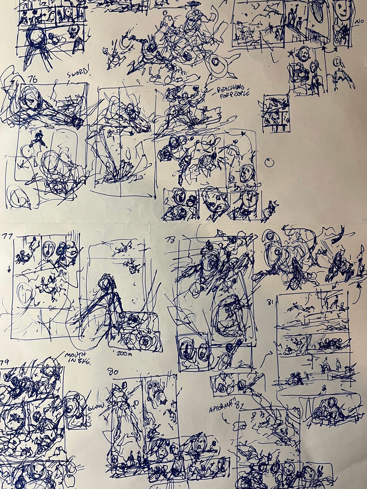
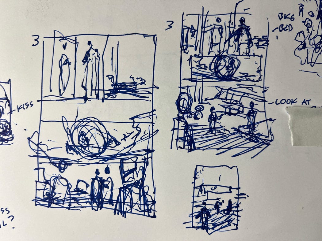
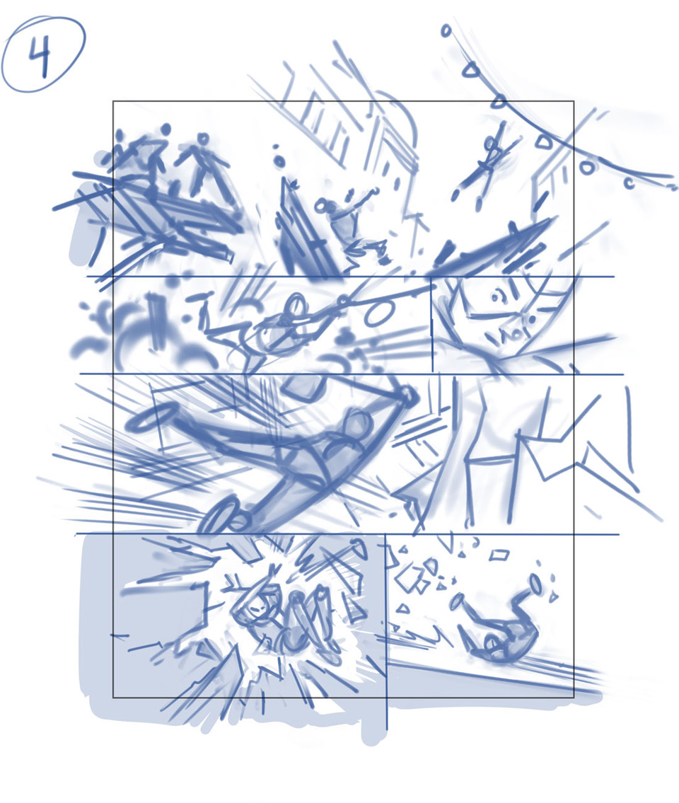
The first thing I do when I get a script is THUMBNAILS. They are small, only 2-3 inches tall, and I use a normal, cheap pen. They are not meant to be pretty, just fast explorations. What I’m trying to do is find the flow of the storytelling and the design of the page. Because there’s a very little time commitment, I can try ideas quickly. It makes this part of the process low pressure and fun. I'm just playing and finding shots that work and panel breakdowns I find pleasing. This is the problem-solving part of the process and I love it! The script is the puzzle, words that describe events and emotions. This is where I start to take those words and translate them into visuals. And once done I no longer have blank piece of paper, the thumbnail gives me a direction for the page and it immediately becomes easier.
When I was first trying to break into comics I got some great advice that was to draw thumbnails of published comics. Our mind makes connections better and remembers things when we draw them. I have sketchbooks filled with thumbnails looking at other artists’ storytelling. Not the drawing but the staging, the composition, and camera angles that they used. It really helped me level up. Actually drawing and breaking down other artists’ panel choices forces us to see the storytelling, asking ourselves “why did they do it that way” engages our brain and makes it a great exercise for anyone wanting to get better at this part of comics!
I tend to throw out my thumbnails so I don't have any from early THE VALLARS pages, but this page from later on in the story is an example of how loose and exploratory they are. You can see where I made notes for myself and where I am trying different versions to explore panel sizes and shot angles.
This page specifically I tried three versions to find something that I liked. As you'll see later in this post, maybe I should have spent a little more time at this stage as I didn't have it quite worked out!
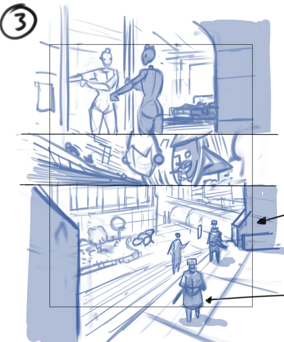
Next is LAYOUTS. This is where some actual drawing starts to happen for me. They are drawn to the correct proportion, and mainly serve to refine my thumbnail. It also gives me a chance to plus my thumbnail. Maybe a couple days have passed and now I see the page with fresh eyes and can see a visual solution that I didn’t before. Not all good ideas happen on the same day. I’m still not worried too much about pretty drawing, but I do try to make it readable and will often give indication of facial expressions. My main focus is clarity of story: Can a reader tell what’s happening visually? I believe we can sometimes break the clarity rule for coolness. But for me, the best visual solutions are both clear and cool. My layouts are drawn digitally, either in Photoshop or Clip Studio. When finished, I send these to our taskmaster overlord, editor Stephen Wacker, and he and the rest of the 3W/3M team will review and (hopefully!) approve.
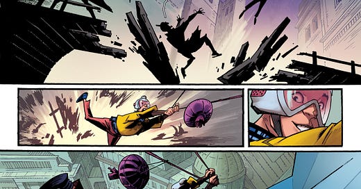
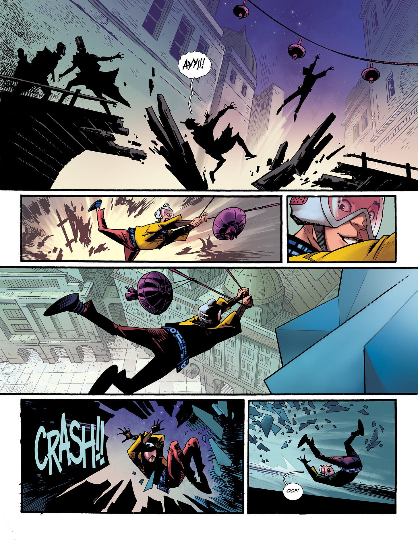
This page is from early in the story and features our hero Tajo running from some baddies. My main concern here is to make the action clear and find shots and angles that are compositionally pleasing and help show movement. I was intentional to keep Tajo moving to the right as he's running away from the guys on the left side of the page.
This page is the Layout for the Thumbnail above. You can see how I've refined the drawing and have started to indicate environments. I struggled with middle panel where the character is in a cool bug car that Mike del Mundo designed. I tried several angles before settling on this one. Overall, this page felt a little blah, but after a couple attempts to work out what I didn’t like about it, I just said good enough and moved on to lay out the next page. Sometimes non-action pages are more challenging to make interesting. Badass action and explosions are naturally cool, but the quieter pages can take more work for me to find a solution that I like.
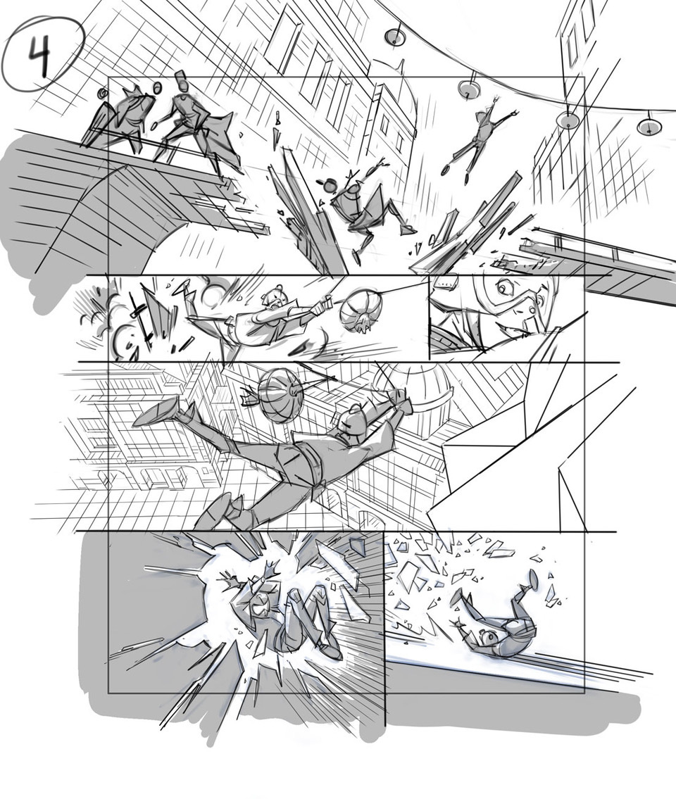
PENCILS! By this stage I have worked out my storytelling choices so all that’s left is the fun of drawing! These are also done digitally. I lighten the layouts layer, then on a new layer above it I just draw. This is where I try to make a face look like a face, and keep the characters on model and perspective and muscles and all the cool stuff. Once the drawing is to a level that I’m comfortable with, I make the pencils a light blue color and I print them out on 11” x 17” comic paper.
You can see in the Tajo page here that I stayed very close to my layout. I felt like the action flowed well, so all I needed to do was clean up the drawing and then set perspective grids and draw the environments. Clip Studio has a great perspective tool! I will also gather at reference at the stage, the hanging lanterns I just indicated from memory in my layouts, but here I googled photos to help get some details right. The gray shadow areas I plan to make darker in value when I ink, either solid black or a pattern of lines/texture. I leave it gray so I can still see the lines of my drawing as that may inform how I approach the area in inks.
For this page I completely re-drew my layout. I didn’t love the layout when I drew it, but I couldn't figure out why. That’s OK, I sent the layout off and sure enough when I came back to pencil it a couple days later, I immediately saw what I could do. In the first panel it needed a full-figure shot in the mirror, this is the first time we see this character and we should get a good look at her. Making that panel bigger meant Panel 2 got smaller, but that worked as I still didn't like that shot from the layout. So I flipped the angle so we see the bug car GOING to a specific destination in the distance. I liked that as I felt it made a better storytelling connection to Panel 3 where she is out of the car and AT her destination. I still liked Panel 3 in my layout, but I wanted to try and make it more dynamic so I lowered the camera angle a little to get some size variation in the guards.
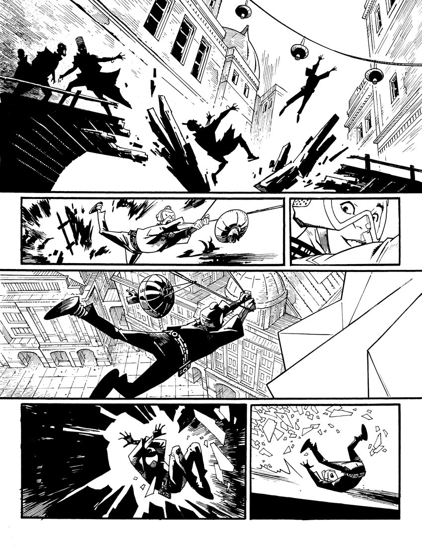
INKS! I ink traditionally using a variety of pens and brushes and markers. Pencilling digitally gives me the freedom to adjust figures and make changes quickly but I still enjoy inking on paper. It helps me break up my process, so I’m not staring at a computer screen every day. At this stage it’s all about finishing the drawing, adding details and linework. I have inked digitally in the past, and I’m not opposed to it, but for now traditional inks are more fun for me. Plus, I have original art for all the pages that I’ve drawn for VALLARS!
Not much changed on this Tajo page. The main thing you’ll notice is the addition of the building detail. I love drawing environments and VALLARS has a lot of cool locations, like the old city Tajo is running thru in this sequence.
And the inks for this page! Again, it’s all about finishing the drawing, finding some flavor in the lines, adding texture and details. Most of the time mid-size to small faces don't get drawn in detail until this stage.
Once the page is inked, I scan it and it's off to fancy pants editor Stephen Wacker, and he sends it to the maestro of colors, Frank Martin, who will take the black-and-white page and make it a beautiful, awesome page of color art. Design genius Russ Wooton does the lettering and there you have it, finished comic book!
So yeah, that’s it. I hope you dig THE VALLARS. There’s tons more cool stuff to come!




![[COMIC] THE VALLARS 1](https://substackcdn.com/image/fetch/w_1300,h_650,c_fill,f_auto,q_auto:good,fl_progressive:steep,g_auto/https%3A%2F%2Fsubstack-post-media.s3.amazonaws.com%2Fpublic%2Fimages%2Fe1486a06-9119-48e8-adf6-eedc7c8b7208_5019x2729.jpeg)



Loved it! Been a fan since Super Dinosaur and was so happy when you joined the team. Really appreciate how you talked about the differences between how digital pencil and physical ink feels for you, it shows a lot about how you specifically connect to your art. Can't wait for the next one! Thanks!
Fascinating stuff! I found the thumbnail process especially interesting. Always good to remember that this is a process (or [PROCESS], as the case may be), and thing don’t emerge from your head like a fully-grown Athena!