[PROCESS] TRANSIT
SPACE WHALE!
Last week we brought you our latest comic, TRANSIT, with art by Christian Ward. Now, today, Mike Huddleston is back to share an in-depth look at his process on the design work for that story.
If you enjoy reading posts like these, consider becoming a paid subscriber, as your support is what makes these possible.
3 Worlds / 3 Moons is a reader-supported initiative. Paid subscribers get:
Exclusive Comics!
Annual and Founding level subscribers get a beautiful, 180-plus page PRINT Graphic Novel / Sourcebook FREE (Shipping not included).
Community Events like Live Draws, Creator Interviews, and more.
Special discounts and early access to new merchandise.
Your support makes it possible for us to make more comics, hire more comics, and tell bigger stories. Sign up now!
Mike Huddleston: Our most recent story follows a little girl and her grandfather dealing with a family tragedy and then, for the little girl, a trip off planet.
The script didn't call out any specific details for the grandfather or the little girl, so I was free to create whatever I imagined. Reading the script it was clear the little girl needed to be old enough to feel the emotions of the situation, but young enough that she doesn't completely understand everything that is going on around her.
I wanted her grandfather to feel sad but stoic. An older man dealing with a difficult situation.
I hoped the robot arm would give him a sense of history, and as I imagined these characters living in a rural location, I thought he could be a farmer. The cybernetic arm as replacement for some injury received working on the family farm.
The other idea I had reading this story is that we should start in a winter location. The journey from winter to warmer locale could help emphasize the emotional arc of the story.
The Aunt. The other family member we meet in this story is the little girl's aunt. The only description of the aunt is that she greets the girl "warmly", so I wanted her palette and design to feel sunny and welcoming.
This is the first time I've worked as a concept artist, creating images explicitly for other artists to use as source material, and this story raised some issues I wasn't sure how to handle.
This script bounces from location to location: hospital room, bedroom, living room, boat dock, etc., often spending as little as one panel in each location.
If this was a story taking place on Earth it would require hardly any design work at all, but as this is an alien planet and we are asking an artist (in this case the amazing Christian Ward) to take us through these situations, each of these locations needs to be designed. Since we're establishing these locations and societies here for the first time, any visual themes in clothing or architecture really need to be worked out... even if most of it never makes it to the page.
At least that's how I thought of it. Someone more experienced with this type of work probably has a wiser take on it.
I tried to give our artist a sense of what each location was, so that meant a lot of concepts for an eight page story.
The Hospital. I was inspired by concept art imagining what 3D printed settlements on Mars could look like. I thought the rounded architecture was pleasing and although it immediately reads as different it's not so exotic that it feels unrelatable. Plus the "mound" concept was basic enough I thought I could run with it as a theme for the rest of the location designs.
The hospital interior was tough as it needed to be familiar enough to immediately read as a hospital room, but strange enough that you're not exactly sure what everything is. I did what I could to make familiar things have odd shapes, and I tried to keep the rounded organic look wherever it made sense.
The House. The house exterior isn't explicitly called for in the script, but again I thought we should supply Christian with some idea of the location. And you never know, if Christian feels like he need an establishing shot, he’s got reference ready.
I designed the grandfather first, so his house is really an extension of his design. I knew I wanted it to be a rural farmhouse, so I tried to apply the hospital's "mound" aesthetic to that idea. Add a yard filled with tools and devices, a fence in need of repair, storage silos filled with local plants or grain, and hopefully this feels like a lived in location.
The Main Room. I wanted the interior of the house to continue the organic shapes of the exterior. A suspended fireplace hangs below a sunken couch area. A holographic projector in the corner acts as the house's main communication channel as well as doubling as an entertainment center.
The Bedroom. This is the little girl's room so I tried to create something that felt age appropriate.
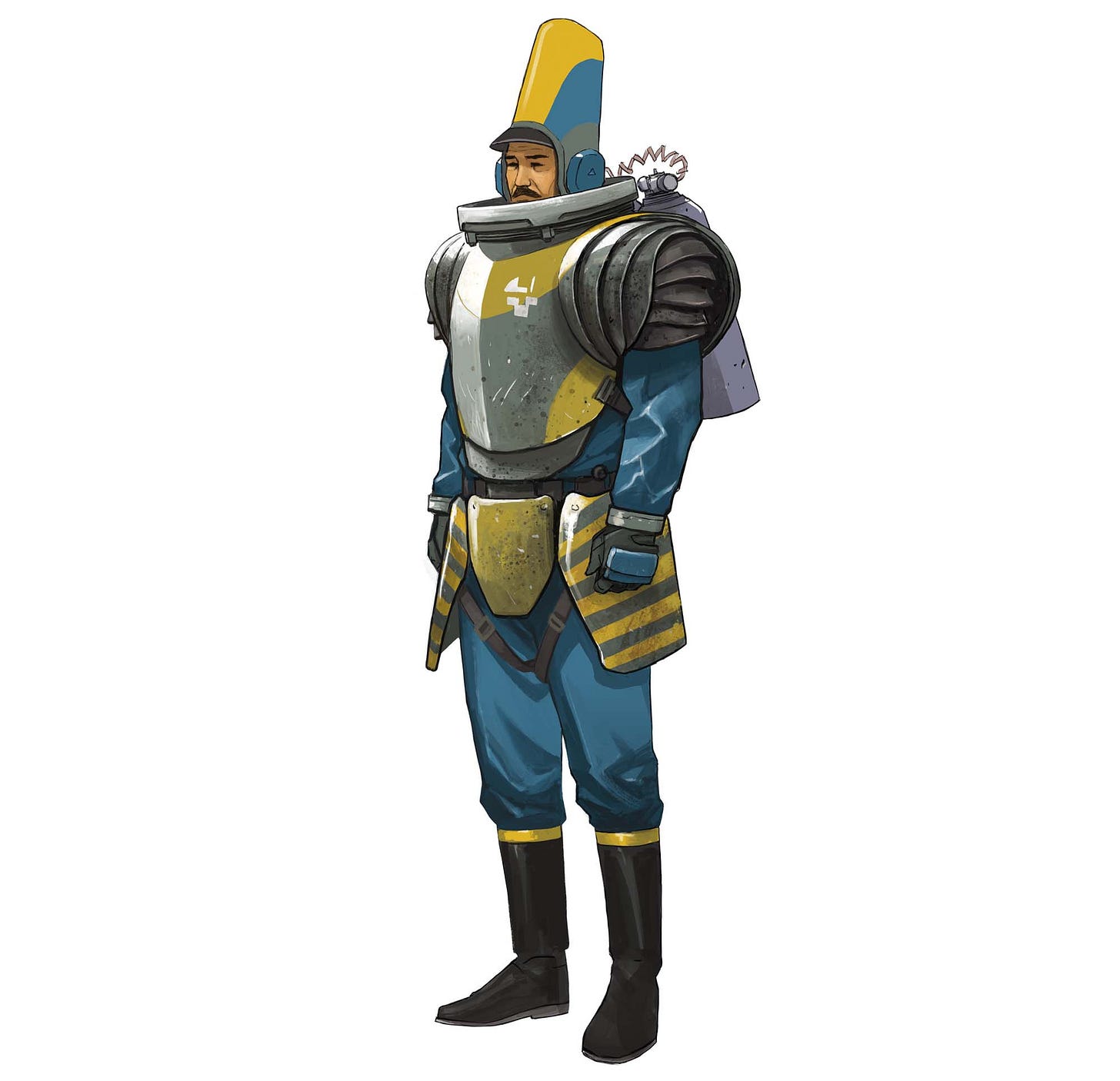
The Priest. Keeping in mind that this is a rural town I wanted the priest's clothes to be fairly practical- much less ornate than our previous "bomb squad" preists. I imagine this guy removes his ceremonial tunic and hat and beneath he has his work clothes on.
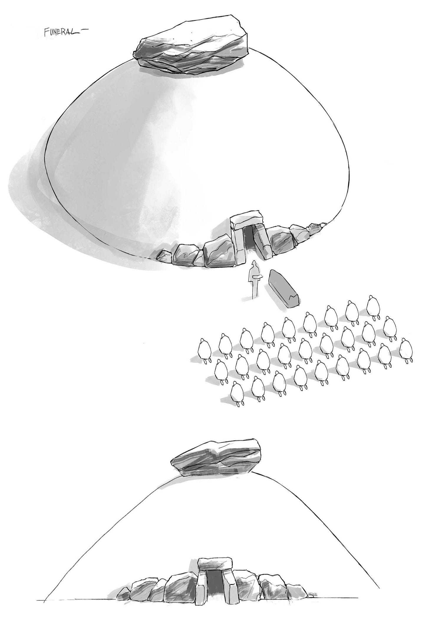
The Funeral. The funeral concept kind of fell into place. Continuing the "mound" concept from the architecture, I thought it made sense for this society to use burial mounds. Attendees kneel during the ceremony, after which the deceased is placed in the mound reserved for their family.
Boat Pilot. Most of the character designs in this story are fairly subdued so I took this opportunity to do something more obviously science fiction. His outfit is a mix of a formal uniform and metal armor. My idea here is that these small transports are used as both commercial and military vehicles, so the pilot is an officer in some sort of military reserve.
The Boat. Described as "a mid size (100 passengers) water transport”. For no other reason than I think they're cool, I designed this ship as a hydrofoil. And for reasons seen further below, I thought the designers of this ship would try to emulate a fish.
The Boat Dock. Continuing with the rounded architecture style, I based this on a rural train station. A small waiting room with a freestanding board outside showing the boat schedule.
Space Whale. In our early discussions about 3W3M Jonathan referred to space whales several times. I didn't know if he was using it as a signifier of how fantastical and outlandish things could be in this new universe, or if indeed we'd have a story with space whales. Turns out we indeed have space whales.
My first realization designing this creature is that if you want to keep the magic of a "space whale" you can't really depart very much from what a whale looks like. Initially I thought I'd combine elements of a manta ray and a manatee, but pretty quickly I realized that it was just a giant monster and I had lost any of the built in appeal that a whale brings with it.
So in the end, I mostly made superficial changes to a whale's anatomy. An extra set of fins, gills and a tail oriented like a fish.
The concept for these whales is that they carry full size cities on their backs and as they fly through space they are able to navigate through dark matter fields.
I wanted to give some sort of visualization to this navigation skill, so I imagined that in the same way that many Earth whales accumulate a buildup of barnacles, these space whales accumulate a buildup of space crystals.
The City. With the whale designed it was time to think about the city it's carrying. In conversation it was stated specifically that this is not a domed city. I'm not sure of the technology or magic that allows this city to have breathable air, but I'm fine designing something that is fun visually and we can fill in the explanation afterwards.
The whale is described as the size of an island so it's large enough to carry a small metropolitan area. Dome or not, this metropolitan area flies through space, makes somewhat regular planetary landings, and spends some time in the ocean, so I thought it at least should be a walled city. It's funny at these moments what seems reasonable and what doesn't. I can buy a flying space whale piloting through dark matter, but an unwalled city dealing with the pressures of space flight???
Whale City Dock. Now the large boat that docks with the space city is something I just made up in response to a disconnect I felt in the script. The way it's described in the script, passengers from the small 100 person boats transfer directly to the whale city via sets of massive stairs.
Once I had the whale and the city wall drawn I realized that these stairs would need to be 50 to 100 stories tall or more. Combine this with the idea that this transfer is made while at sea and I could envision the tops of those staircases swaying so wildly it would probably throw most passengers to their deaths.
Stepping back I thought, besides being an awe inspiring arrival of a space whale, this is also a full city coming into port. They need supplies, as well as a way for people to arrive and disembark. So I imagined there are oil tanker size vehicles that dock with these cities and act as an intermediary dock for the small transports.
Loading docks open in the city walls and passengers transfer from the deck of the large boat. And we still have the large staircases, but now maybe 5 or 6 stories instead of 100. I still fear for these passengers so I put nets below the stairs.
And that's it- all the designs (probably too many) for our space whale story. Let me know below if you guys have any comments or questions.


Wow this is incredible. The thought you put into every aspect is really smart. We are gonna need prints of that space whale drawing.
Amazing work! "Unwalled city"? How ridiculous.