[PROCESS] THE NORTH
Mike and Mike explain how they designed the Institute Base on Therra, the Orphans, and more for [MAPS].
Before we get to today’s post, a reminder that this Saturday, November 4, we’ll be hosting a brand new [WORLDS WORTH WATCHING] where we’ll be watching M3GAN (Unrated) – with YOU. The film starts promptly at 4pm ET / 1pm PT. We hope to see you there!
Earlier this week we released THE NORTH, our latest comic drawn by Meghan Hetrick and colored by Nick Filardi. Today we’re back with a brand new [PROCESS] post by Mike Huddleston and Mike del Mundo where they break down the thought process behind The Institute Base on Therra, Mechs, Orphan uniforms, and more.
THE NORTH is one of 12 comics included in the [MAPS] Graphic Novel Sourcebook, which will also house a treasure trove of world-building and behind-the-scenes material. If you’d like to read THE NORTH, other [MAPS] stories, or anything else we’ve released, you should join us as a paid subscriber:
3 Worlds / 3 Moons is a reader-supported initiative. If you like what we’re doing and want to get access to great comics, events, exclusive merch and discounts from EMPORIA, and want more from us, please:
To get even more, you can also:
Because today’s post is image-heavy, we strongly advise using the Substack app to read it, as email providers sometimes limit images. You can also click through and read via the web.
Let’s start by hearing from Mike Huddleston, who really wanted to create a history for the locations and mechs he designed for this story.
Mike Huddleston: THE NORTH was a fun story to work on as it gave me an opportunity to design more buildings, but also a battle mech!
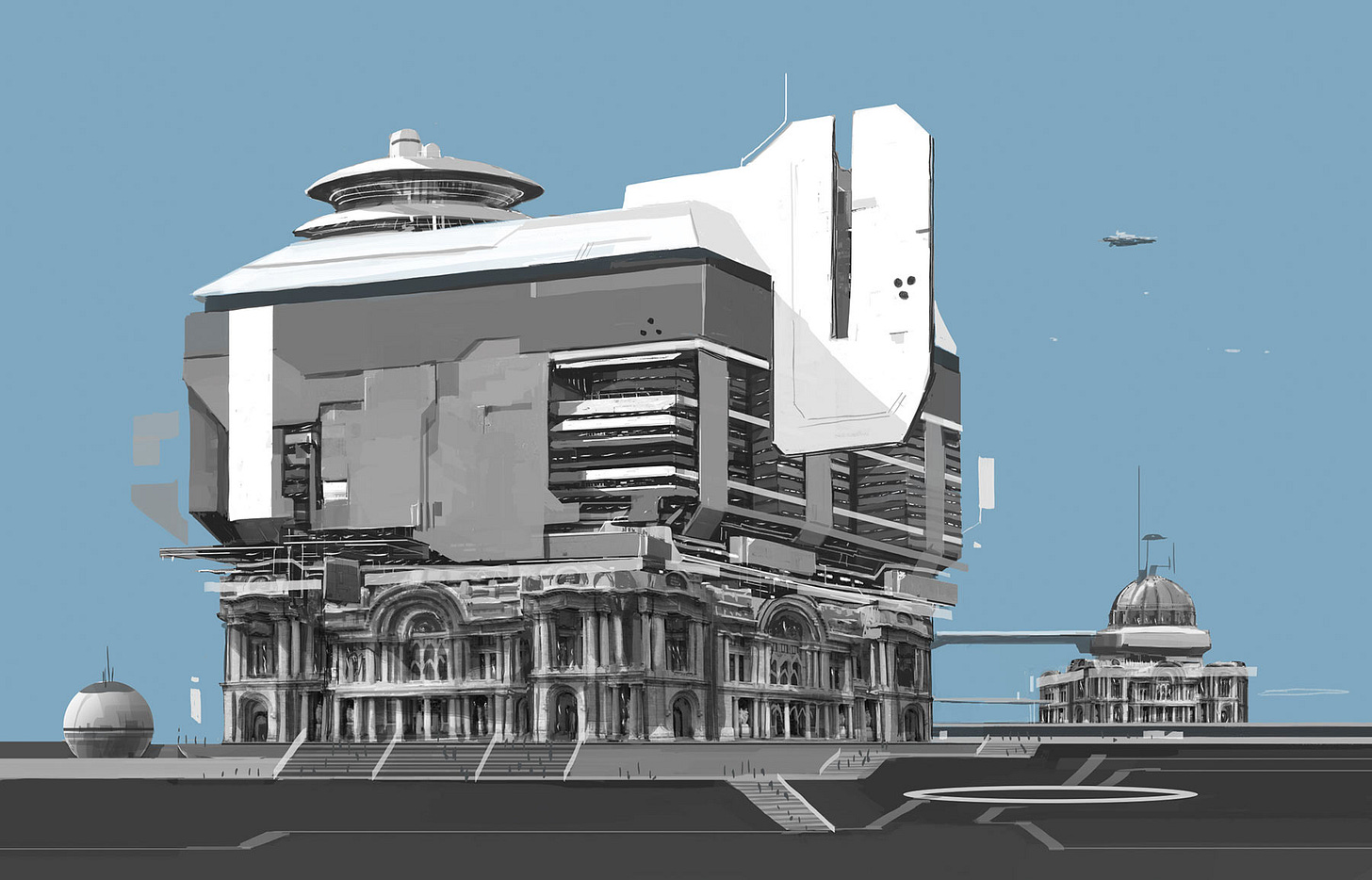
The description for the North Institute Base on Therra was brief: “Italian renaissance architecture with some modern flourishes. (See: US Naval and NATO bases located in Naples.)” Looking at these locations it was pretty clear the direction we wanted to go, but I thought the bases were designed basically like hotels – thoroughly modern buildings with a facade of arches and pillars as a gesture at the entrance. I thought we could do better.
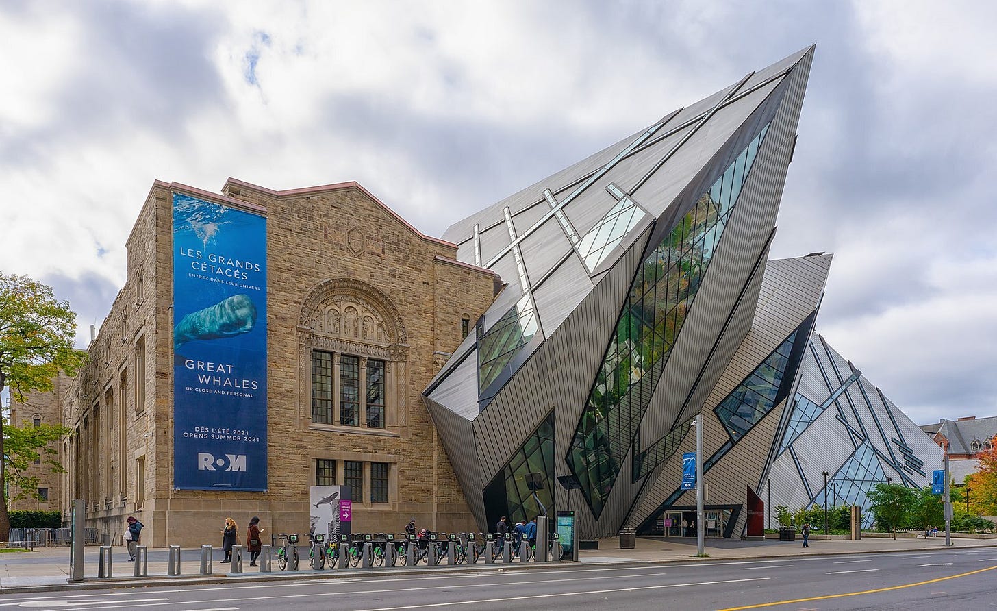
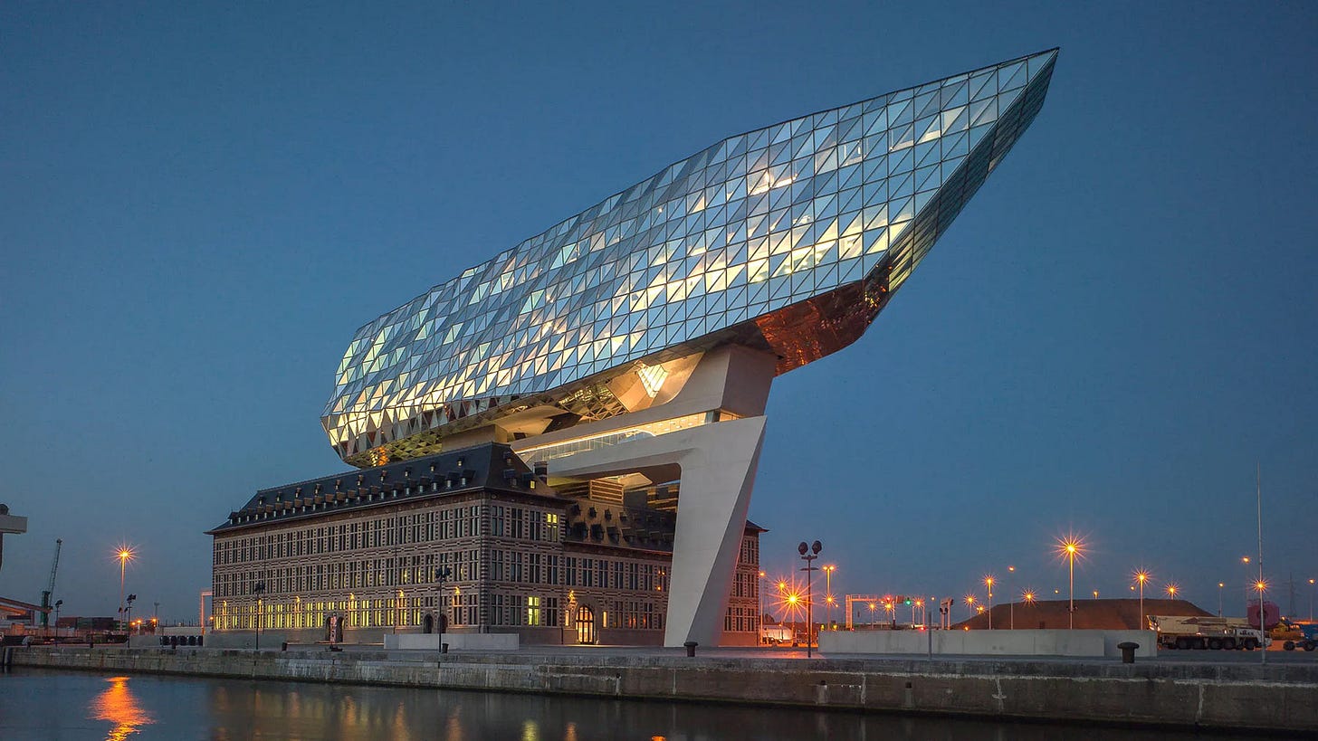
Whenever I think of combining architectural styles, I'm taken back to the first time I encountered the Royal Ontario Museum in Toronto or saw photos of Antwerp’s Port Authority Building in Belgium designed by Zaha Hadid. These buildings both really blew my mind as they looked like a spaceship had crashed into a building and they just incorporated it into the daily life of the city. I found the collision of styles inspiring and it's an approach to architecture I've used several times already in my work (although I should probably move on as I'm explicitly calling it out).
Sketching out the HQ, I loved the idea of incorporating Renaissance architecture, but instead of just a flourish, let's make it a Vatican-style basilica full of arches and columns (and also probably twice as large as it should be).
Sitting on top of this ancient base, I wanted a hyper modern office building, composed of enough planes, angles, and geometry that it felt obviously high-tech.
Aside from just visual interest, I'm always hoping these decisions suggest a history for a location. How old is this place? How DID this building end up this way? What was this location originally? Was this a peaceful transition from the building's past, or is this a sign of conquest?
I rounded out the design with some other buildings, connecting walkways, and the suggestion of a surrounding campus- a proper headquarters.
Now onto the battle mech!
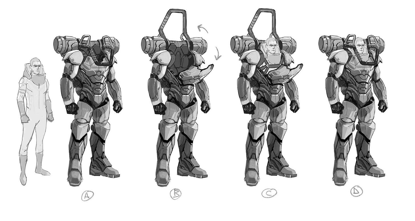
The combat mech had a short brief, which expanded some after talking to the team. “These should be like the loader in Aliens – not a robot exterior that covers the driver completely so we can't see them.” We also discussed keeping the mech more humanoid and that I shouldn't go crazy designing something that might be difficult to draw – which, admittedly, is a good note.
Immediately the combination of notes was pointing toward something interesting – the mech needed to be humanoid, but also utilitarian like a construction vehicle with a partially exposed operator. Power suit meets bulldozer.
Getting to work on the mech, I kept to a pretty basic human design. I wanted it to feel a bit generic with the one panel opening for entry, with a series of belts to hold the driver in place. More like getting into a vehicle than a suit. The head would remain uncovered, but a set of roll bars would pull down and around the pilot. This was a combat vehicle after all, so the pilot's head needed SOME protection.
The roll bars were a direct nod to the Aliens power loader and they're my favorite detail on the basic suit.
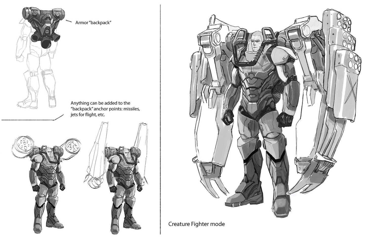
I wasn't sure of all the situations this mech would find itself in, so in addition to the basic suit, I gave it a modular extension backpack that could be used to add all sorts of items.
The backpack looks like a jump pack with directional rockets at the bottom, so if we need to write a suit jumping to the top of a building, we've got that covered. The top parts of the backpack are two large contact points where any number of modules can be attached. I sketched out rocket launchers, larger flight engines… and giant monster punching arms.
Some of the team discussion about this story included the idea that giant monsters would be a concern and we could definitely see these mechs being used to confront them. With that in mind I started thinking about fun ways to fight monsters.
This is one of those moments where a bunch of disparate ideas just come together and make something without you doing much at all. My thoughts were “We've seen giant robots fight giant monsters, but this is a small robot. Could it still have giant arms?” and “I love it when Hellboy punches monsters with that huge stone fist. This mech should have big fun scenes like that.” And it was decided: this mech needed to have giant fists to punch monsters.
The idea is pretty outrageous, so I wanted it to look the most grounded in reality of any part of the suit. Flat mechanical shapes, exposed hinges and hydraulics, digging blades that would be appropriate on a construction vehicle. Also, the arm shields look ad hoc. They weren't a part of the original design but experience has led to them becoming standard. Yes, I'm really trying to sell the realism and history of these crazy giant punching arms.
I realize this probably veered into the “difficult to draw” territory, but I played it so safe with the rest of the design I thought it would be ok. I'm hoping we get more stories with these mechs as I would love to revisit and customize their design for stranger and more exotic missions.
Now let’s enlist Mike del Mundo to talk about designing the Orphan uniforms as well as their salute, and how the latter was a family affair…
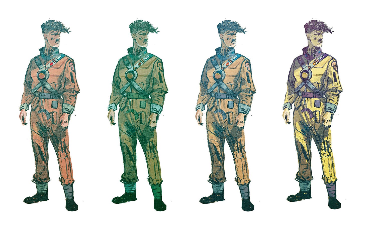
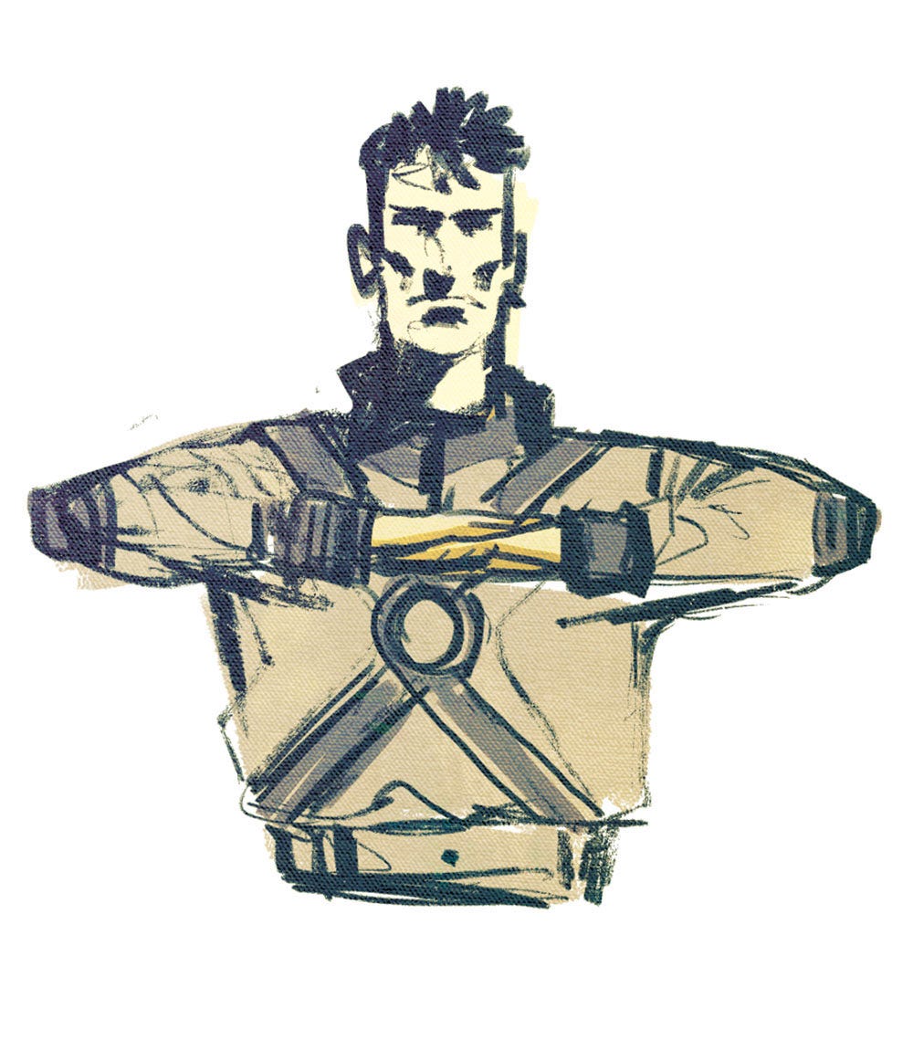
Mike del Mundo: I was tasked with designing the jumpsuit uniforms for the Orphan cadets, as well as their salute.
The Uniforms were pretty fun and easy, to say the least. I’d already had plenty of suits for the past year and a half, so I had a good grasp on what I wanted to do. All that was left was to decide which color variation to go with.
The uniforms were a good exercise before I had to wrap my brain around the salute, which was tricky.
I thought, “Hey, how hard is it to come up with a small simple salute?” What I didn’t realize was that a lot of hand gestures and poses had already been used – in prayer, martial arts or military gestures, or your favorite movies and TV shows. So I had to go deep to make sure that what we did didn’t reflect anything that had been done before. It was a lot of digging on Google for salutes that had already existed and then figuring out something different.
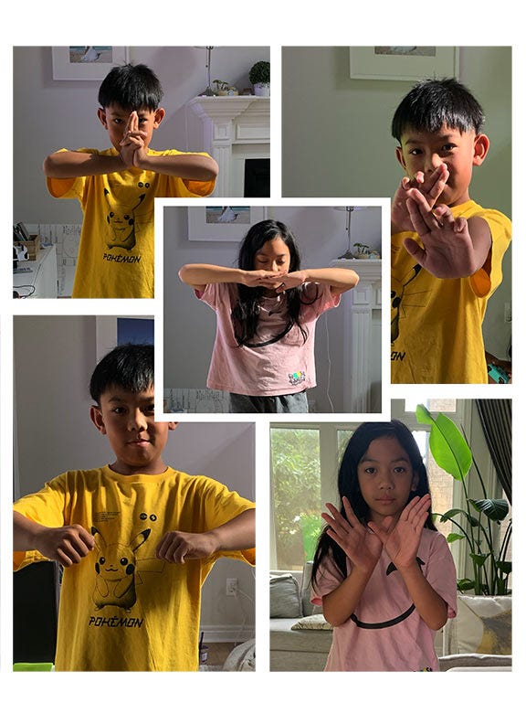
What helped me a lot was actually getting my kids to attempt different salutes. I use my family a lot for reference, but having them perform salutes was a first. I had them doing like 20 gestures each, which was hilarious and fun, and it actually landed me on the main salute we ended up with. My daughter hit the target. Here’s a couple of them from the dozens we took.
As quick as the final sketch came together, the process to get there was a journey. It was also a treat to see the salute drawn by Meghan in the story.
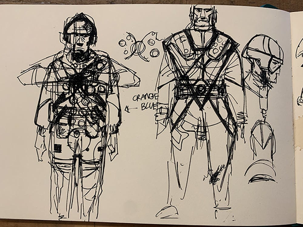
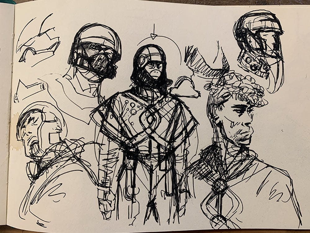
As an extra thing, here’s a few of my really quick sketches that I did to warm up the brain and to get those first bursts of ideas down for the suit.


