[PROCESS] SISTERHOOD
The Adventures of The Waiter.
Yesterday, we brought you a brand new comic, SISTERHOOD, with art by Langdon Foss. Today we’re back with a look at the behind the scenes process for that story, with our own Mike del Mundo.
But first, a reminder- SISTERHOOD, along with 11 other comics, will be included in our [SYSTEMS] Graphic Novel Sourcebook (along with a wealth of world-building and process material), currently available FREE (shipping not included) to Founding and Annual Subscribers. This offer ends April 12th! You can read more about that here, and reserve your copy by signing up here:
3 Worlds / 3 Moons is a reader-supported initiative. Paid subscribers get:
Exclusive Comics!
Annual and Founding level subscribers get a beautiful, 180-plus page PRINT Graphic Novel / Sourcebook FREE (Shipping not included).
Community Events like Live Draws, Creator Interviews, and more.
Special discounts and early access to new merchandise.
Your support makes it possible for us to make more comics, hire more comics, and tell bigger stories. Sign up now!
Now, on to Mike…
Hello friends. Back again with another process post for y’all. This time we’re exploring badass Grandmas and Squid Bombers, mmmmmm..calamari. Before we go right into it, I just wanna say Langdon Foss totally annihilated this story in a good way. I loved it so much and grateful to see my designs come to life.
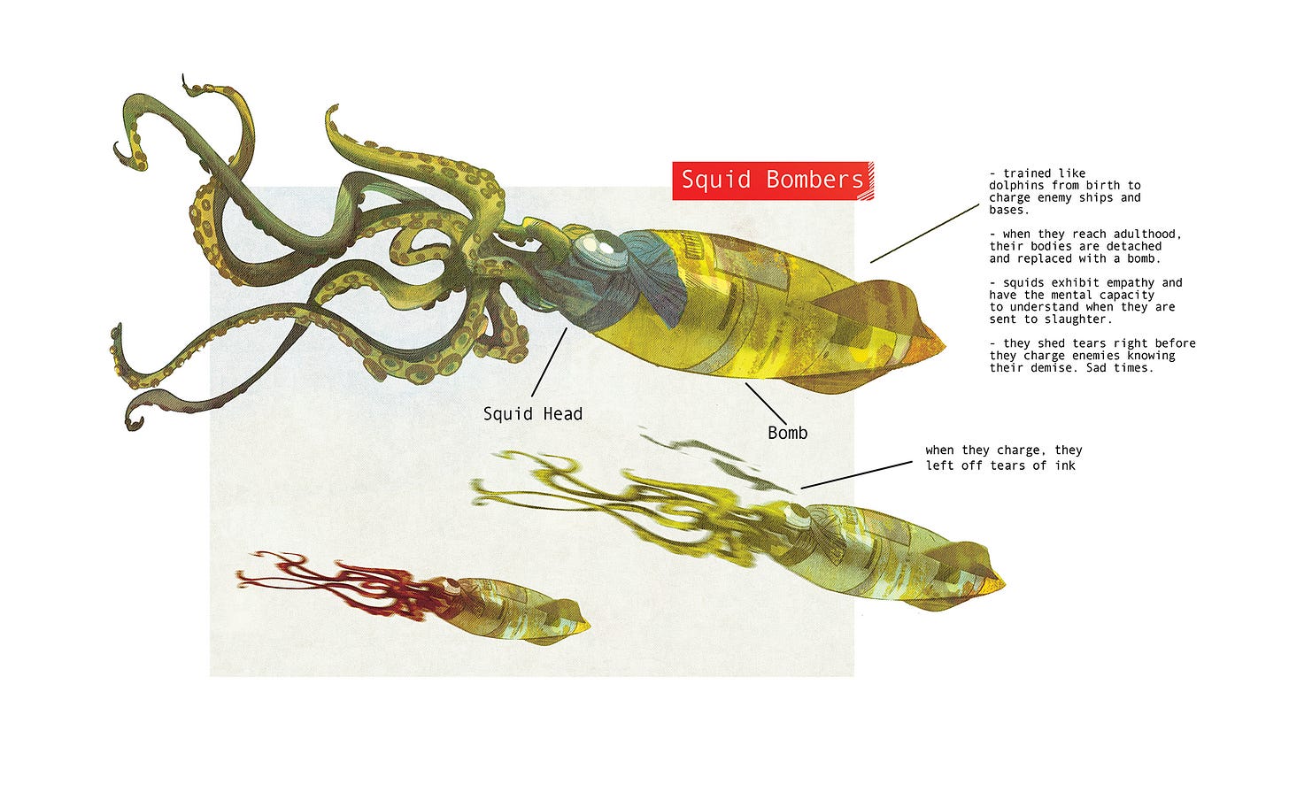
GIANT SQUID BOMBERS
Let’s get right into it starting with one of my favourite designs of this story, the infamous squid bombers. The original concept for this was to create these underwater fighter jets that would bomb a mining facility. While I was in the process of drawing, the bombs or missiles were starting to look more and more like the head of a squid and boom! Eureka, SQUID BOMBERS! The sad part of this is the story within this design. Typical story, humans being humans, finding a way to weaponize this underwater creature by replacing it’s body with a missile and programming it to crash to their death into mining facilities. Maybe a story to explore these tragic creatures in the future? Click the image for more details in the process.
THE SETTING
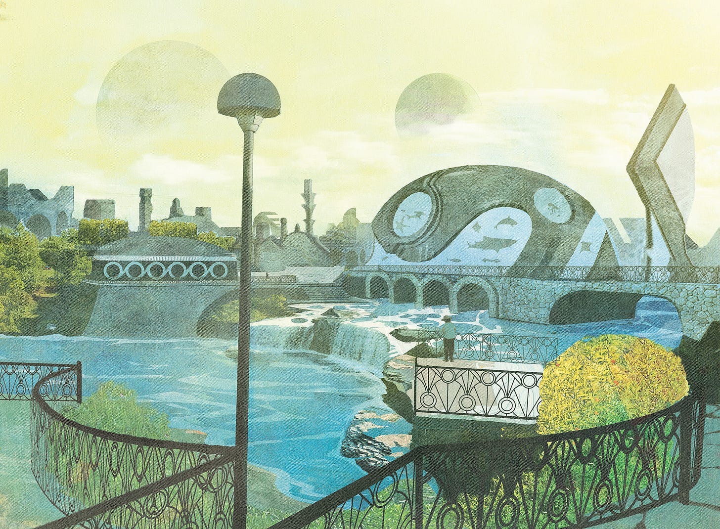
I gotta admit, perspective lines are my enemy. I so wish I had it in me to crush it on perspective but sometimes there are so many angles and different vanishing points to deal with it becomes a logistical nightmare. I’m already terrible at planning and my process is usually just to go in swinging swords and guns blazing. Sorry, Jeru, but I don’t “plan my attacks”, I’m a little impatient and I try not to lose that energy in the planning stages. Which is why I end up using my digital dry ice and atmosphere the f$#ck out of everything. Shortcut tip, fog machines hides a lot of stuff and it always looks cool. Most of the time.
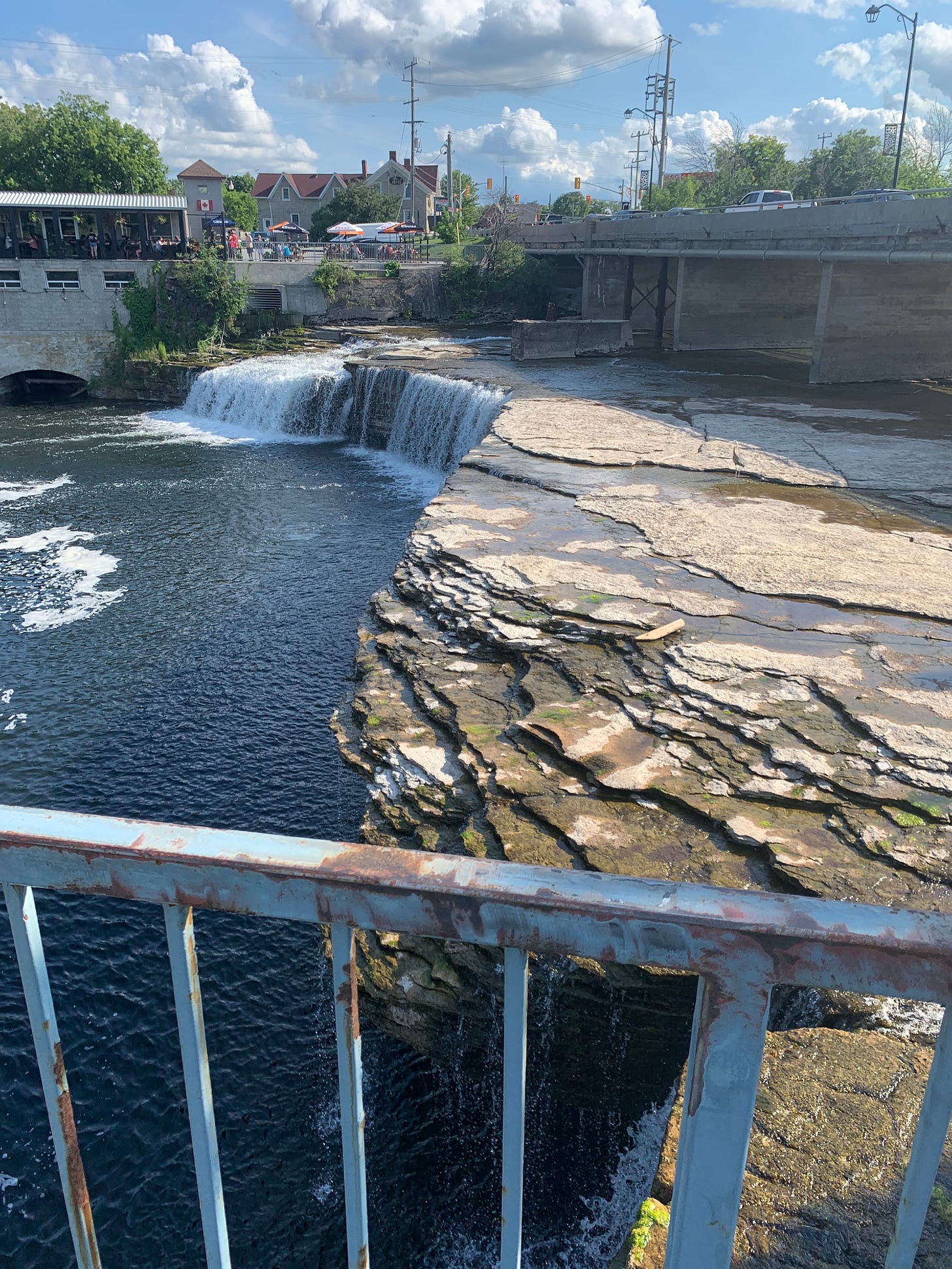
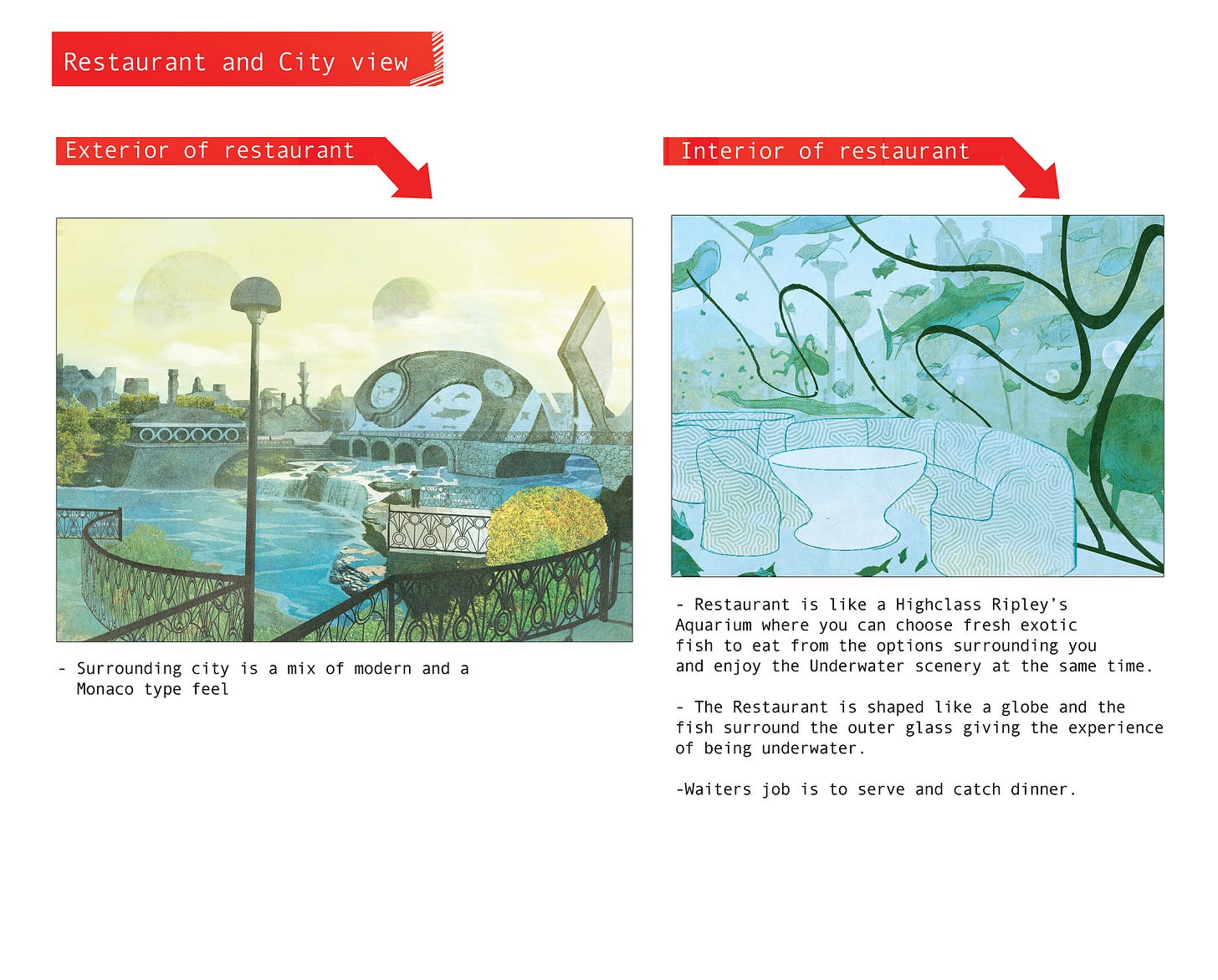
To solve my perspective incompetence, what I’ll do sometimes is paint over an original photo of mine and just add or subtract things, cut things out, move things around. It’s basically FREESTYLE and it’s SO MUCH FUN when the majority of the perspective is all laid out for you and your basically just adding cool weird stuff and using all that creative energy into making a cottage town photo into something out of this world. And yeah, artist trick to creating something off world, add more then one moon. Three Moons works well. Check the magic below.
Original Photo by Yours Truly.
Restaurant Interior
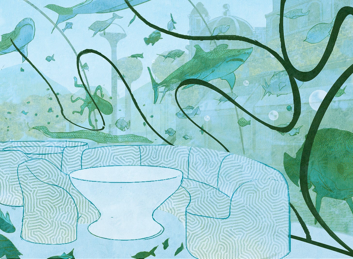
The concept for this restaurant was a seafood restaurant but I tend to want to put things on steroids so why not a a High Class Ripley’s Believe It or Not aquarium where you can enjoy the wondrous view of Ocean life and eat it too. Click below for more details.
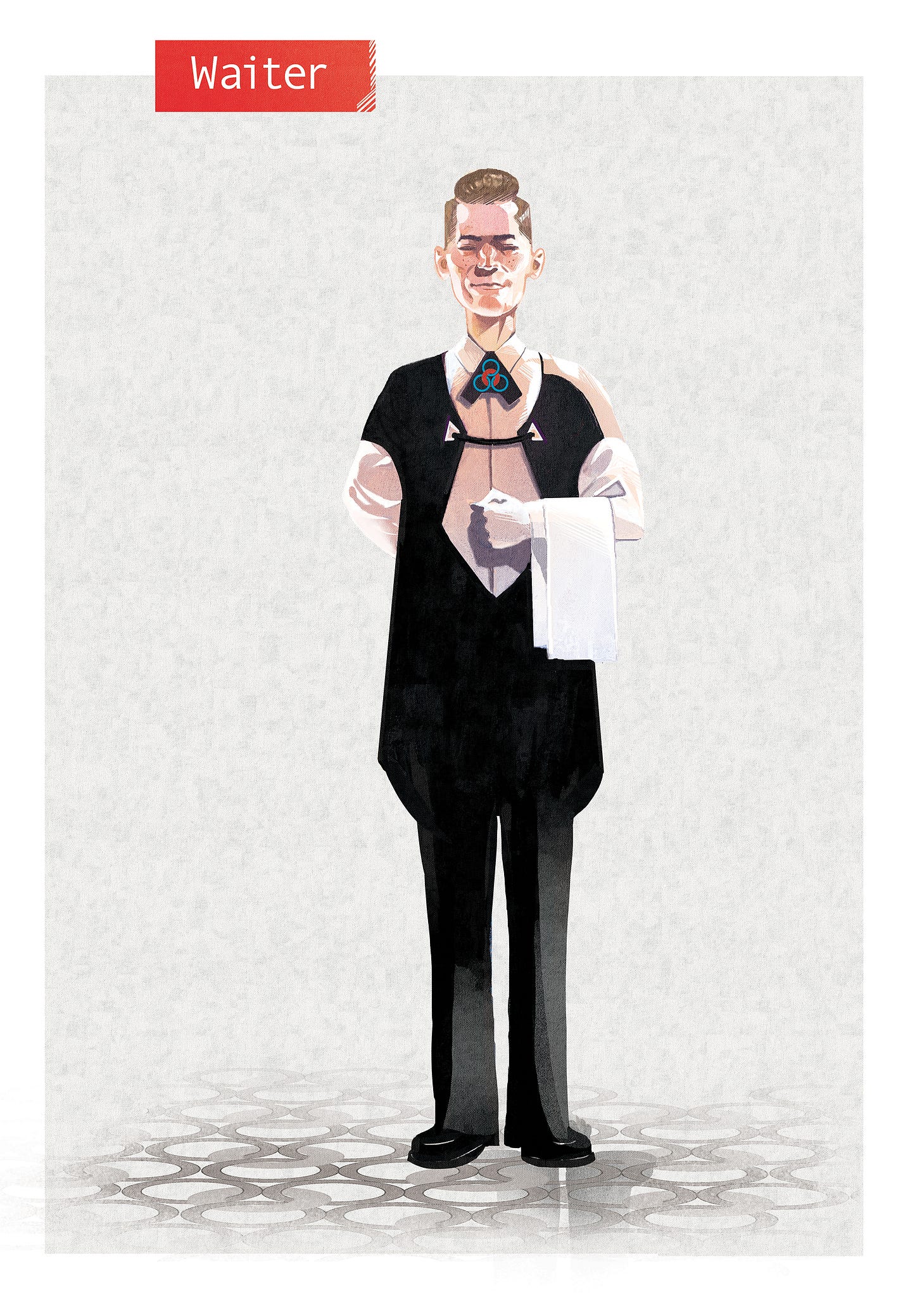
This concept of the restaurant lead to our waiter not just having the job as a server but also the job of diving and hunting the catch of the day. I vote this waiter to have his own story in the future possibly fighting a shark or giant octopus for the lunch special.
TEXTURES!
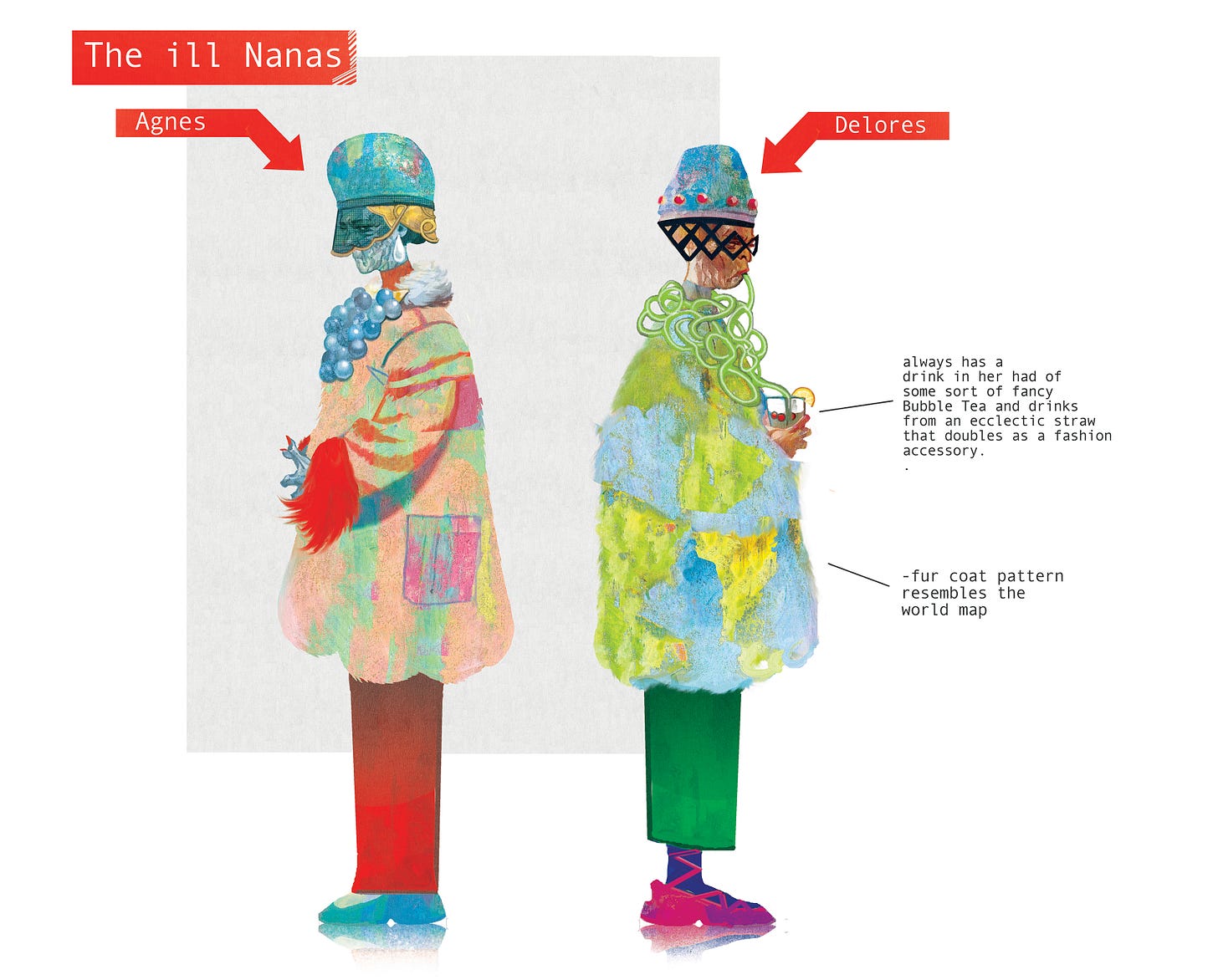
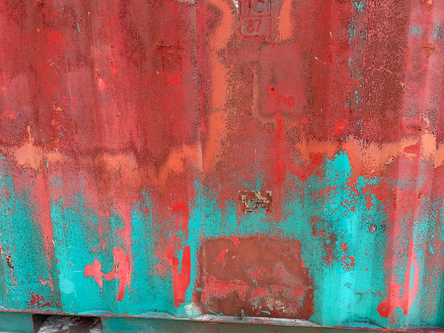
Ah yes, some of my favourite concepts to date. The goal of these concepts was to try to create the most absurd pretentious imagery which came in the form of an eclectic straw that doubled as a scarf and a fur coat. My favourite part of these concepts was Dea’s fur coat that resembles the Globe which came about from a happy accident. I was overlaying a ton of textures to give the fur coat some grit and somehow one of those textures created somewhat of a world map which was perfect imagery for these world domination grandmas. Check more details below and I added the texture I used as well. Feel free to take it and use it and have your own happy accidents.
MERCS!
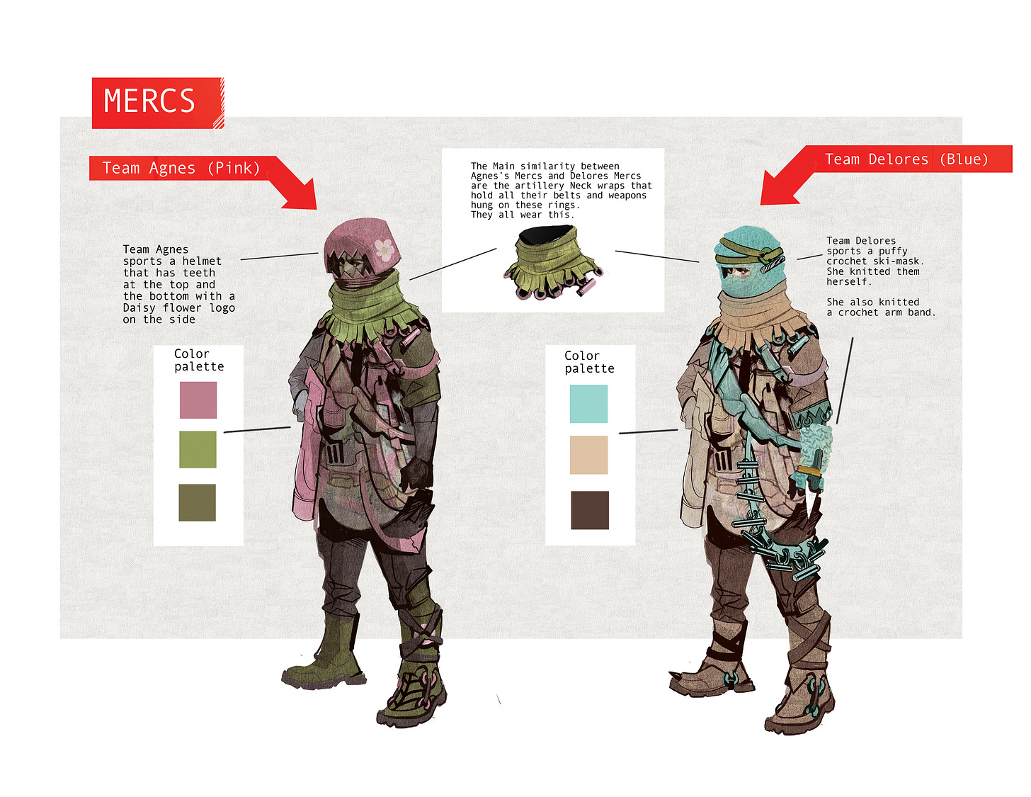
I wanted to make these mercernearies a little more eclectic so the idea behind it was mixing heavy artillery with knitted croquet garments. The story behind it would be that Delores and Agnes actually designed and knitted the merc suits themselves. The idea came from memories of my Lola knitting us croquet hats and scarves. I thought it worked so well with the pretentious nature of these powerful grandmas. Click the image for more details below.
And that’s about it for this process. Again, hats off to Langdon Foss and Michael Garland. It’s amazing to see these designs come to life.
Take care.



I loved the concept of the Evil Grandmas knitting the uniforms. It feels like a level of power that is nearly impossible to obtain- which is exactly the point. I am hoping the next stories will have details on WHY the Evil Grandmas are at war. Also...since Mike Del Mundo DID say they were Grandmas....how do their kids and Grandkids feel about all this?
Knitting the merc unis is a hilarious touch.