[PROCESS] SINGURAIL - PART 1
Hop on the design train as Mike Huddleston takes you on a journey to the latest [MAPS] release.
Hopefully you’ve already checked out SINGURAIL, our latest comic release drawn by Peter Krause and colored by Ellie Wright. Today, we’re sharing another excellent look at the process behind the visuals, with our own Mike Huddleston sharing his process for coming up with the visual design for the Singurail and other related elements.
[COMIC] SINGURAIL
Today we’re proud to present a brand new comic for you, SINGURAIL, drawn by Peter Krause and colored by Ellie Wright. SINGURAIL is the tenth story from our upcoming [MAPS] Graphic Novel Sourcebook. You can read or revisit the previous [MAPS] stories – along with everything we’ve released to date –
SINGURAIL and 11 other comics will be included in the upcoming [MAPS] Graphic Novel Sourcebook, plus tons of world-building and behind-the-scenes material. If you want to read the comic right now (and everything else we’ve released to date), be sure to subscribe:
3 Worlds / 3 Moons is a reader-supported initiative. If you like what we’re doing and want to get access to great comics, events, exclusive merch and discounts from EMPORIA, and want more from us, please:
To get even more, you can also:
Because today’s post is image-heavy, we strongly advise using the Substack app to read it, as email providers sometimes limit images. You can also click through and read via the web.
And now, let’s turn it over to our conductor today, Mike Huddleston…
Mike Huddleston: I’ve spent very little time thinking about trains or train design, so when I read the description for the Singurail I knew I needed to do some research: “The train cars themselves should feel futuristic around the edges, but it really needs to have that retro, Mad Men era, old boys club vibe.” “…very retro-future, and same with the stations themselves.”
To communicate an idea like this through design I needed to understand what makes a modern train look modern, what makes a vintage train look vintage, and see if there was a way to combine those things.
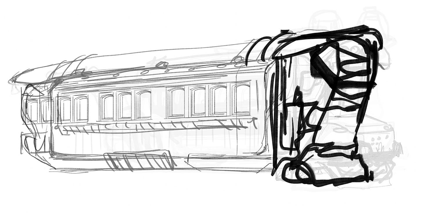
A major element to the look of modern, high speed, trains is the long, sloping, airplane-like nose, and I felt like that element would do a lot to make my design feel futuristic.
Looking at old trains, as well as old cable cars, they were very boxy and much of the feeling came from the type of decorative flourishes you might see on a house: wood paneling, square framed windows – lots of vertical elements.
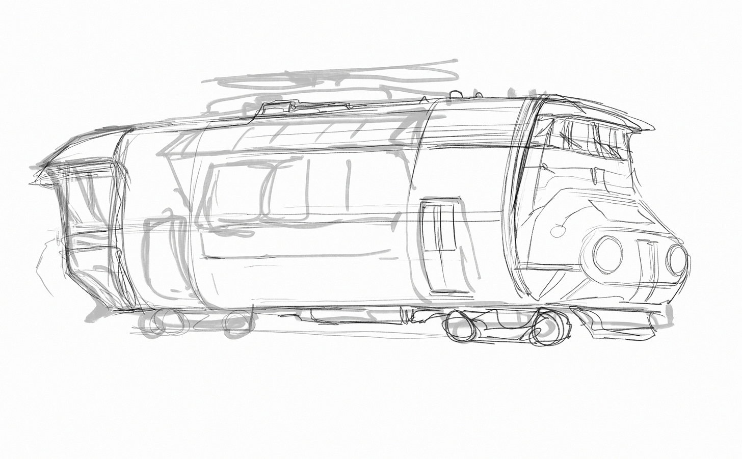
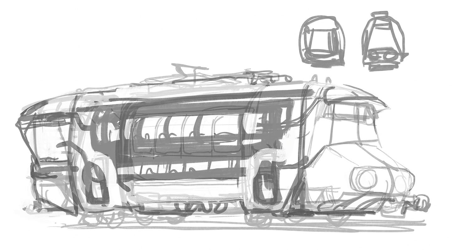
When I tried to combine these elements, I made something that felt more like a futuristic school bus.
I made a bunch of school buses.
Every time I tried to combine the long nose of a modern train with the vertically oriented midsection of a vintage train it felt like a bus, which is good to know if I’m ever asked to design a futuristic bus, but it wasn’t what I needed here.
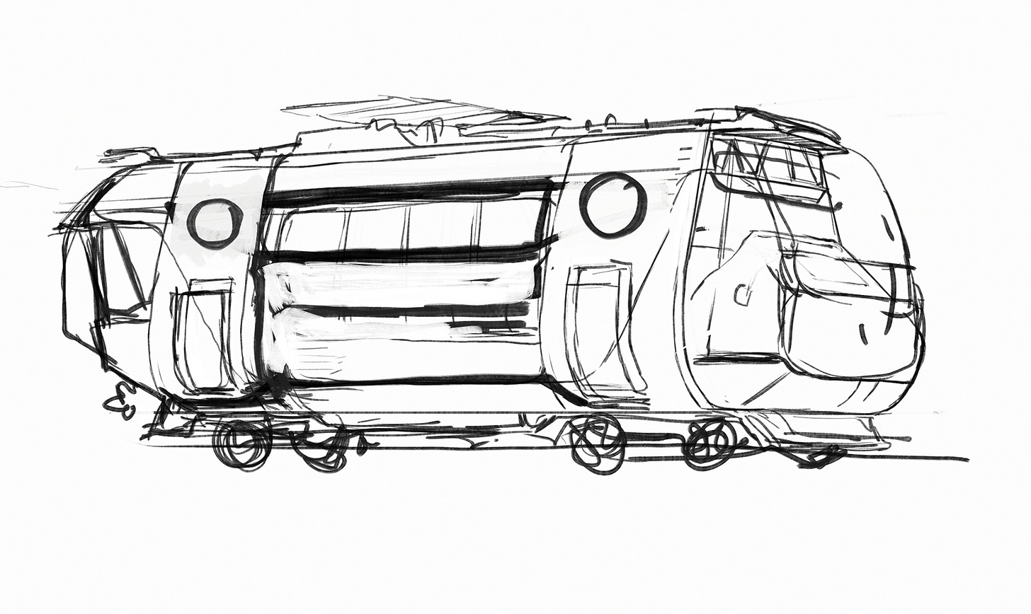
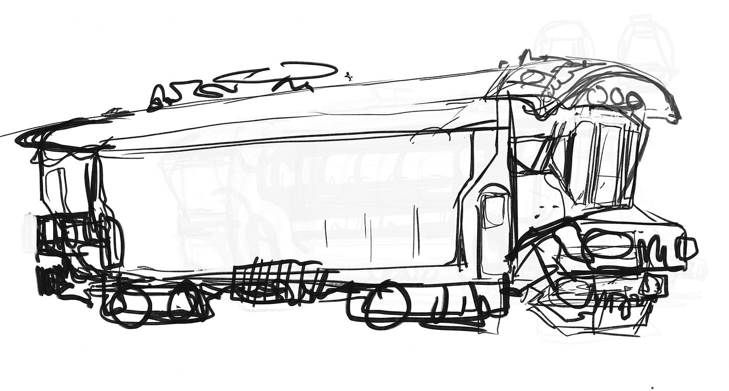
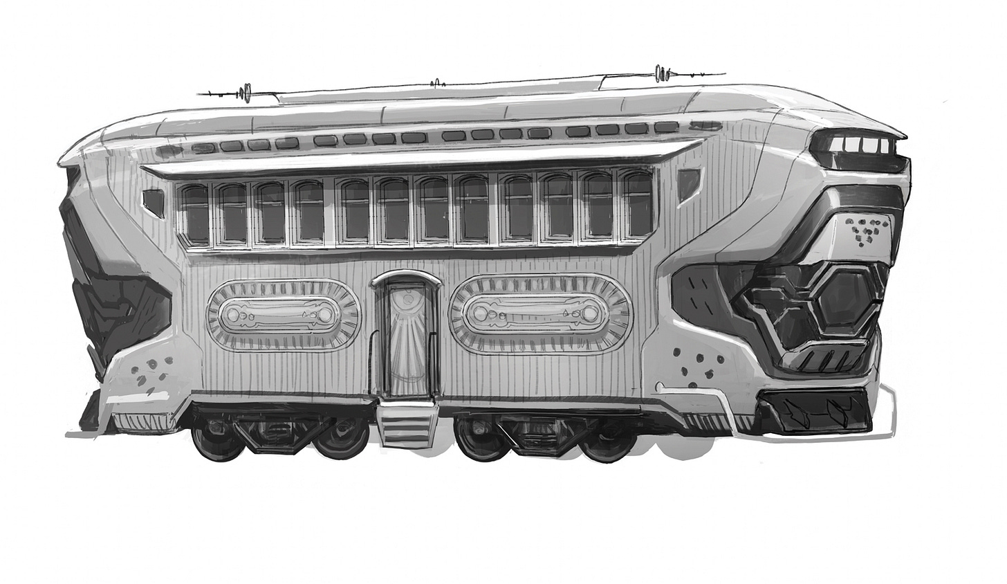
If I’m stuck on a design, one of my go-to techniques is to flip an element upside down or backward, and this time it really helped. Flipping the sloped nose upside down looked interesting and I felt like I was finally on to something. My sketch didn’t look like a bus anymore, it felt train-like, and it was just an odd enough shape that it felt like it could work as an AI train on an alien world.
Once I had a basic shape that worked, the rest was just a matter of details. The central part of the train was fleshed out with those vertical, square-ish details I had noted on vintage trains and I bookended it on both sides with a high tech sci-fi looking section. The brief said “The train cars themselves should feel futuristic around the edges” and that is literally what I did.
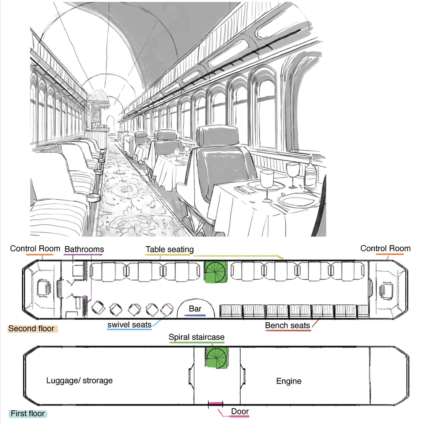
The train interior needed to communicate an older romantic idea of train travel so I lifted elements directly from vintage dining and lounge cars, only updating some shapes and materials to make it feel more futuristic.
THE TRAIN STATION
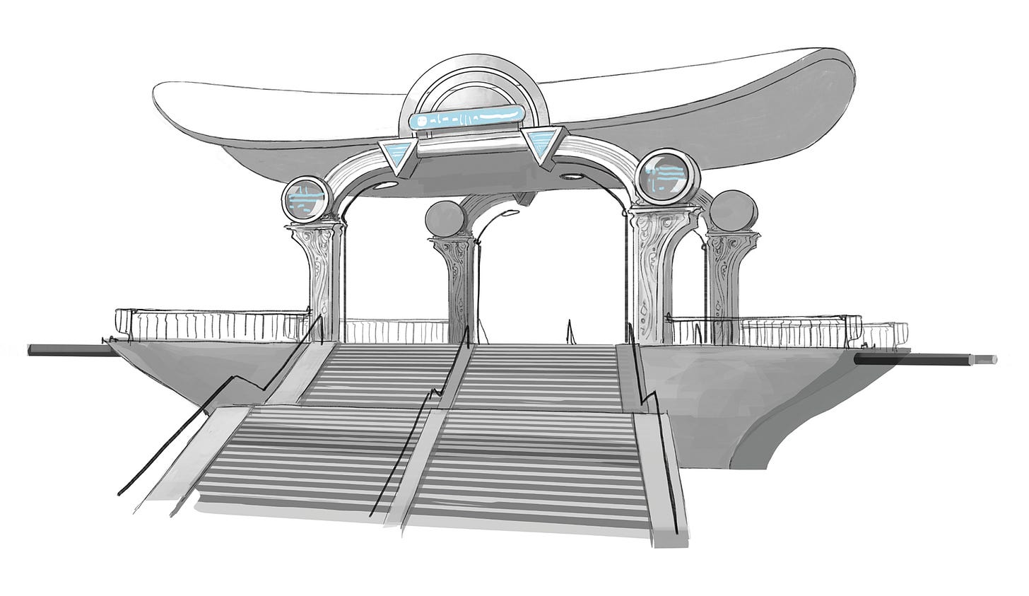
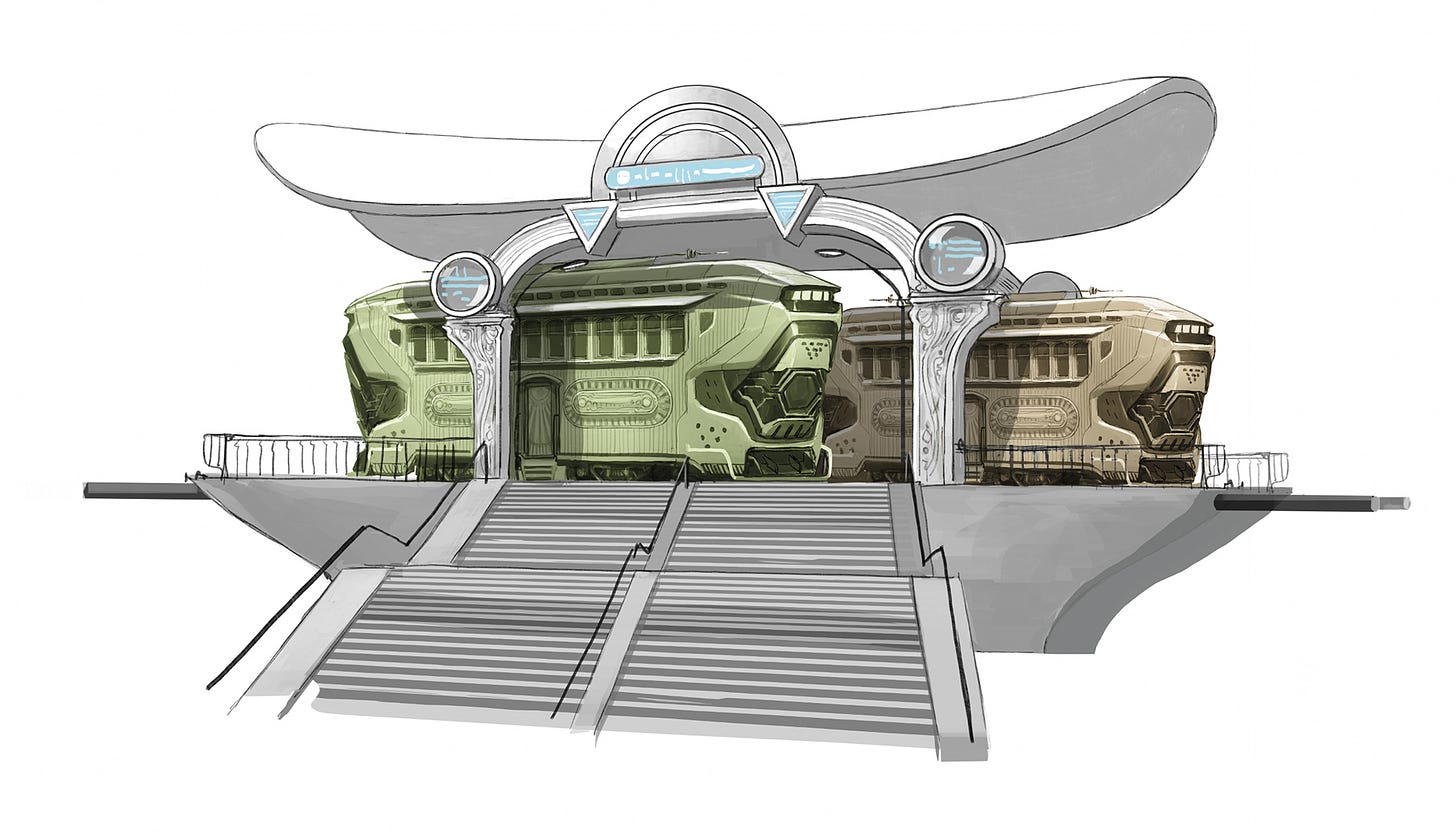
These stations would be manifested by the same AI making the train, so I felt like it should have the same combination of elements: vintage, futuristic, and alien. I was hoping that the decorative carving into the support columns would bring some aged / vintage feeling to a design that otherwise was very modern in its use of geometric shapes.
Another influence on the design of the train station is the concept work of Mike del Mundo. Mike and I often work in parallel contributing designs to a story and I’m always impressed with his use of shapes in his work. Both sophisticated and whimsical, Mike’s sensibility produces designs that are immediately enjoyable to look at. I thought this train station was a perfect opportunity to step back from my habit of overworking ideas and try to design something more direct – and it’s one of my favorite designs so far.
THE AI PEDESTAL
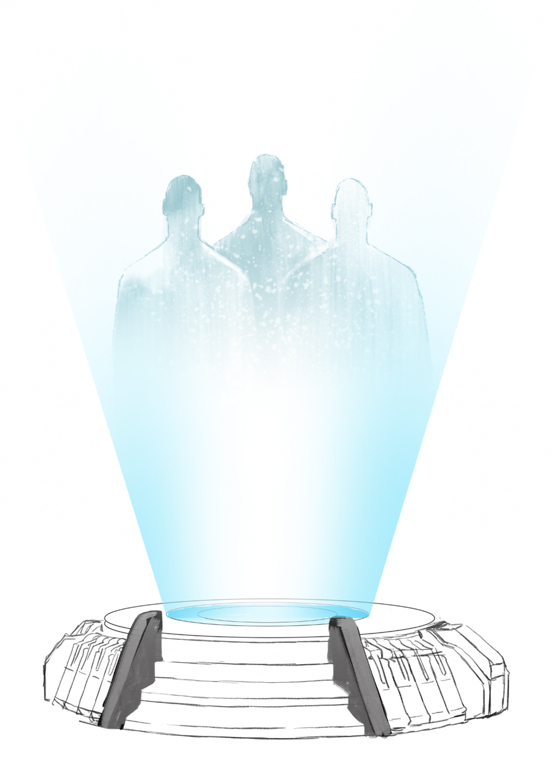
I actually designed this misunderstanding which AI we were talking about.
In the story, people pitch their ideas for trains and train lines to an AI who manifests the accepted proposals. I mistakenly thought of the AI from our PERO-PUZ story and I imagined someone pitching ideas to a giant, holographic, mechanical head, which I thought would be confronting and very alien looking. Thankfully the artist on SINGURAIL, Peter Krause, fixed the concept and presented the AI as three shadowy figures, which is still a very weird and uncomfortable audience to pitch your ideas to.
Thanks, Peter!
PART 2, featuring artist Peter Krause, is headed your way soon!


![[COMIC] SINGURAIL](https://substackcdn.com/image/fetch/$s_!D_ir!,w_280,h_280,c_fill,f_auto,q_auto:good,fl_progressive:steep,g_auto/https%3A%2F%2Fsubstack-post-media.s3.amazonaws.com%2Fpublic%2Fimages%2Fa55321ff-448a-4dd8-acad-f2dac20f56b7_1200x857.jpeg)

