[PROCESS] SANKTA URBO
Mike Huddleston and Mike del Mundo divulge the secrets behind designing The Holy City of Akva.
What better way to get through the week than a double dose of Mikes, as Mike Huddleston and Mike del Mundo once again team up to share their insights and approach to designing the latest 3W/3M story, SANKTA URBO, from the upcoming [MAPS] Graphic Novel Sourcebook. Take a minute and refresh yourself or give it a read for the first time if you haven’t done so yet.
Special thanks to artist André Lima Araújo and colorist Chris O’Halloran who really brought the goods to Akva. It looks great on screens, and it’ll look equally amazing in print. If you’d like to receive a copy of [MAPS], you should become a paid subscriber.
We’re currently offering 20 PERCENT OFF all new Annual Subscriptions through May 29th – our biggest discount ever.
Or you can upgrade to THE CIRCLE, our premium membership tier, to receive [MAPS] in a deluxe hardcover format, get access to early EMPORIA drops through the PREMIERA GUTO, and much more.
Let’s start with Mike Huddleston’s deep dive on the Filth Priests, and the animals and instruments that inspired their final design…
Mike Huddleston: When a script arrives for Mike del Mundo and I to start concepting, sometimes the characters come with very detailed descriptions and sometimes you only get a name: "Filth Priest."
FILTH PRIESTS
The script for SANKTA URBO reminded us that there was an order of "Gold Priests" whose architecture and clothing were extremely ornate, and another order of Filth Priests who were in opposition to them – and that’s all we knew to start.
My first questions when starting on a new character are, "who is this character, and do they have a story that gets them to this moment?" If the writers have specific ideas in mind, that’s great! Then it’s a pretty straightforward conversation about the character’s look, but if we have a case like this, where all we have is the character’s function in the story, then the door is open to create as much as I can, as long as it doesn’t contradict any ideas in the script.
These are my favorite concepts to work on, because if you choose to, you get to do some concept "writing" along with the picture making.
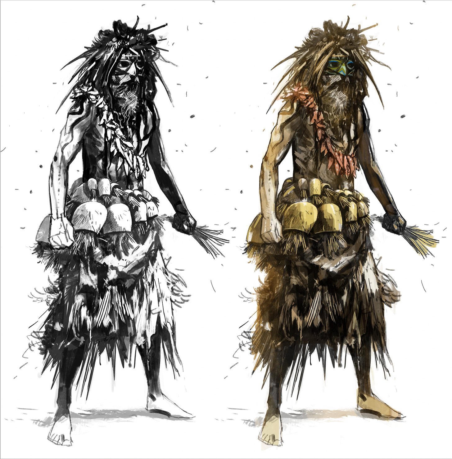
So who are these guys? Ripped up robes, smeared with mud and trash felt like it was making a statement. I started to imagine a mud-covered mystical character where you weren’t sure where mud-covered clothes ended and mud-covered skin began. Also, I thought the hair should be just a mass of mud, grass, and trash – again nearly melding together with his mask, a remnant of that ancient costume.
So at this point we have a dirty priest, but he doesn’t have any sort of signature visual element that makes him unique.
"How do people in this world react to these filthy, stinky, priests?" My first thought was, "people will want some warning that these guys are nearby," and it made me think of the huge bells that are worn as part of traditional Krampus costumes. I love the look and sound of those bells, and story-wise it felt perfect.
So the story in my mind is that at some point in the past this filthy order was forced to wear belts with giant bells so villagers would know when this band of unwashed zealots were approaching their town.
Almost immediately, though, I was reminded of stories I’ve heard of elephants stuffing mud into the bells they wear so their human handlers can’t hear where they are.
Mud-filled bells seemed to match the Filth Priest concept too perfectly to ignore, and my thought was THIS could be the signature element for this concept. I gave our Priest a garland of horrible smelling dried flowers or peppers that he wears around his neck.
The last touch, and again, completely a narrative just for myself, was that the Priest carries a handful of ripped paper as his "holy texts". I was torn on whether these pieces of paper were in fact shredded pages from ancient books, again highlighting the order’s fallen state, OR if they were just strips of random meaningless paper and it was commentary about the idea of having a holy text at all. Who knows?
Now all this writing and narrative I’m making up is basically fan fiction at this point. I have no idea if any of this will be picked up by the team to become canon, but I feel like it’s part of my job to throw out as many creative options as I can. If they’re used, awesome! If not, that’s totally fine. Some concepts may find a home somewhere else, or maybe help kickstart ideas for other stories entirely.
Regardless, I feel like these fan fiction stories helped me get this concept to a place where it feels unique and like it has an internal logic to it, which is what I’m always shooting for.
And now let’s hear from Mike del Mundo about his approach to the Gold Priests, those glorious squid fighters, and the Holy City itself.
Mike del Mundo: As Huddleston mentioned, the description in the script called for two different orders of priests that would be in opposition to one another. Huddleston had the chores of doing the filthy side and I had the chores of doing the more elegant and ornate look.
GOLD PRIESTS
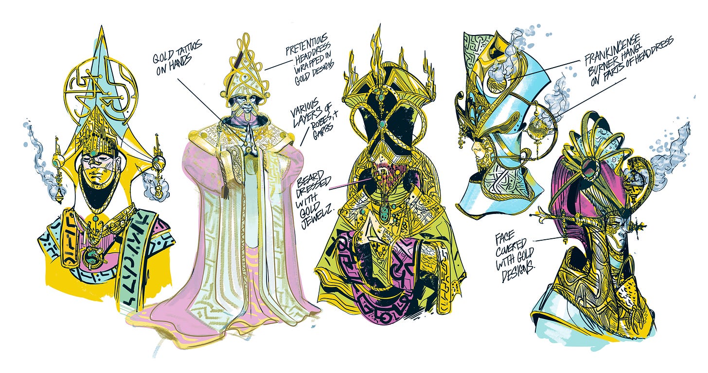
One thing I had to keep in mind was that these are two orders on total opposite ends of one another, so I went as extreme and as pretentious as possible with the look of these Gold Priests. It really brought me back to being a kid and seeing priests in ornate wear, but what I really remember was the smell of burning incense and those frankincense containers that they hold and swing which would disperse a ton of mist. It was cool, and the perfect focal point to dress up these Gold Priests. I went as pretentious as possible and had them hanging on their head wear like it was a part of the fashion instead of them just holding it. On top of the pretentious headdress, I dropped them in Gold to juxtapose the Filth Priests and had jewels hanging on their beards.
UNDERWATER DOG FIGHTERS
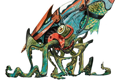
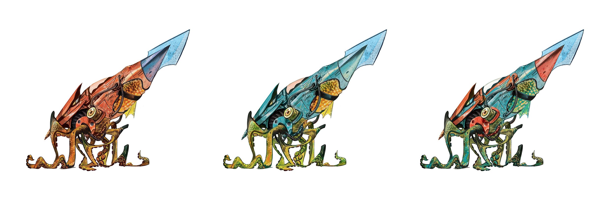
The squid dog fighters were actually one of the first concepts I drew for our Three Worlds and Three Moons when all of our ideas were still in their baby stages, so it’s cool to see it finally in action. Big ups to André Lima Araújo for bringing these squids to life. He really brought in the kinetics.
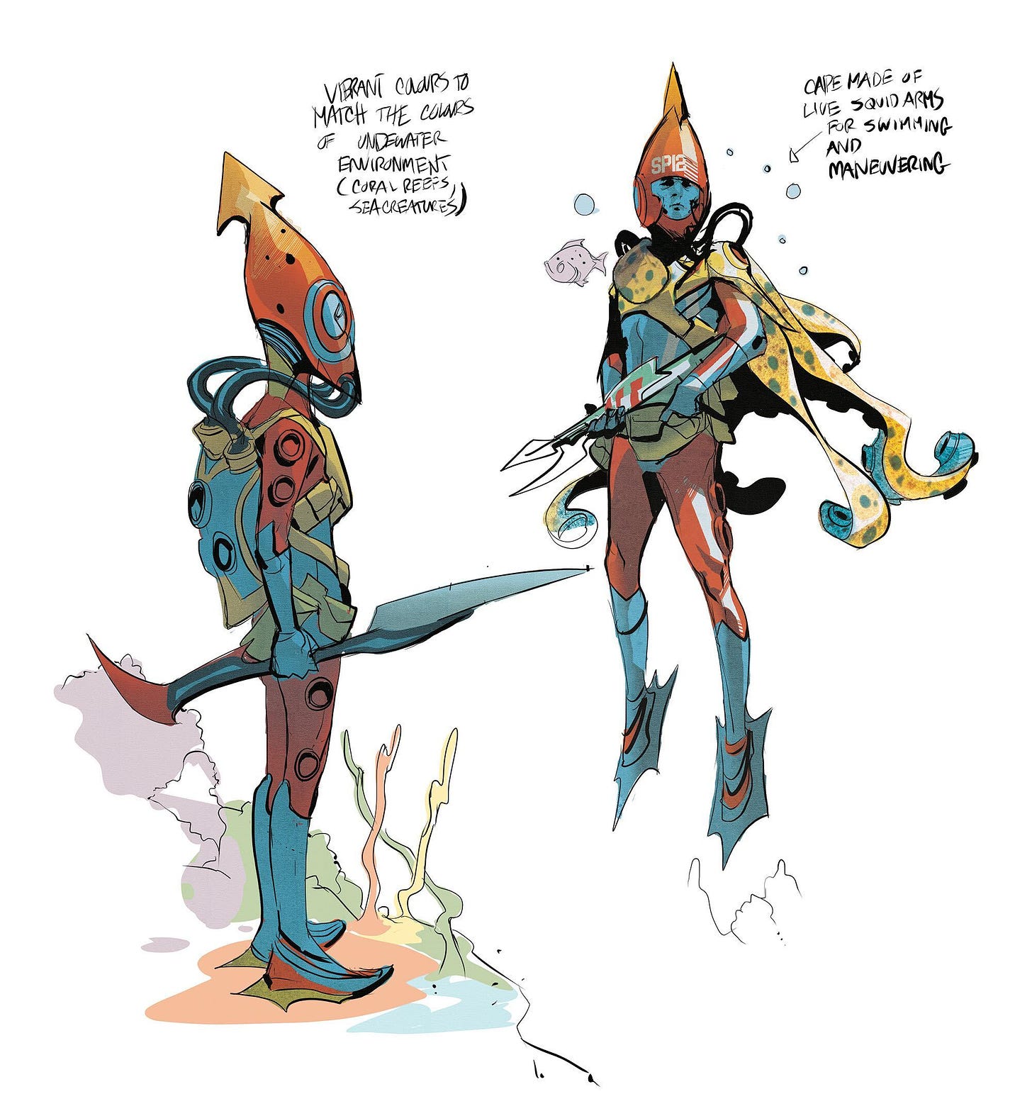
The designs were pretty straightforward. I didn’t stray from the original description of these dogfighters being some form of underwater squid ship. The main problem I had was how I would be able to fit this tech part of the ship to the squid. Would the squid be interconnected with wires tubes and such, or would it be like an armored hat that would be fitted over the head/body like a sock? I went with the tech.
Mike Huddleston had a previous design that had the squid without the armor in a pool and read more like a pet, like they would be able to train them like dolphins – so no real bionic mad scientist version. The long blade at the nose of the ship was inspired by bayonets and I imagine these dog ships to be able to maneuver in a way that they could swing swords and fight in fencing movements. It would be cool to see these squids be able to learn different styles of sword fighting.
DOG SOLDIERS
For the design of the pilots, I looked to the shape of the squid planes and took a lot of my inspiration from it. Definitely the helmets matched the look of the it. The color choices for the suits were inspired by the colors of the ocean. I would believe that fighting in the waters would be a different type of camouflage. Suit colors would be more vibrant and colorful to easily hide from enemies within the colorful landscape of sea life. I also thought it would be cool if these soldiers had some sort of live squid cape that they attach themselves too. Maybe wired to their brains that allowed them to control the cape and maneuver easily in the waters. Maybe they’re mad scientists after all…
THE HOLY CITY
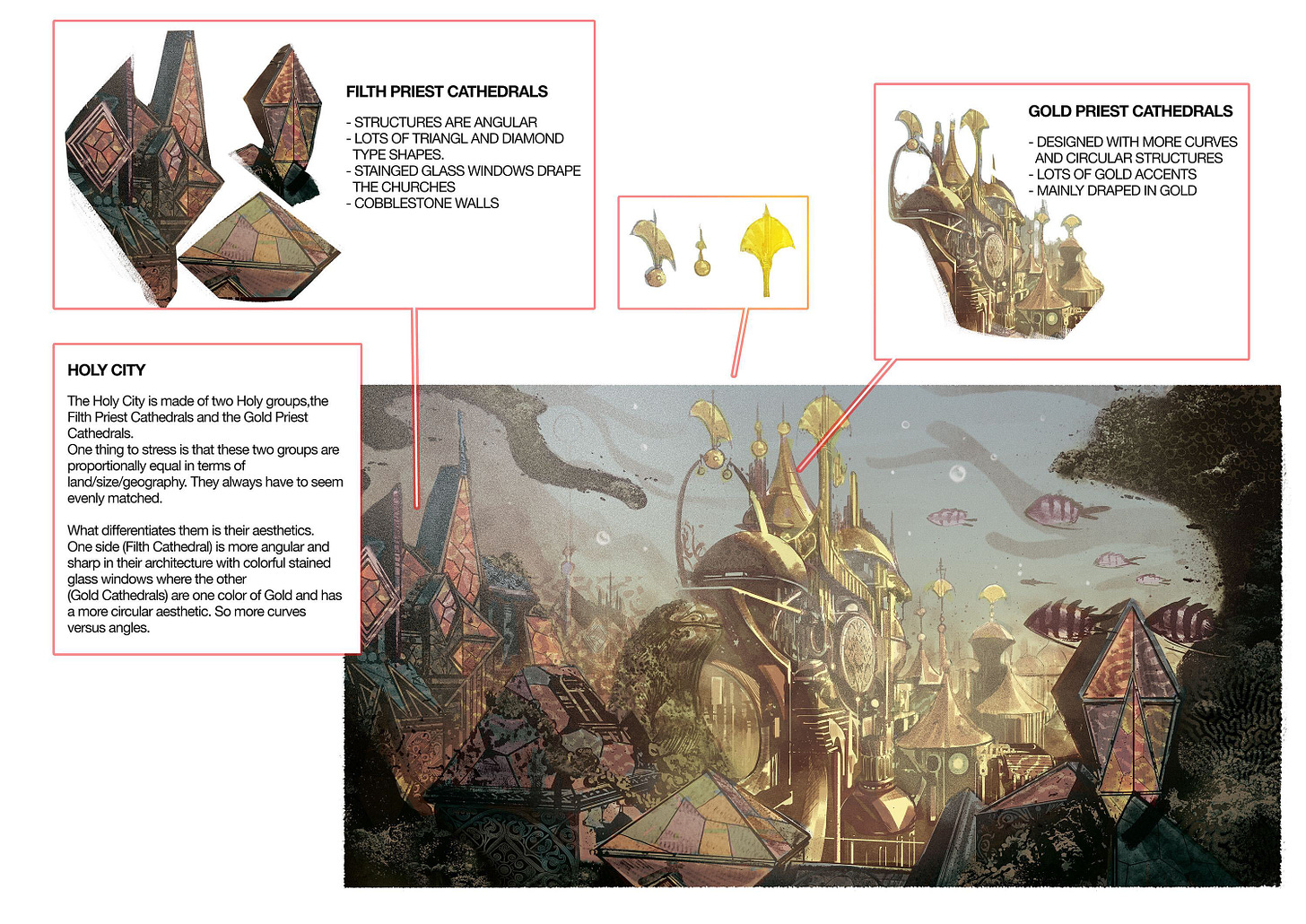
The holy city was made of two orders: the Gold Priest side and the Filth Priest side. The main note here was that both sides would have to be equal to one another. So the architecture and buildings of one Order could look extremely different visually but could not look either smaller or larger than the other Order. It was a note to keep in mind because my original concept had the Gold Priests located on a higher plane.
The main challenge for me was how to differentiate the architecture of both sides. What came to mind was animated movies and how they would approach the look of good and evil. The villains of the stories were drawn more angular and pointy versus the good guys, who had softer features and curves. So I imagined the architecture of the Filth Priest side looking more angular like Maleficent, Cruela, or Jafar vs the Gold Priest side that was softer like Belle or Simba. Basically, Circles vs. Triangles.
In terms of the looks, the Filth Priests would look more old school – so think ’80s Catholic Church vibe with lots of stained-glass – vs. a more modern, pretentious gold look for the Gold Priests.
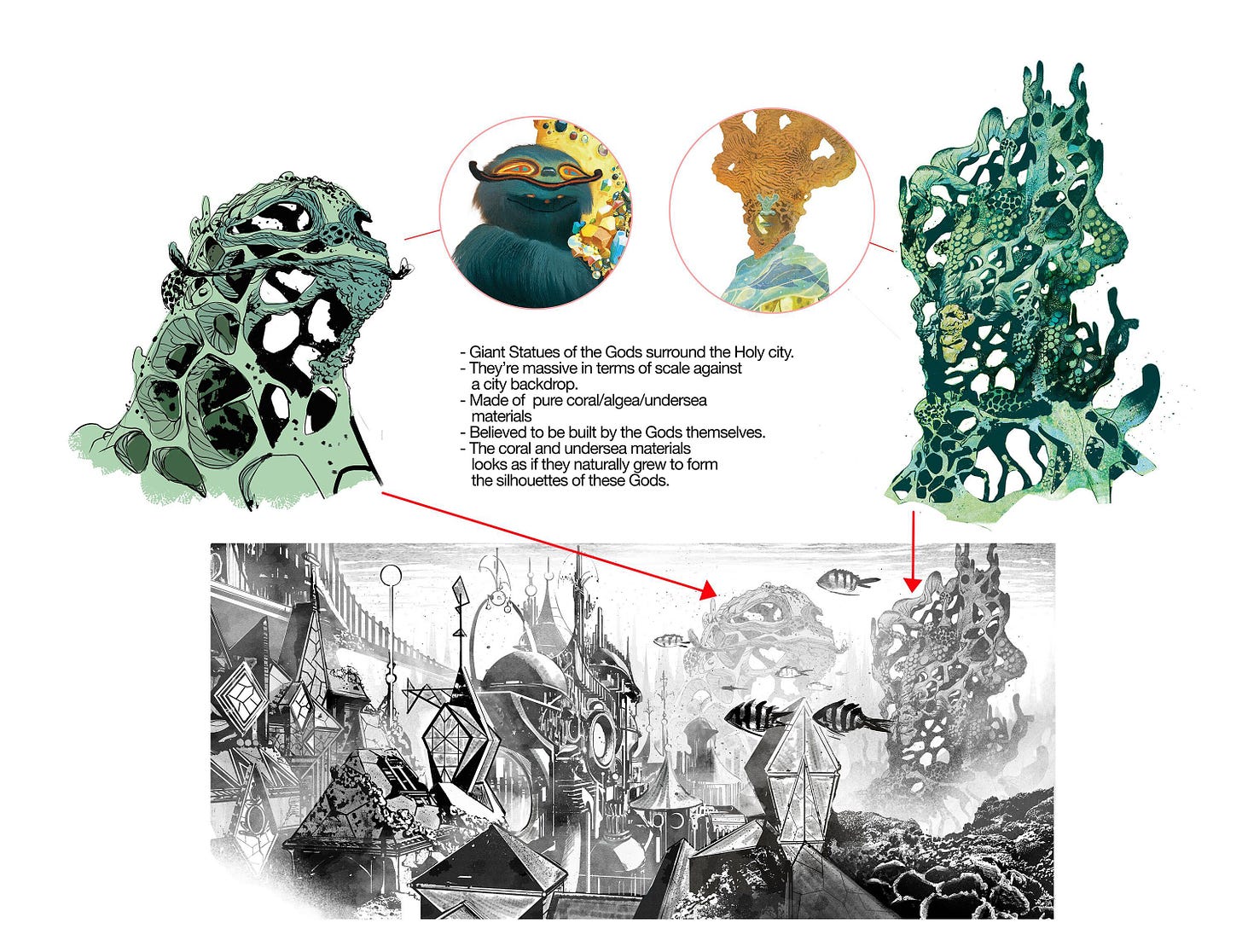
I also had to design these huge structures of the Gods which would be spread around the Holy city. They had to look gigantic like mountains, and not man-made, so I figured it would be cool if the giant coral and sea life grew to create these things, thus the coral-type look of them.




![[COMIC] SANKTA URBO](https://substackcdn.com/image/fetch/w_140,h_140,c_fill,f_auto,q_auto:good,fl_progressive:steep,g_auto/https%3A%2F%2Fsubstack-post-media.s3.amazonaws.com%2Fpublic%2Fimages%2F2e99c84d-24d3-4ad8-9b24-bca41b385aaf_420x300.jpeg)


I would read a whole series about these two groups!
Love it! Thanks guys!