As promised, here’s Part 2 of our [PROCESS] RUINS posts, this time with Mike Huddleston walking us through his pages.
Before Mike begins— a reminder we’ve got another big announcement coming your way tomorrow, so keep an out.
Okay, here we go…
3 Worlds / 3 Moons is a reader supported initiative. Paid subscribers get:
Exclusive Comics!
Annual and Founding level subscribers get a beautiful, 180-plus page PRINT Graphic Novel / Sourcebook FREE (Shipping not included).
Community Events like Live Draws, Creator Interviews, and more.
Special discounts and early access to new merchandise.
Your support makes it possible for us to make more comics, hire more comics, and tell bigger stories. Sign up now!
Mike Huddleston: One of the things I enjoy about working on projects with Jonathan is that often a story starts with him asking "What do you want to draw?", and this time I knew exactly what my answer would be.
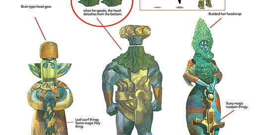
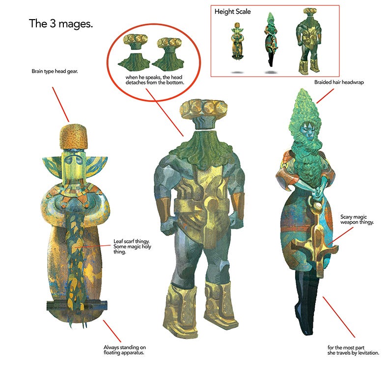
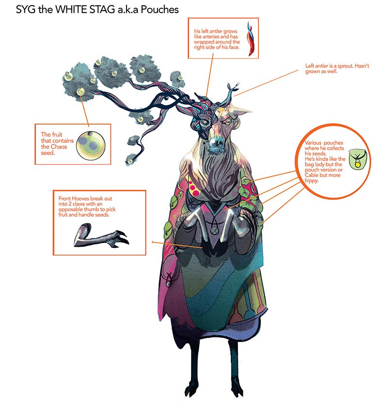
Mike del Mundo had turned in these amazing designs for three magic users and a character called the White Stag. I thought these designs were beautiful and I jumped at the chance to draw them.
When the script came in, it was planned as a joint story between del Mundo and myself with a handoff somewhere in the middle, which was both exciting and intimidating. Knowing your work is going to run directly behind Mike's makes you step up your game!
So I'm going to run through some of the steps of production on this story and talk through my decisions along the way.
LAYOUTS
As with any story I start with layouts. These are the first things I imagine as I read a script. If I was doing this work for a publisher I would run these by my editor to make sure everything made sense and that the storytelling was clear.
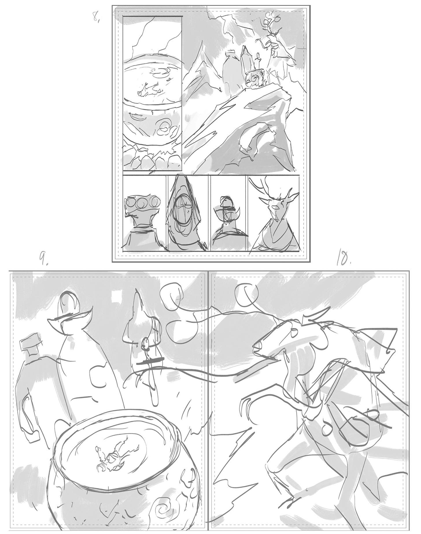
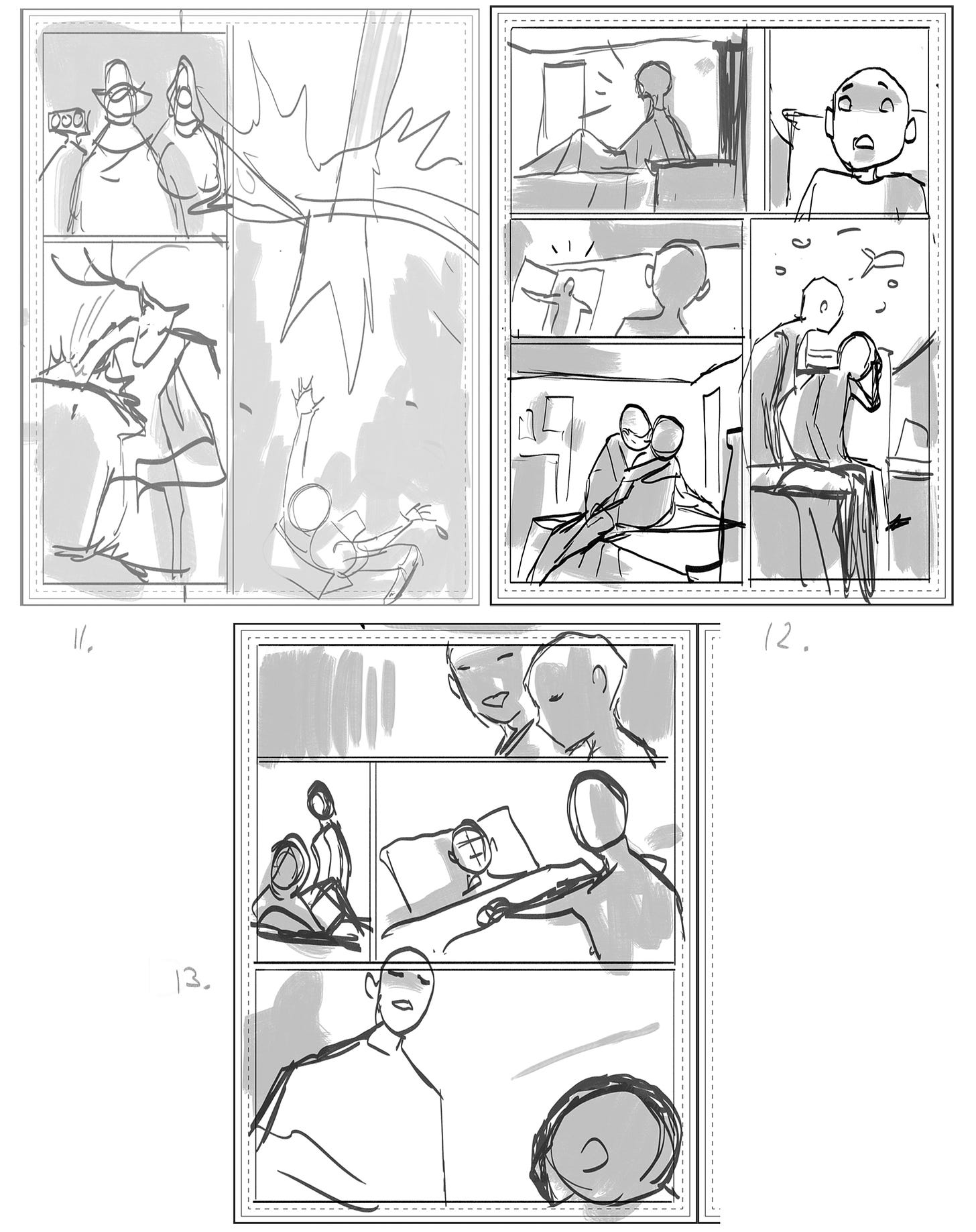
This is also the stage where you find out if you need to depart from the script. In this case the script called for the wizards to be revealed in panel 1 of a three panel page, and later the White Stag's hoof plunging into water, to be a full splash page. I thought that emphasis was a little misplaced. Mike del Mundo's designs were for me the visual high point of the story, and they needed all the screen time we could give them. So panel 1 of 3 became a double page spread and the hoof into water splash page became panel 3 on a three panel page.
PENCILS
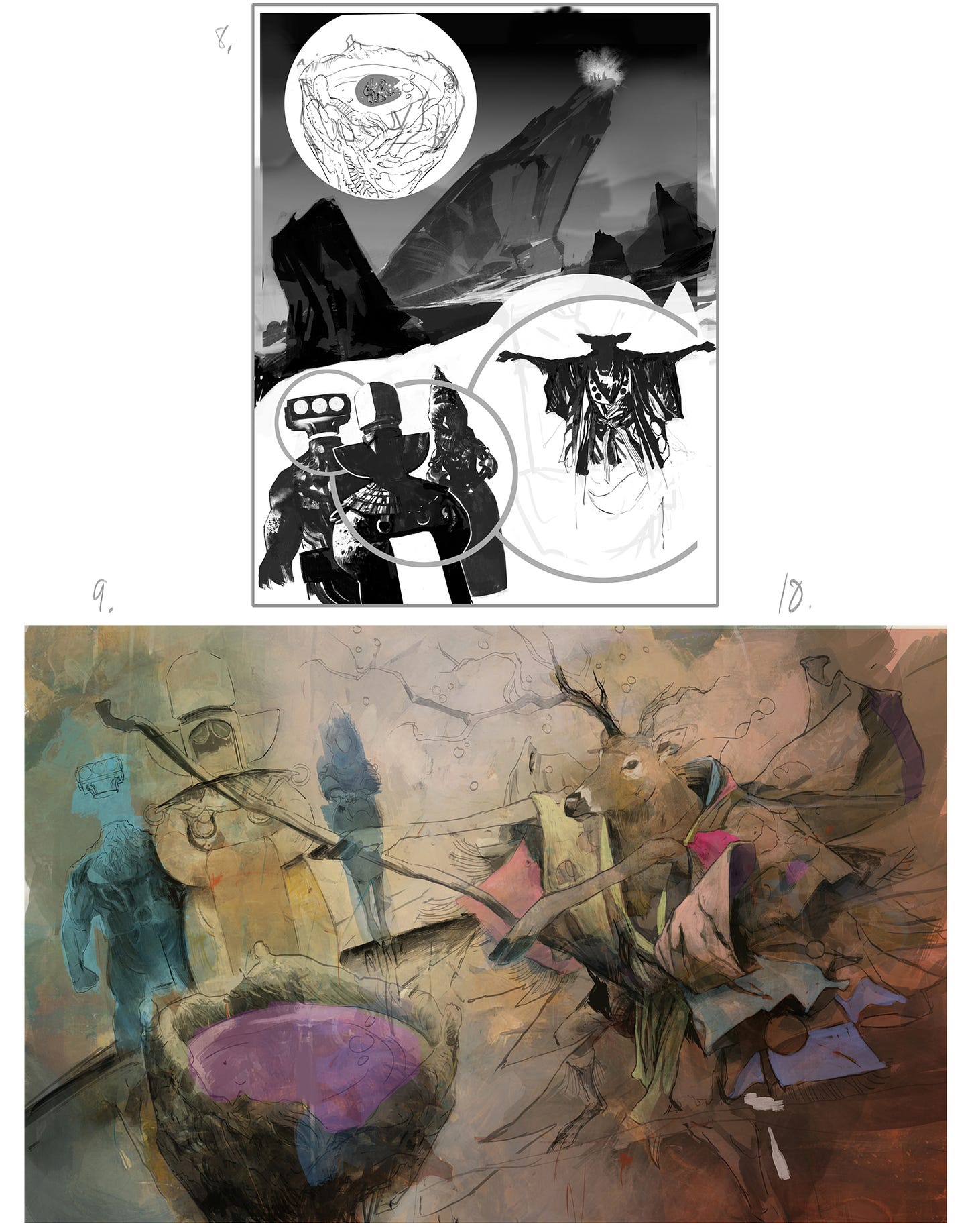
Here you can see how the different art approaches come together at different speeds. Page 8, I have completely thrown out my initial layout. The four headshots felt too static as a reveal for these exotic characters so I'm trying to find a more creative layout that flows as one large design. I'm just getting a shape together for the background landscape and I'm trying to find a way to fit in the cauldron called for in panel 1.
Pages 9/10 and 11, the drawings are finished and ready for me to start painting.
Pages 12 and 13 are traditional comic book pencils, so I'm mostly trying to land the gestures and expressions of the characters. I'm revisiting a location I've already drawn before so I don't have to design any new scenery this time around.
INKS/PRELIMINARY PAINTING
Page 8 is coming together. The placement of the word balloons has been figured out so now it's basically an illustration job.
Pages 9/10, just starting the first applications of color. No idea where this is going yet.
Page 11, this is a tricky page as it will transition between our wizards and Phin in his room asleep. The wizard face in panel 1 came together quickly, but I'm still figuring out the rest.
Pages 12 and 13 are inked and ready to be colored. The one discovery I had on page 13 is how much fun it is to design something using the fonts Sasha Head created for us. I can see myself designing a lot of t-shirts, billboards, book covers, etc. inside this universe.
COLOR
Page 8, the script describes this opening location as a "dark, Sauronesque mountaintop" so I'm doing my best to make this scene moody and ominous. Also, around this time I see what Mike del Mundo is planning for his last page so I know I'll be using a strong magenta for the color inside the Stag's cauldron. I want to work in a bright yellowish green to tie in with the aquarium/room color at the end of the story, so I'm trying to figure out if I can balance those colors... and I still can't find a design/storytelling solution I like for that cauldron in panel 1.
Pages 9/10, just somewhere in the middle of working on this. Lights and darks are figured out, but a long way to go. Cursing myself for all the drapery.
Page 11, I'm still not sure how to handle the stag in panel 2. Panel 1 needs detail but is mostly finished. I need a plan on how to give panel 3 some energy.
Pages 12 and 13, for some reason I lost or trashed the very early stages of coloring these pages but they came together very quickly. I had already designed and colored this location for our first comic "Myth" so I didn't have to spend any time working out a palette. Time was short on this story so I skipped my usual flatting phase and just started laying colors in.
And that brings us up to the final stages where I finish everything off.
I eventually gave up on my first panel being a shot of the cauldron and just zoomed in on our falling hero.
I feel like the magenta and greenish/yellow colors balanced well throughout the story, and I was happy and surprised to see Mike had also used those colors together so it really helped the handoff from his pages to mine.
On the double splash I painted our astronaut hero floating above the surface of the water in the cauldron... which doesn't make literal sense, but hey it's magic and I thought it made a more compelling image.
Eventually I settled on the stag being black and white on page 11, panel 2. I thought I should keep the focus on the water in the cauldron, plus any other color I used in that panel seemed to fight with either panels 1 or 3.
And the last two pages I just polished up. I finally gave Opal a hand on page 12 panel 4, and put the fish in the aquariums. I kind of overworked that final shot of Opal, but then realized the rough color stage was the best version of that shot. So I threw away the polished panel and stuck with the rough color.
And that's it- another visit to Three Worlds Three Moons! Let me know below if you guys have any questions or comments.








You crushed these, Mike! I highly enjoyed your process talk and just seeing you breath life into the Mages is a gift on it's own.
T-Shirts, Book covers...hell, I'll settle for a bookmark. Your art and contribution to this universe is brilliant.