[PROCESS] RUINS - PART 1
Face Off
Big week, right? In case you missed all the announcements, you can find them right here. And of course, you can read our new [comic] RUINS, right now, for free, with art by Mike Del Mundo and Mike Huddleston.
Del Mundo is here today with a detailed look at his [Process] on RUINS. Tomorrow we’ll be back with Huddleston doing the same in Part 2. Then Friday, we might have another big announcement to make.
Take it away, Mike…
3 Worlds / 3 Moons is a reader supported initiative. Paid subscribers get:
Exclusive Comics!
Annual and Founding level subscribers get a beautiful, 180-plus page PRINT Graphic Novel / Sourcebook FREE (Shipping not included).
Community Events like Live Draws, Creator Interviews, and more.
Special discounts and early access to new merchandise.
Your support makes it possible for us to make more comics, hire more comics, and tell bigger stories. Sign up now!
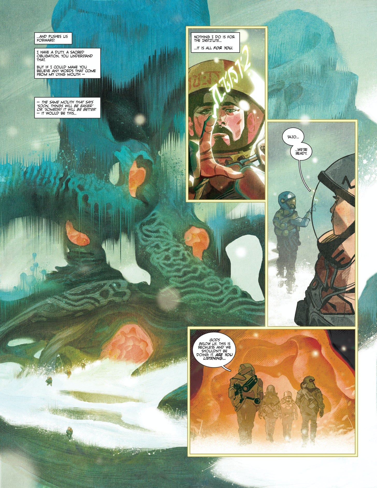
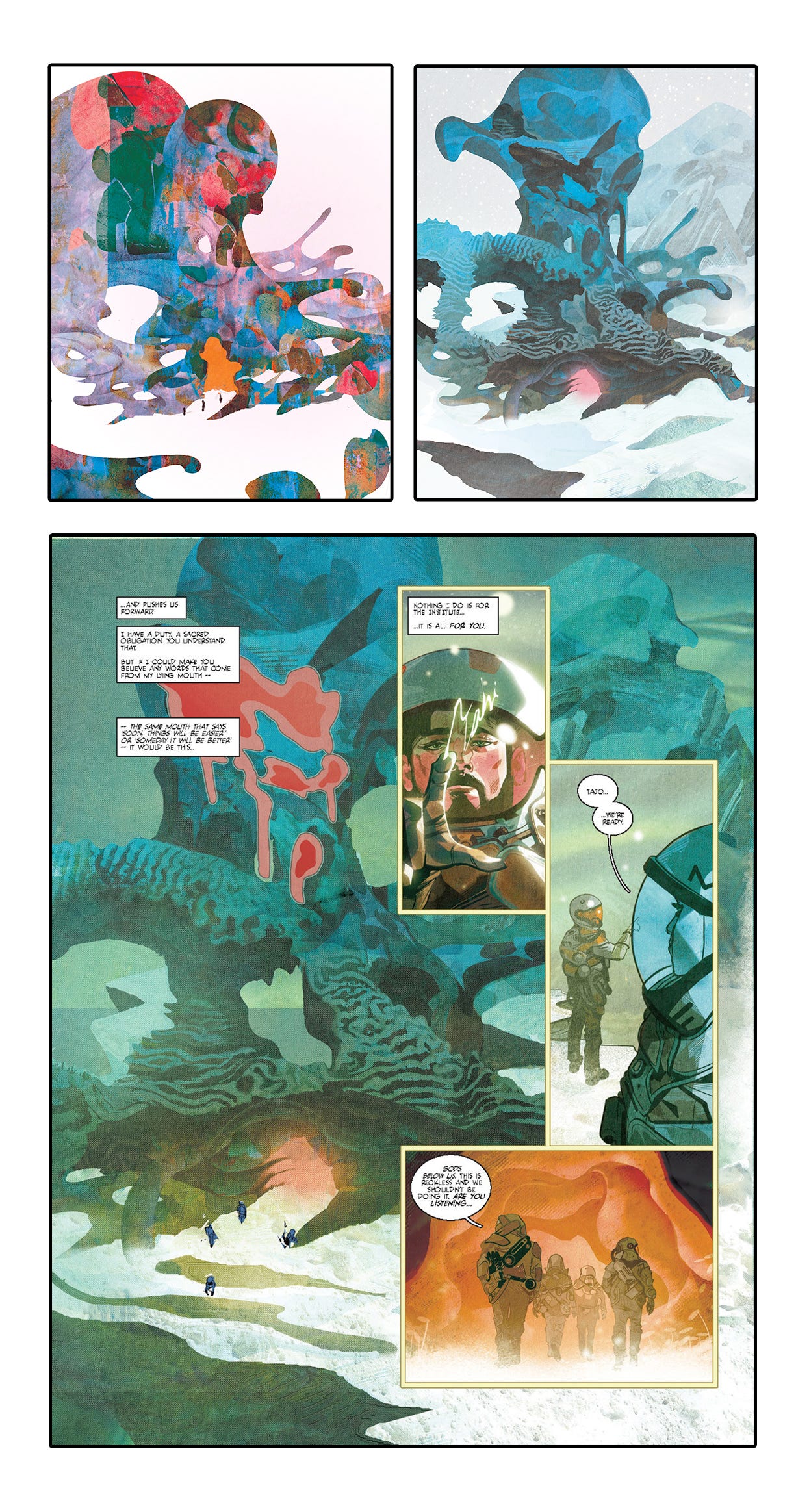
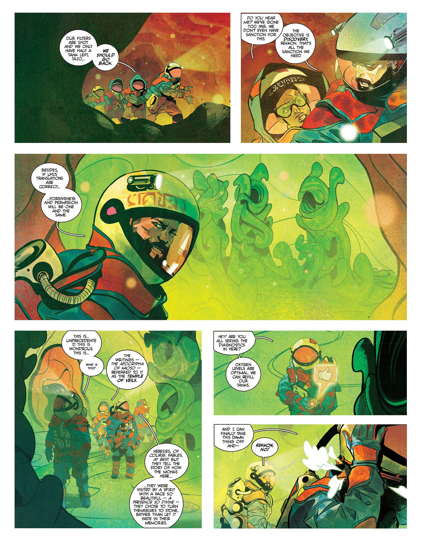
So for this image (panel on pg2) I kind of just treated it like my playground. Just had a lot of fun with it, lots of freestyling. Below, you’ll see the 3 stages it went through before the final output of what you see above. I’m sure it was more like 30 stages but didn’t want to bore you with my knitpicking. The setting for this story are these scientists surveying the ruins on the Kaoso Moon, so it called for an outer world look. Basically, anything that’s beyond the ordinary is what we were looking for, which gave me a lot of freedom to just go at it. No predetermined thought process, just take the pen and go and see where it takes me. I kind of played two roles, one as the artist and one as the art director. The artist would take it, play with it and the art director would look at it and see what worked and what didn’t. Me and me would go at each other for a few rounds until me and me hit something we both liked. That’s kind of how the process went for that first panel splash. It was really fun to just not have to think and just do the weirdest stuff possible. Anything went, I would overlay textures here and and overlay patterns there, and hoped to see magic- sometimes it looked like crap but when I saw something cool, I left it and built on it like a layered cake. You’ll notice some coral like patterns applied to the ruins that I’ve been using a lot for past designs like the mining story.
They just look beautiful for outer world stuff.
That’s the freedom of building a world that’s just weird. Anything goes so for this one, it was just a feeling.
I did mention that this initial concept was freestyle and there was a lot of freedom to go nuts.
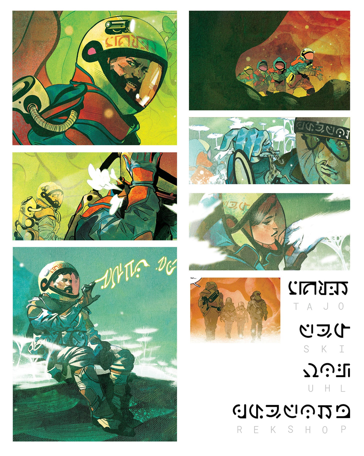
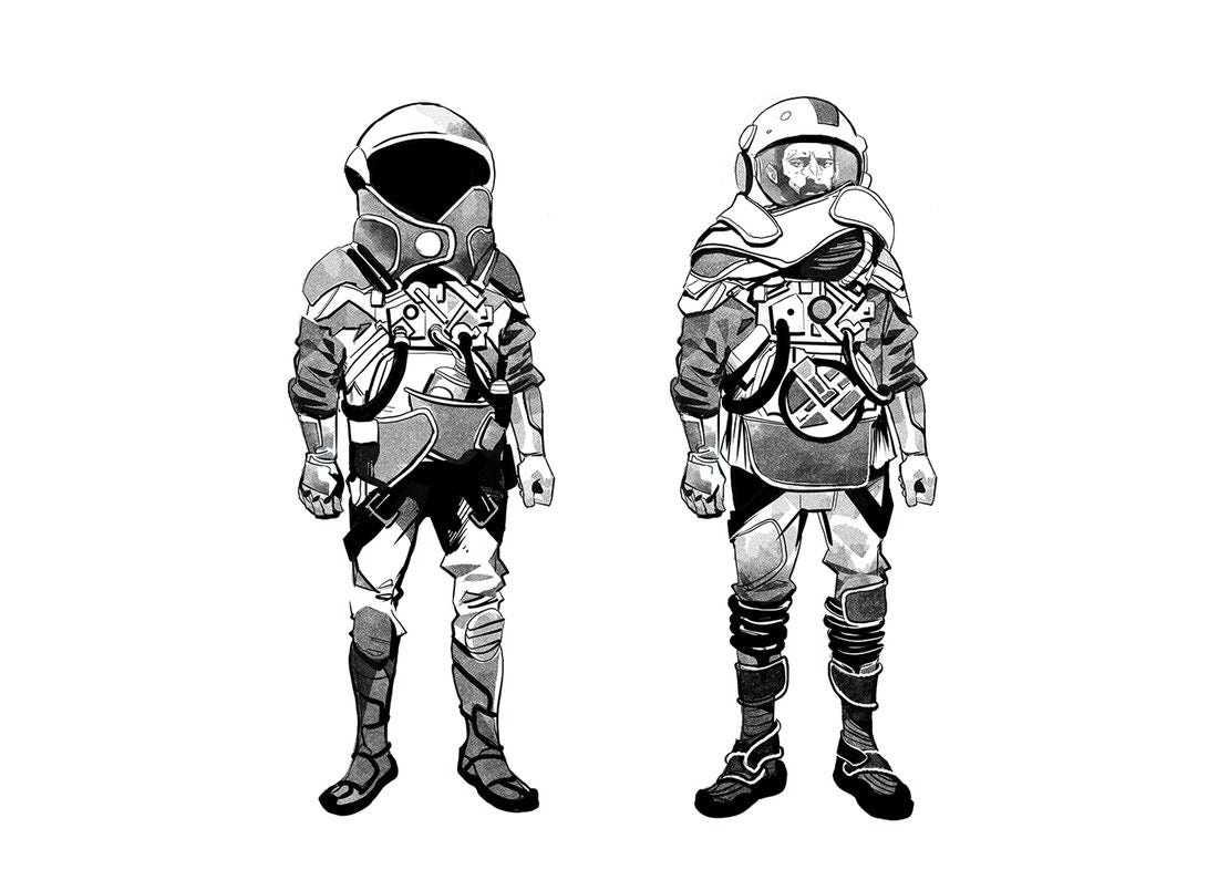
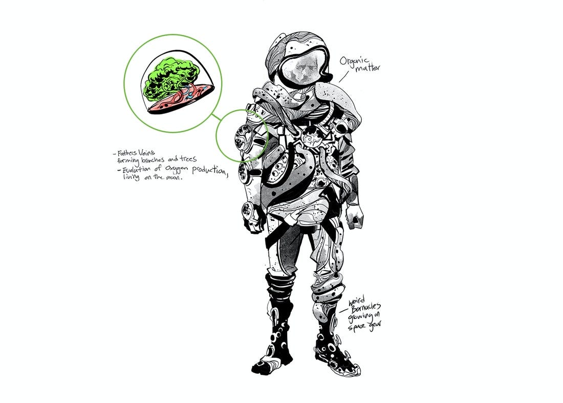
But the space suits were a bit of a different story. There was more thought on function. How big they were gonna be, would we go bulky or more form fit. The space suits for the most part had a very OG look to it but I wanted to give it something simple to call it our own, so the main part I focused on was the face shield and how it connected over on the ear piece. I thought it looked cool as a design aesthetic. I think the coolest part of the space helmet is the Kreska Type that I sticker slapped on them with the Doctors names. Sasha created such a beautiful alphabet for this world we’re building and it just made gave these space suits such a cool look. Another cool aesthetic I had fun with was dressing some of the scientists in these heavy duty type Northface jackets. The oversized hoodies just looked super cool draped over the helmets. It was also a way to signify frigid temperatures within the environment they were in.
Not to spoil anything but the layered velcro patches that overlap on top of each other were designed to match Dr Tajo’s future suit. The suit will eventually transform into something different, something more organic, so we wanted to create the silhouette of the past suit and the future suit to match each other. Dip back to our Dr Tajo post to know more:
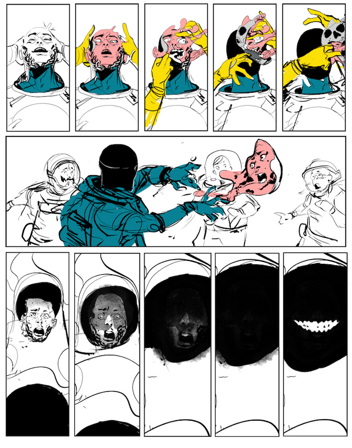
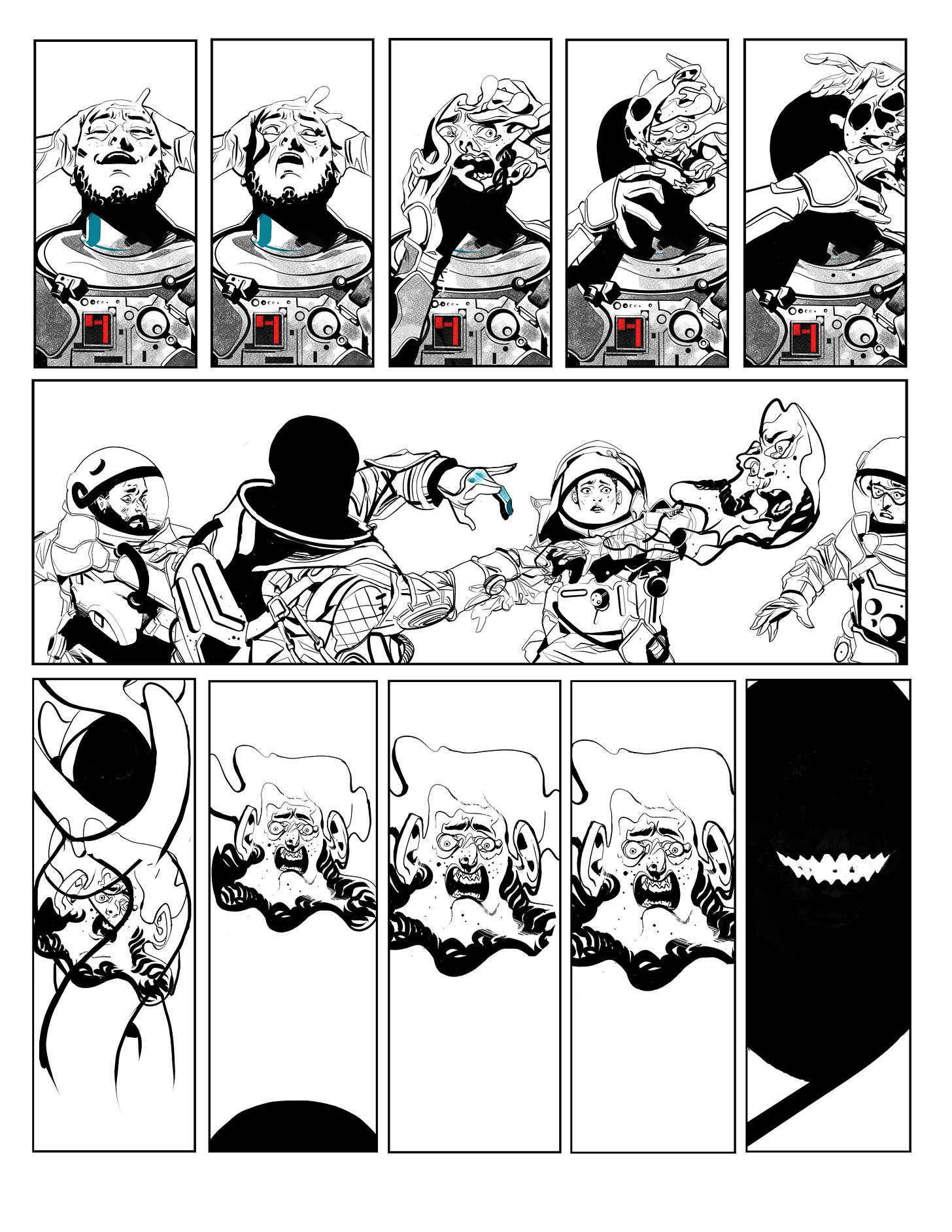
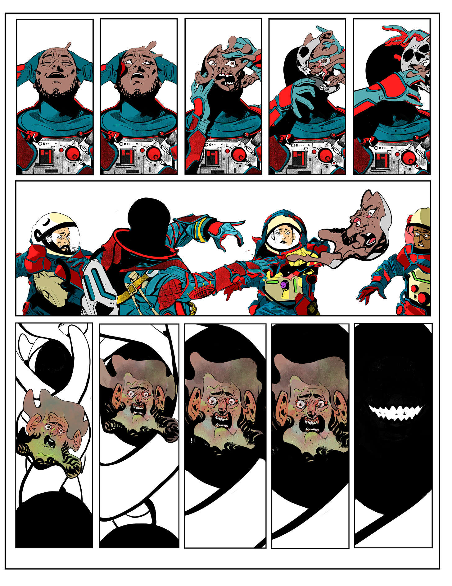
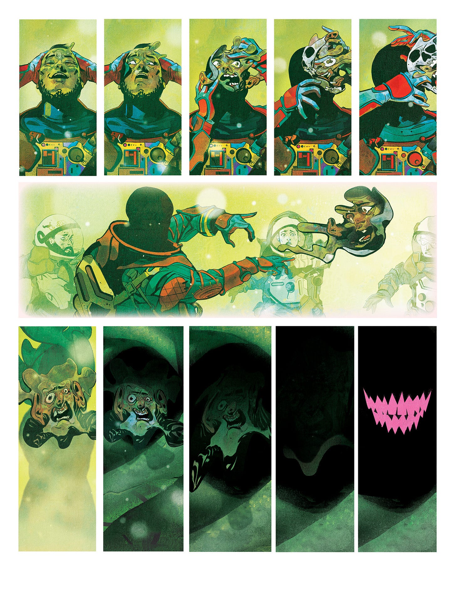
Ok so this face peeling off sequence was my favorite part of the story. I just loved how the beats were written. When reading the script, I felt the visuals had to feel very slow. Like, I wanted to stretch the storytelling far enough so it looked like it was in slow motion and some of the panels particularly the middle horizontal, to be almost frozen in time so you can really immerse your self in this frightening moment. I added enough panels I could squeeze into the page and thankfully we were working on an 8.5 x 11 which gave me a lot of real estate to work with and get as close as i could to an animatic slow burn.
On the process side, here’s a look of how the pages get done from start to finish. Most of the groundwork was done in clipstudio and then photoshop was used to do all the cool atmosphere, glitter, color changes, and mixing. If we were talking music, clipstudio would be the recording part and photoshop would be the mixing and mastering. It starts off as a rough breakdown which looks like the fastest part of it but it’s actually the most tedious part where all the problem solving is. How to arrange these panels in the best possible way to tell the story. Once the roughs are done, it’s smooth sailing going into the line art and then to the colors.
Lastly, if anyone missed the last live draw, I was in the process of inking one of the panels for Ruins. So whoever was there, below is the finish panel and whoever wasn’t, here’s the live draw vid for context.



Love this. The face off panels were my favorite in the comic. So eery and scary and wonderful ahhh
I really love reading what the Mikes have to say about this stuff.
The splash page was so gnarly.