We have a special treat for you today, with Mike Huddleston and Mike del Mundo joining us to look into the design process for PERO-PUZ, the latest story from the upcoming [MAPS] Graphic Novel Sourcebook.
Before Mike and Mike do their thing, we wanted to pause to appreciate the stellar work from artist Ming Doyle and colorist by Marissa Louise. We were lucky enough to speak with Ming last week, so give that a read if you missed it in [DISPATCH].
A reminder that 3 Worlds / 3 Moons is a reader-supported initiative. If you like what we’re doing and want to get access to great comics, events, exclusive merch and discounts from EMPORIA, and want more from us, please:
To get even more, you can also:
Let’s kick things off with Mike Huddleston talking about the initial jumping off point for the game board, his approach to the game pieces, and the lab on Ordo where the tournament is being observed.
Mike Huddleston: As scripts come in, you never know what you’ll be designing next and PERO-PUZ was unique in that we were making a game that characters would play in-world. The initial conversations focused on gameplay: "Will there be dice? How many pieces will a player use? What will the pieces do? What will the board look like?
Jonathan made the first big visual statement with a board design that I loved (if we ever make one for the shop I’m buying it immediately). It was reminiscent of both Chess and Chinese Checkers but was obviously not either of those games. His board hit that exact balance I’m always trying to find with sci- fi concepts: "Familiar, but alien."
GAME PIECES
Once the number of pieces, and a general sketch of how the game would be played was settled upon, I got to work designing the game pieces.
Starting off, I felt like the pieces had a couple requirements: 1) They needed to suggest a chess-like game, 2) They needed to work for either/both players, and 3) They needed to look like something mass-manufacturable.
The pawns were easy, and they gave the strongest hint that this game was something similar to chess.
The next type of piece – Royals for one player, Priests for the other – needed a design that could work for both of those concepts. The solution I settled upon was an old, robed man, so I tried to imagine what the most basic sculpt of that could be. This was going to be a small piece manufactured for a mid-tier game board, so it shouldn’t be too ornate.
The Machine piece was the most fun to work on. It was a translation of a Mike del Mundo design from a different project, and the task here was to take a fairly complicated design and boil it down to something simple enough to be a plastic game piece.
The final piece to design was The Planet. At the time of design I wasn’t sure if this piece moved or not during gameplay, but the two planets were central to the game concept so I wanted them to feel heavy and consequential – almost like a paperweight compared to the pawns.
ORDO GAME LAB
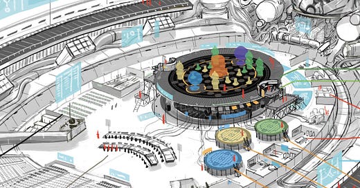
The next design needed was a game laboratory. The script described this as a warehouse-sized, high-tech research facility where scientists were studying PERO-PUZ gameplay. It even housed the AI shown earlier as the God Machine game piece.
I imagined this location as a small sports stadium that had been converted into an experimental lab space. The central focus was a giant, two-story, holographic game board which was large enough to have 20-30 scientists on the game surface at a time.
Surrounding this main stage there were several smaller game stages, a mission control-style set of computer terminals, makeshift classrooms, medical facilities, generators, and open areas for group gameplay. The outermost ring of the lab has a section of stadium seating left intact, large holographic displays, and tens of miles of cables connecting each of the research stations to the AI which looms over everything.
PERO-PUZ was an interesting story to work on. I’d never thought about game pieces or the design that went into them, and taking something small like a board game and going completely over the top with it and blowing it up to stadium size was a lot of fun.
Switching gears, Mike del Mundo explores the process for refining the specific iteration of the game board used in the story, as well as designing The Machine.
Mike del Mundo: This time I was tasked with adding the artwork for a board game that appears in Ming Doyle’s story, PERO-PUZ. Love seeing how Ming translated it into her style!
PERO-PUZ BOARD
Before I talk about my part, I wanted to show off the cool roughs and final line art design for the board game that Jonathan did. There was a lot of meticulous planning and final details to create this game so I thought it would be cool to show off the initial looks and what it took before I added in the visuals.
So check it out. Here’s the initial rough concept from Jonathan:
He then revised it while we were discussing the rules of the game, and you saw that version above. Below is also another evolution with some new elements added:
My job was to add the illustrations to the skeleton of this game, and it was really fun and might've been easiest part. There wasn’t much planning, I kind of just used the overall line art of the board game and started to color over it like a coloring book. One suggestion that gave me a great starting point was to add the Vojogonto, our prized space whales. It’s always good to have a starting point to get rid of those jitters of actually putting the pen to paper. What I usually do is just start sketching out the space whale and from there ideas will start to flow. It’s kinda magical how ideas just sprout just from doodling. It’s a nice thing to practice. Try it out. It works wonders.
Okay, so now after drawing the space whales and ideas were flowing I started looking at the actual look of the board game and I saw something pretty cool: it had a circle in the middle and a 2-inch border that surrounded it. The first thing that came to mind was to draw in some sort of map or planet in the middle circle and it just came naturally that the border that surrounded that circle would work as outer space, and that’s where I was able to plop in the space whales. The cool part is it was telling a story within this game about our universe and how the space whales are ever existing in this constant revolution of our worlds.
So boom, the visuals were done but it felt a bit flat. So I decided to spice it up and add some 3D elements like small indents and grooves to add the feeling of playing on top of a real landscape. And then looking at those grooves I thought, why not make those a housing spot for the game pieces. And voila, game done!
THE MACHINE
For The Machine, The task was to create this giant face where all the facial parts would be made of tech and wires. I didn’t stray away from the original description as it was the perfect visual, it was actually a quick and fun process where I built the simple shape of the facial features as a skeleton and pretty much drew over it with a whole heap of tech and wires.
It was really fun because the silhouette of the face features were already there so it was a process of drawing wire on top of wire, intertwining over another with random tech stuff as the garnish of the face, like creating mechanical spaghetti and meatballs. Actually yeah, it was really like cooking pasta and laying it over a mannequin head, minus the sauce.


![[COMIC] PERO-PUZ](https://substackcdn.com/image/fetch/w_140,h_140,c_fill,f_auto,q_auto:good,fl_progressive:steep,g_auto/https%3A%2F%2Fsubstack-post-media.s3.amazonaws.com%2Fpublic%2Fimages%2F1ceef60a-c246-4a69-ad85-aae5b7907fae_1680x1200.jpeg)


Sooooo 2024 Founder reward is the game, right? Right?
Awesome stuff!
I want to play this game. When will the rules be posted on the site? Also what about an online version for subscribers to try out before you go into physical manufacturing of the game. But I only want to play other humans. I don't want to play the Great Machine and become a popsicle.