[PROCESS] MUZEO DE KLERA - PART 1
Mike del Mundo takes you inside the hallowed hall to explore his designs for the latest [MAPS] story.
Before we get to today’s [PROCESS] post, a reminder that we’ll be hosting a LIVE DRAW with Mike del Mundo, Mike Huddleston, and 3W/3M Editrix Maxima Molly Mahan tomorrow, Friday, October 6, at 6pm ET / 3pm PT. We hope to see you there!
Earlier this week we brought you a brand new comic, MUZEO DE KLERA, featuring art by Brent Schoonover, Rafael Pérez Granados, and Chris Sotomayor. Today we’re back with a look at the behind-the-scenes process for the story, featuring designs and insights from our own Mike del Mundo.
But first, a reminder – MUZEO DE KLERA, along with 11 other comics, will be included in the upcoming [MAPS] Graphic Novel Sourcebook (along with a wealth of world-building and process material). You can visit The Index any time for a comprehensive index of comics, world-building, and [PROCESS] posts so far. Some of the comics, including MUZEO DE KLERA, are only available to paid subscribers, so if you haven’t yet:
3 Worlds / 3 Moons is a reader-supported initiative. If you like what we’re doing and want to get access to great comics, events, exclusive merch and discounts from EMPORIA, and want more from us, please:
To get even more, you can also:
And with that, we’ll turn things over to Mike…
Mike del Mundo: Back again with another process post. This time we explore the Muzeo de Klera, a pulpy museum on Therra packed to the walls with magical relics and curiosities. If you haven’t already checked out what Brent Schoonover and Co. did with the story, be sure to read it first.
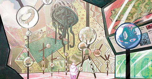
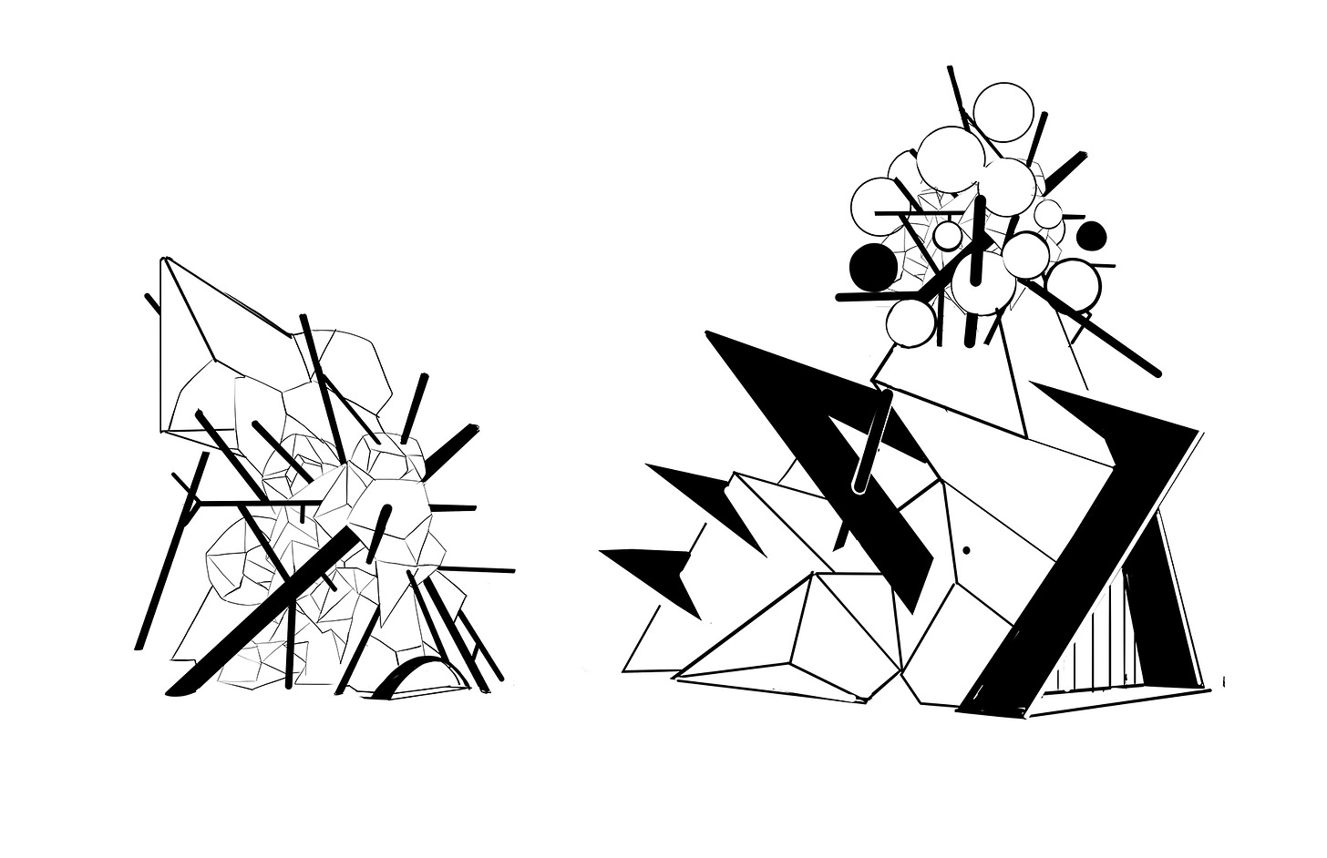
My first thought was drawing a Museum in the shape of triangles and angles that go against perspective rules so the effect would leave a visitor on a kaleidoscope trip. I wanted to get as weird and beyond rules as much as possible since we are dealing with the strange and fantastic. And sometimes it’s just more fun not to feel right (mostly all the time). But yeah, the main purpose was to make the mood off kilter.
After building the exterior of the triangled building, I felt like it needed more then just angles, it needed an extra piece of character. I’m not sure how this came to mind but I thought why not do some sort of Kerplunk look where big sticks or pipes would jut out of the building in different angles as if all these sticks were responsible for keeping the building from Kerplunking. (Is that a word?). So I pretty much built a Deformed Kerplunk Pyramid. Maybe I started off just drawing sticks in the buildings and it just started looking like it which gave me the idea for the foundation of the building.
Doing the interior was a bit easier because the foundation was built so I extended the sticks from the outside into the building and followed with the Kerplunk theme even more adding in the Glass balls that would act as the displays to showcase the relics.
After building the interior, adding in the relics was smooth sailing and I just drew to my heart’s content whatever weird stuff I could imagine, and you can see that Brent did the same in the story.
The colors also had to feel pulpy so I went for a ‘70s type of color scheme and added a yellow hue.
So there you go – a pulpy, trippy kaleidoscope museum inspired by one of my favorite childhood games.
Stay tuned for PART 2, where artist Brent Schoonover explains how he brought the story to life.


![[COMIC] MUZEO DE KLERA](https://substackcdn.com/image/fetch/w_140,h_140,c_fill,f_auto,q_auto:good,fl_progressive:steep,g_auto/https%3A%2F%2Fsubstack-post-media.s3.amazonaws.com%2Fpublic%2Fimages%2F4ecb52da-797c-40ea-8f9a-c3144a0d6314_1000x714.jpeg)


