[PROCESS] HAVO’S WAGER - Part 2
THE HOW...CONTINUED
Back again with the second part of artist Nimit Malavia’s visionary work on Havo’s Wager.
If you missed part one of his [PROCESS] post, do yourself a favor and check it out now.
Now, here’s part 2 from Nimit…
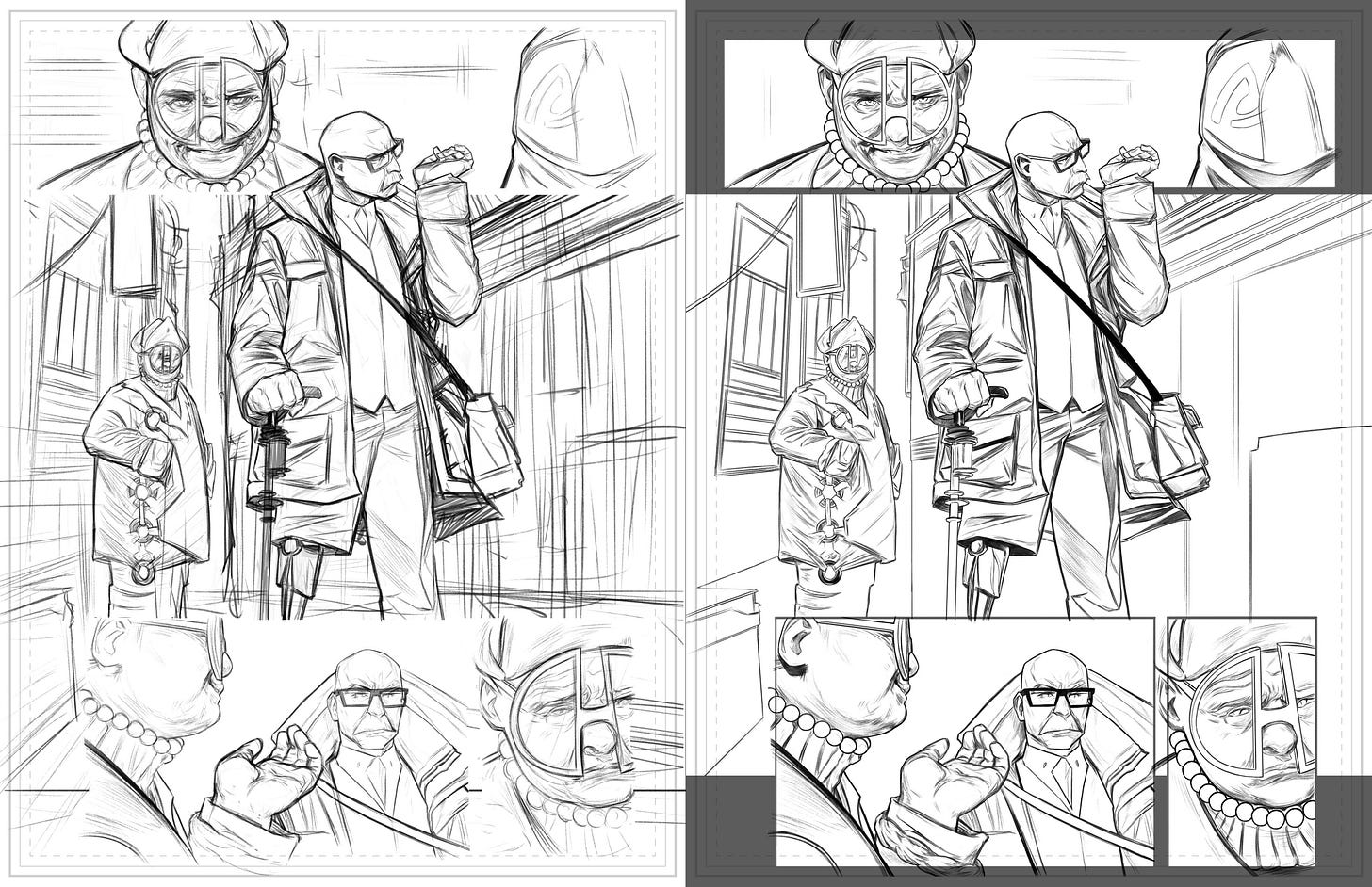
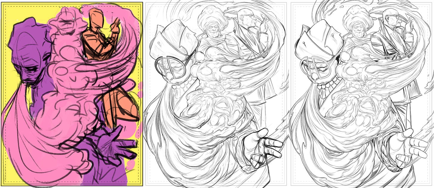
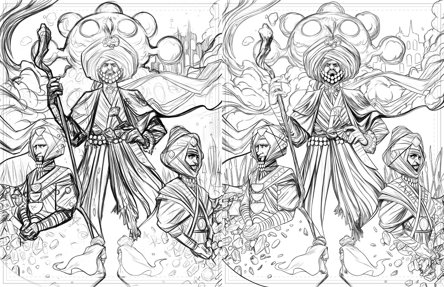
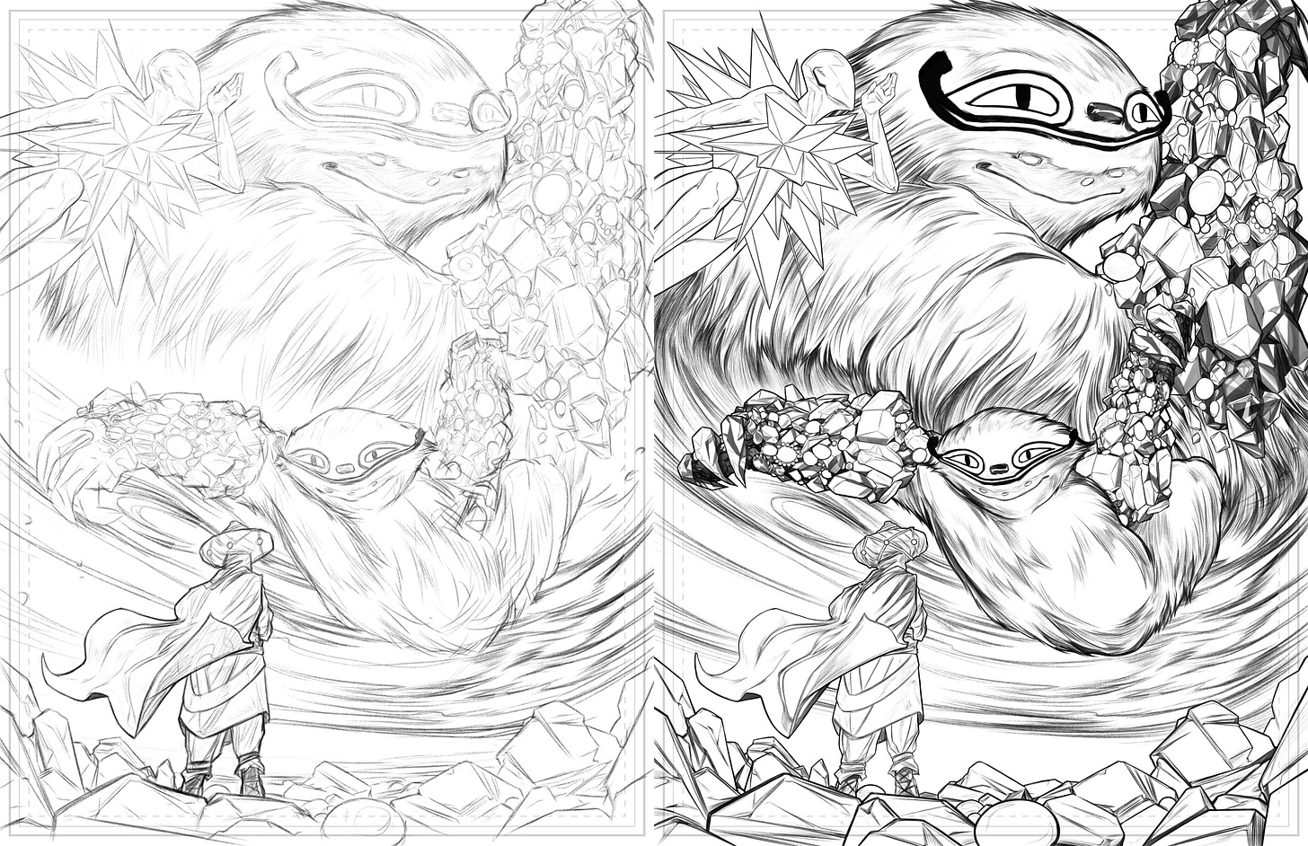
PENCILS >> INKS
Layouts to Pencils to Inks. I try to hold to these as the clear stages, but working digitally, the boundaries of those steps can become so blurry. Most of the time, pencils are essentially 60% inks. Some say that’s too much or that you’re investing too much in the process, but for me, it comes from a place of efficiency/quality control. I try to front-load as much of the thinking as I can so that the latter steps can become less weighted and almost automatic if need be.
Another reason why I take care with the shapes and compositions in the layout stage, a little more thinking there can save loads of time later on. Especially when the designs are as involved as, say, someone like Hova or the Princeling, you want to make sure that you have enough room to enjoy that process and not feel like you have to cut corners and skip the polish.
When it comes to the actual drawing, I like to be pretty economical. Layouts are where I test a lot out and can throw away ideas quickly. Once that’s decided, I tend to get things dialed in pretty quickly.
REFERENCE
Quick word on reference. It’s great. The end.
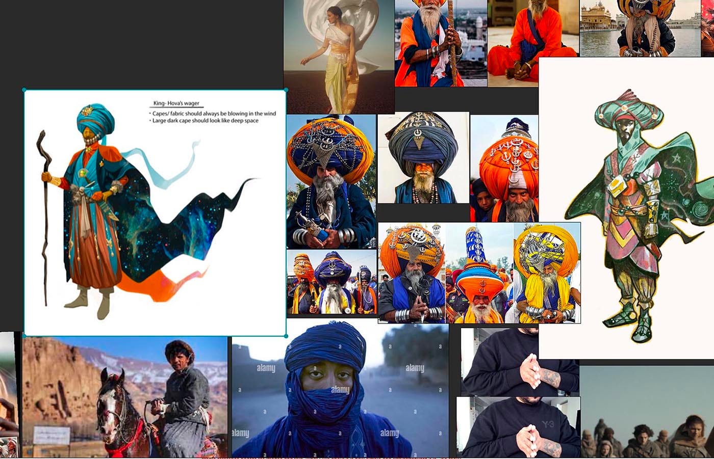
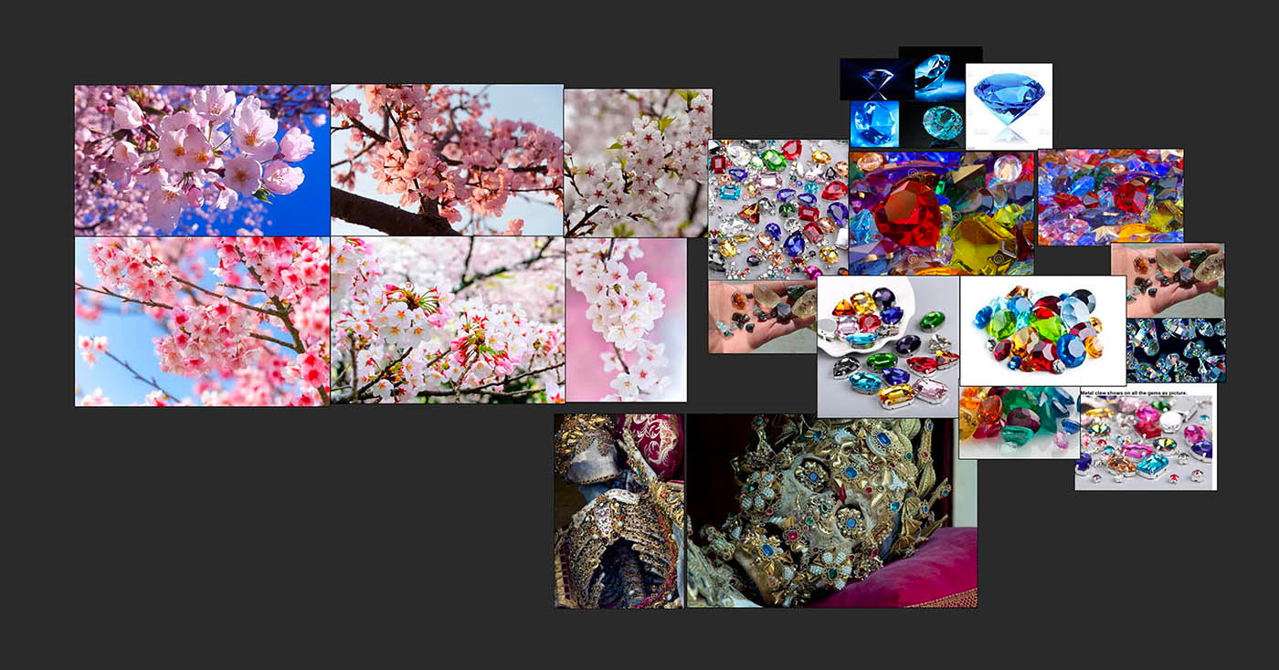
Okay, slightly less quick. Part of how I tend to use reference in my process is in two ways – at the start, for really broad direction setting and then specifics to help speed up the working time. In this case, so much of the way finding was already there within previous stories and designs, so any references were case specific, or more for inspiration and to add another level of dimension or texture.
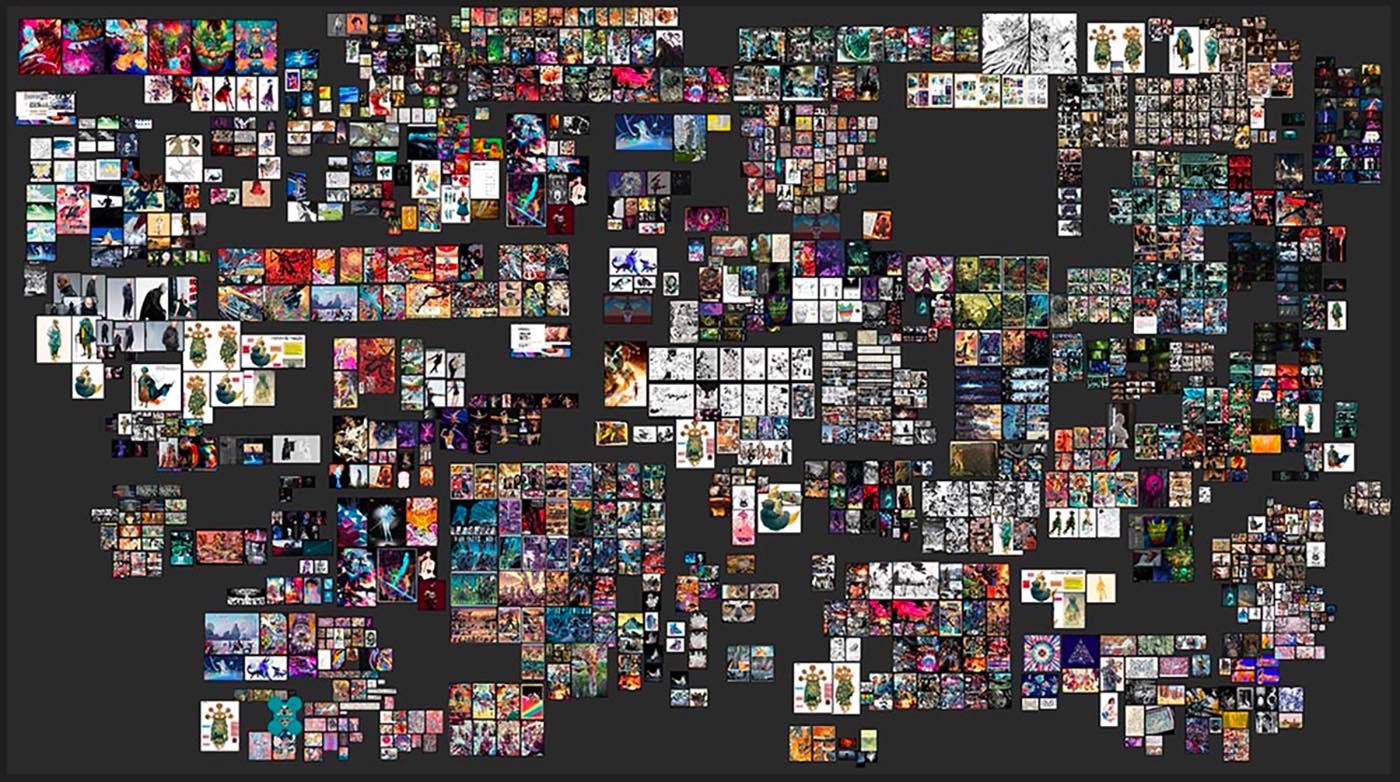
Also, a shout-out for the hyper-specific setup/process junkies – A tool that’s become pretty critical in my process is an app called Pureref. If you need a way to organize and create reference boards, it’s pretty great. What I like about it is how simple and straightforward it is– I can just reference-dump and organize everything into clusters and go in and out as I need. Easy.
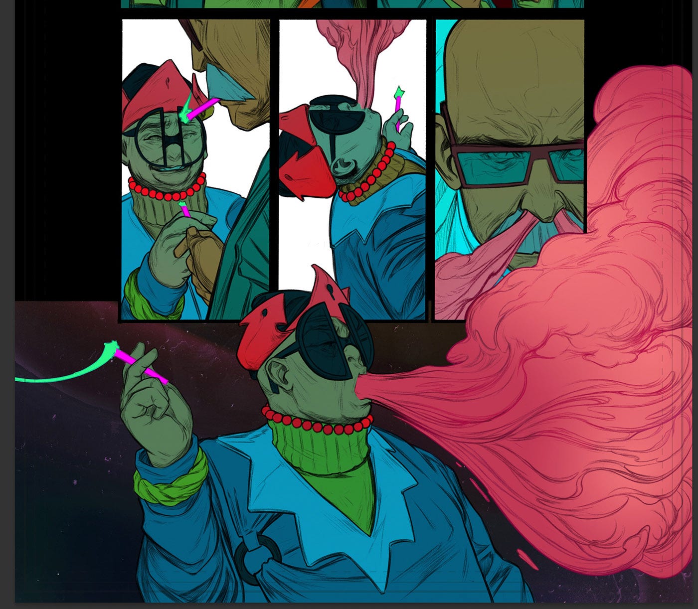
COLOUR
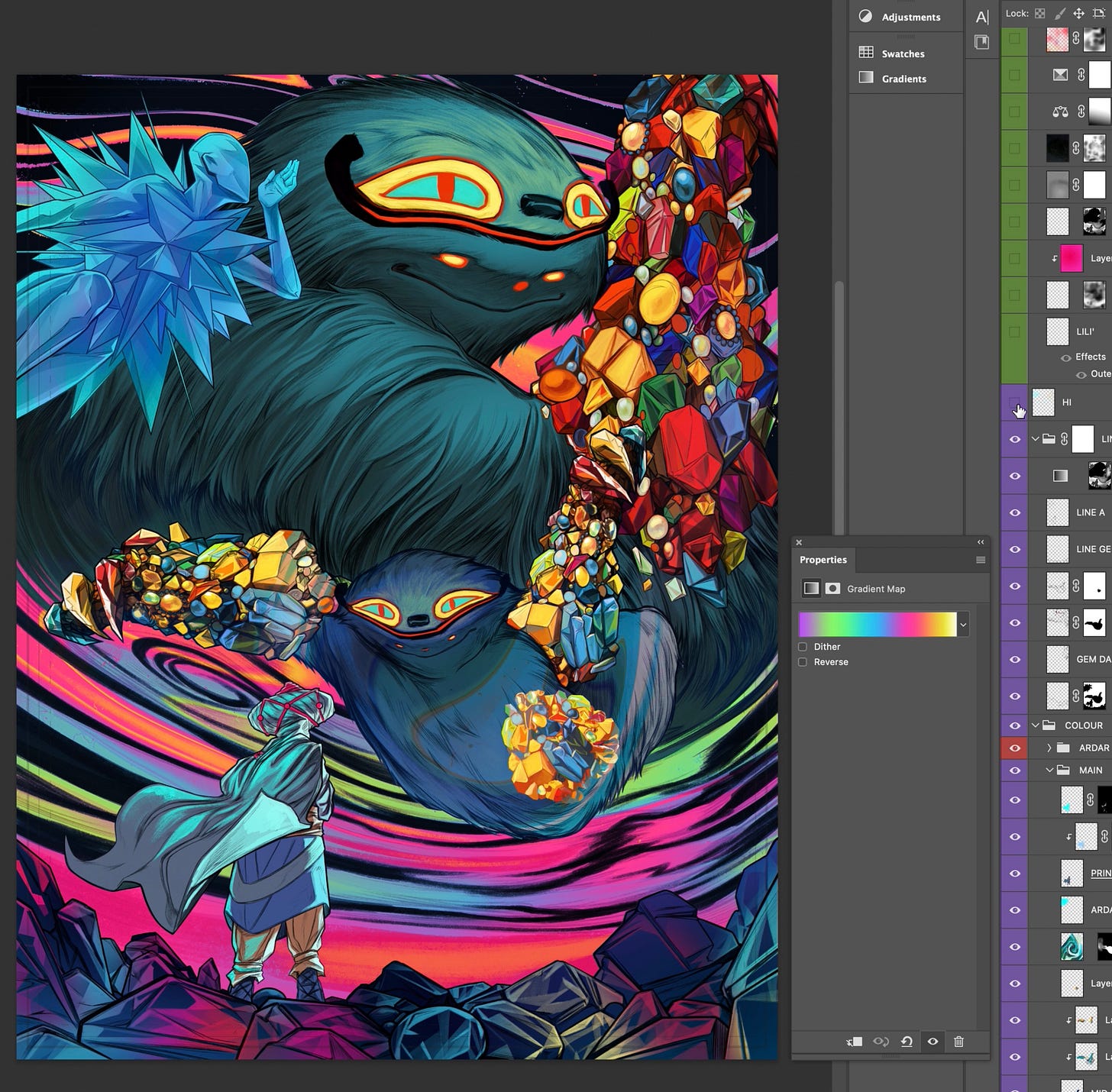
With colour, I find it’s always a little disorienting; even with a strong plan you can’t help but feel a little unsure until you start laying things down. That said, thankfully, some of the initial considerations helped keep the ship moving at pace. Like, I knew we’d want to develop that same distinction between the Tale and Monno/Dmitrik parts of the story. So it was a matter of figuring out how restricted we could make the one palette so at a glance, you knew exactly where you were, and the texture and feeling of it felt a little more solid.
All things to mull over as you're laying down the colour flats. It’s usually here where tricks with Hue/Saturation sliders and gradient maps come in handy. With just an added layer, suddenly, you have a completely different vibe, and sometimes a combination presents itself that sings…. and suddenly, you know exactly where you're going. It’s the best feeling.
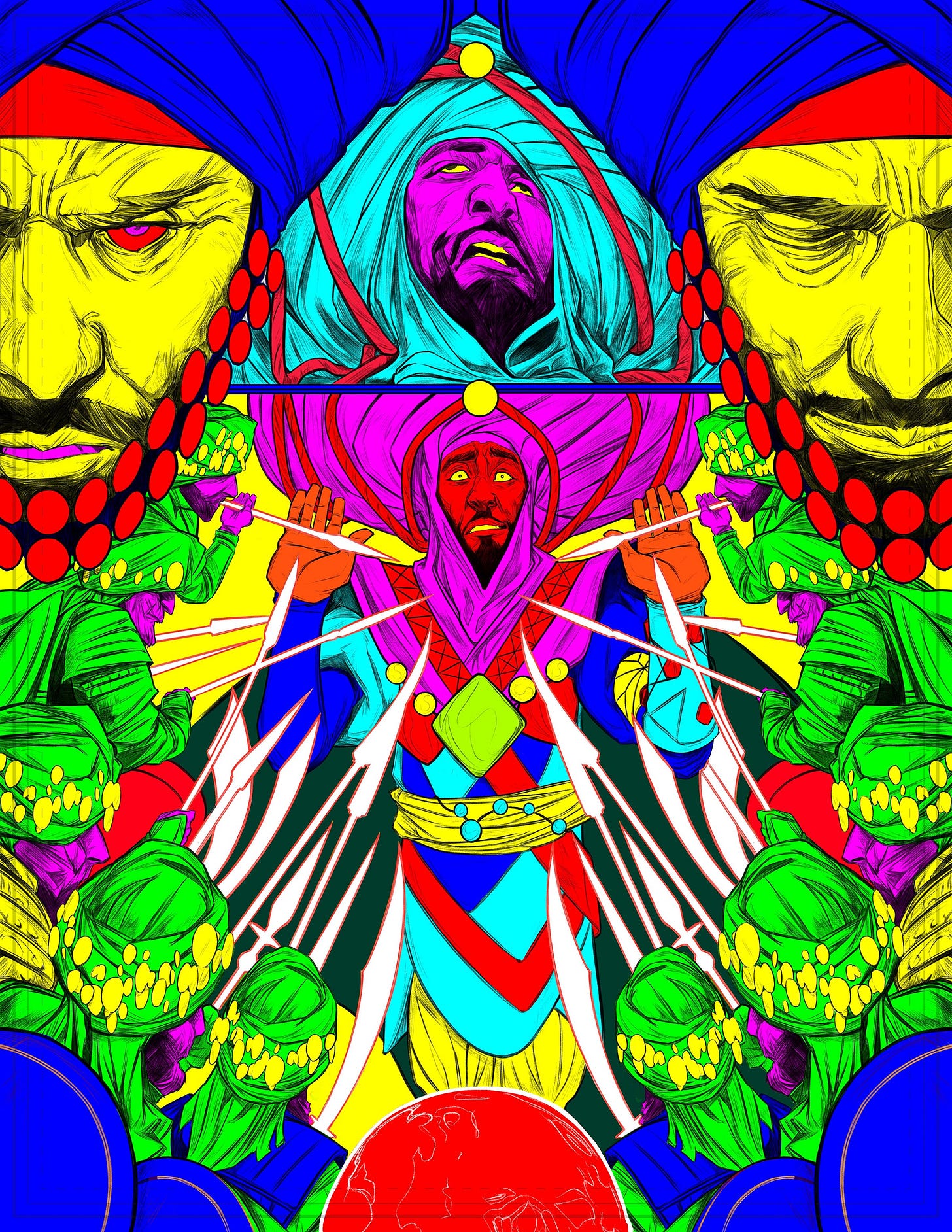
When it came to Hova’s Wager itself, there was a lot more clarity. The palettes in the designs were the guiding lights, and it was about building those out, letting these scenes feel vivid and bright like each page was telling a complete story full of both darkness and light.
FINAL
From here, some quick conversations about type. That mostly went something like, “here are some placement suggestions…. But also, Sasha’s a genius, so feel free to literally throw them in the garbage.”
And there we have it! I’m so proud of how this story came together and I hope you enjoyed this peek behind the curtain at how we made it!


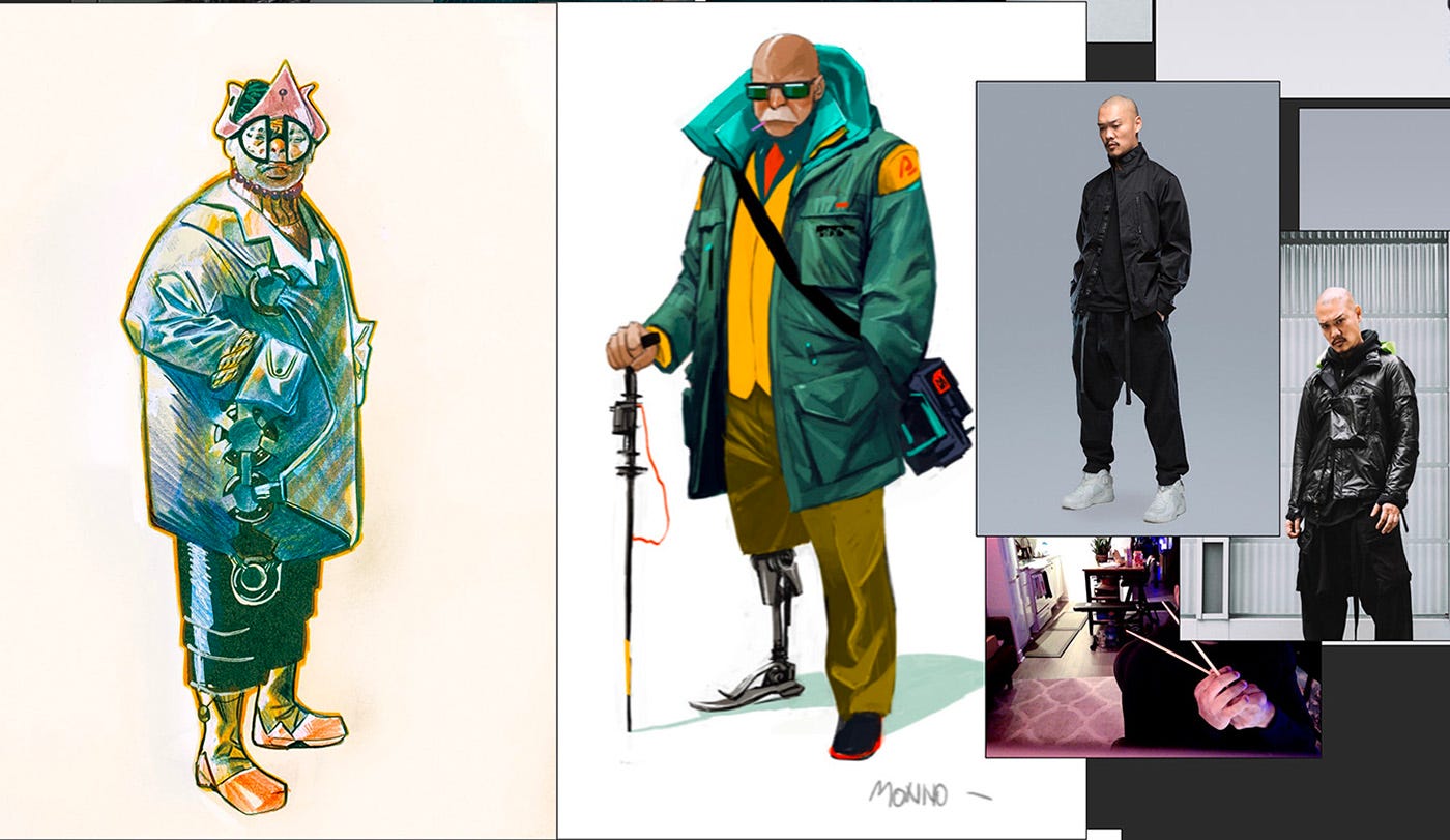


Love this! Special mention for using Errolson Hugh as reference :-)
Thanks so much! Absolutely love your work, I hope we get more soon. And the color and "consistency"? Of your smoke blows me away, amazing.