This is a big one.
It should be clear by now that design is an elemental consideration in the universe we are building and the stories we are telling. That’s why we’ve been honored that Sasha E. Head is helping lead the work it takes to make our upcoming Sourcebooks and comics stand up against the best-looking books out there.
You met Sasha back on Christmas Day when we released our first Kaoso and Origen font packs to subscribers. She’s made a massive splash in comics publishing over the past few years, most recently joining Jonathan and Mike H. on Decorum.
The conversation between Jonathan and Sasha that follows is a fascinating deeper dive into our design, an element of modern comic aesthetics that is still under-appreciated but more necessary than ever. And few people are doing work as thoughtfully and clearly conceived as Sasha. We’re lucky to have her.
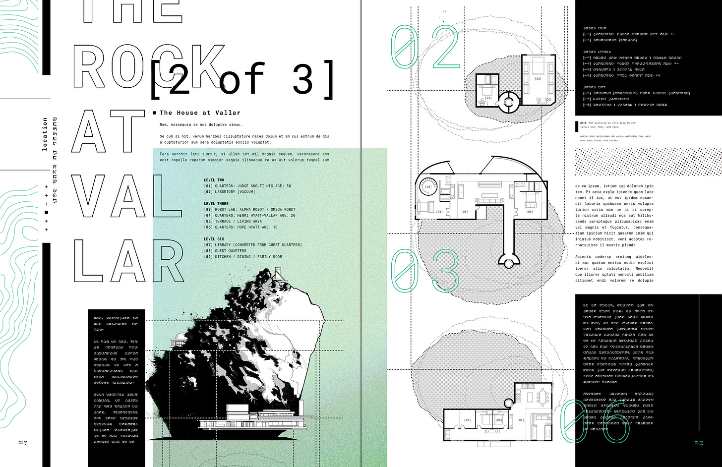
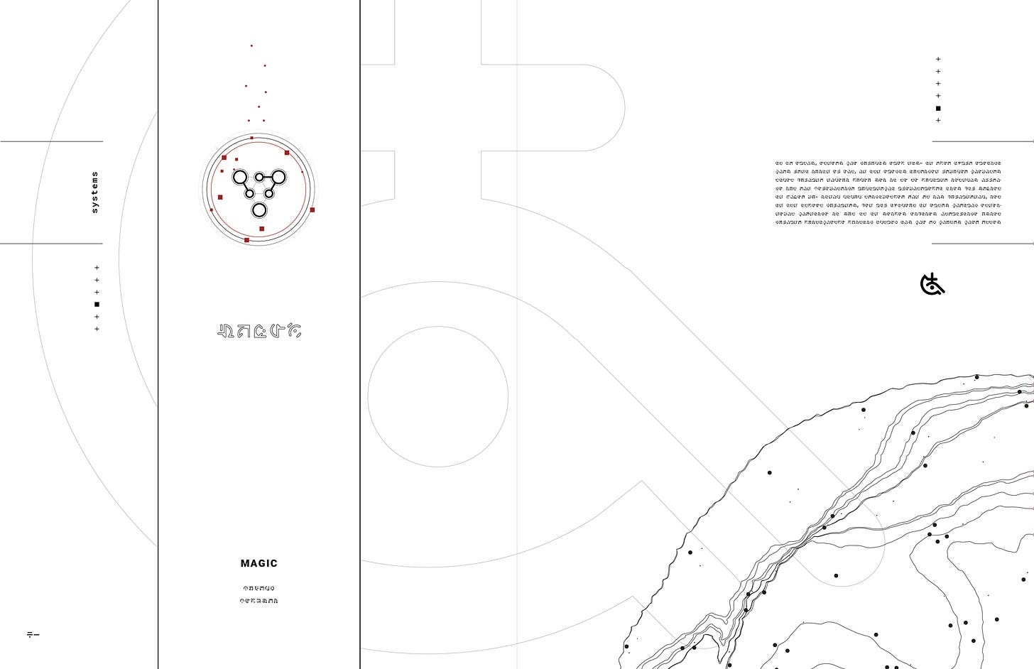
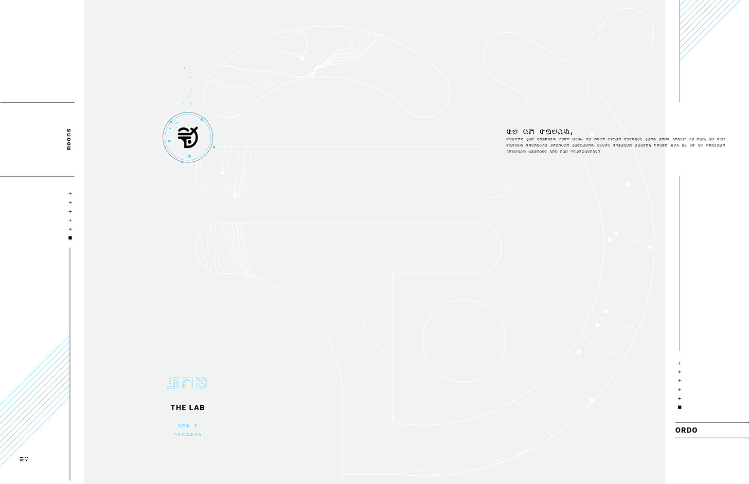
What also makes this entry so important to all of you is that some of the pages that we’re about to premiere will be included in our upcoming [SYSTEMS] Collection, which will be available in print later this year for Founding and Annual level subscribers (shipping not included). Others are from the FABLE / RUINS Deluxe Ashcan, which is still available to Founders for a limited time only, so sign up now:
Okay. You ready? Settle in, grab some caffeine and enjoy!
Jonathan Hickman: All right, let’s get into it. Book design. What are we doing?
Sasha Head: Well, we just finished doing the Decorum HC.
JH: Did I tell you they rushed those things out in Italy? They liked them so much?
SH: No! That’s great.
JH: Yeah. So awesome job on that again.
SH: Ahh, thanks! I can't wait to get my copy, haha. Anyway, onto 3W3M! We started drafting the overall language and "look" of 3W3M as we were finishing up Decorum, so folks will no doubt see some similarities here. With Decorum, I really wanted to develop something that would mesh with whatever crazy shit Mike was up to in that issue-- something that would play nice with whatever location the story was happening in, and therefore whatever style he had chosen for that page.
At the same time, Mike's work is so dense; I had wanted to pendulum-swing into the opposite for most of those infographics-- I wanted something super clean most of the time, and any textures I used came straight from his artwork.
JH: Yeah. It was super important that we had the contrast there. It was almost like the book had two ingredients, you and Mike, and we could just lean into that as hard as we wanted.
SH: Exactly, but with 3W3M, we will literally have different art styles across the pages sometimes, with multiple contributing artists, so I want to build on that even more... but honestly, the main reason I gravitate to editorial design over, say, logo design, is because I absolutely love using text as a design element itself, and having text-heavy worldbuilding pages is going to give me a lot to work with. I love text-heavy pages, and even more than that, I love text-heavy pages that are structured non-traditionally (think House of Leaves!). So for these mockups, we have a bit of both: dense content-heavy pages alongside quieter design element pages. I expect as we move along further in the process, there will be even quieter ones for when the setting demands—a deep breath between comics or infodumps.
JH: Yep.
SH: What I'm saying is that I want to go bonkers with some of these info pages.
JH: Haha. Agreed.
SH: When we were on the phone after I had finished up Kreska Origen, you mentioned wanting to have the "translation" of every article/worldbuilding piece within the Sourcebook from Latin to Kreska. I had been wanting to do something like that for literal years!! I am a big fan of a Japanese magazine called Plus81; every single issue has every article in both English and Japanese on the same spread. It makes for some chaotic layouts, but also some wonderfully structured and graceful ones too. (My two favorite issues that I reference all the time are the Spring 2009 Typography Issue and the Spring 2014 Book Design Issue. They always find their way back to my desk even after I try to clean up and put them away...)
JH: Uh-huh. Definitely want to do that. I mean, I think we have to pick our spots, but just as design elements, things like the page numbers at the bottom of each page being English/Origen is a layup.
SH: Yes! And I really enjoy design with a lot of contrast, whether that's between line weights or thematic contrast. This is generally why I love using the topography lines-- not only does it give a sense of sci-fi and traversing large distances, it's also a completely organic-looking element that has to exist next to aggressively straight and completely unnatural straight lines. On top of that, a lot of my favorite design is "low-tech print" containing large blocks of color (reminiscent of screenprinting). I like layering that with more technical-looking glyphs or overall composition. I enjoyed this about The Black Monday Murders the most-- there were all of these wispy thin lines and tangents of scratched paper next to corporate documents.
JH: Dude that designed that stuff was a hack.
SH: Haha. The worst. I will say that unlike The Black Monday Murders though I really do enjoy the idea of having colors pop out. Black, white, and grey with a color pop. We spoke previously about having a color assigned to each planet and moon, and we have a rough idea of what those colors will be, but I definitely want to mess with it more.
JH: Yeah, I think the idea of having a framework of color coding for the different systems is a solid idea. From a thousand feet up all of this will definitely seem a little scattershot if we don’t assemble it properly. A big part of this one is going to be organization. Without a doubt.
SH: I agree.
JH: Okay, I think that about covers it. Let’s get some mockups going and go from there.
Reminder! Annual and Founding Members can still get the [SYSTEMS] Collected Edition, where these pages will be seen in print. Founders can still get the FABLE / RUINS Deluxe Ashcan. So sign up today:
If you want to see more of Sasha’s work, check out her website. (The 100 Book Cover Project is particularly brilliant.)
That’s it from 3W3MHQ. We’ll talk again in a couple of days with more surprises.


Loved reading Sasha's thoughts on both Decorum and 3W3M! She absolutely raises the level of whatever project she's on, so I was thrilled when I heard she was joining us for this adventure. Now I gotta hit Ebay and see if I can find those Plus81 issues...
Sasha is a national treasure.